Want to go: 0
An empty list looks like a feature nobody wanted. Sometimes it's a feature that was priced too high.
August 2026
·8 min read
Here is a screenshot of my saved places in Google Maps. The interesting number in it is a zero.
Want to go: 0. Below it, Travel plans: 0. Further down, Favorites: 1. Those are the lists every Google account is born with, and they are named for precisely the thing I have spent years doing in this app.
The obvious read is that I ignored Google's vocabulary and rolled my own. That was my read too, until I thought about why I actually stopped using them.
I stopped because a place can only look like one thing. Save a trailhead to Nature & Remote and its pin wears that list's icon. Add the same trailhead to Want to go and I'm suddenly negotiating with the system over which icon it keeps, and I don't get the deciding vote. The second membership isn't free. It costs me a categorization I set on purpose.
So I ration. One list per place, whichever one I'd most want to see on the map. Nature & Remote ended up with 110 places, Eat & Drink with 48, Been & Loved with 38. Want to go ended up with zero, and it isn't because there's nowhere I want to go.
I love this app. I use it more than almost any software I don't write myself. Getting from here to there, finding the thing near me, understanding a city I've never been to - it is astonishingly good at all of it, at a scale nobody else operates. This isn't a takedown.
But everything below is a version of one problem. Maps is exceptional at the moment of saving, and it has almost nothing for the years afterward, when a collection stops being a pile of saves and becomes something you tend.
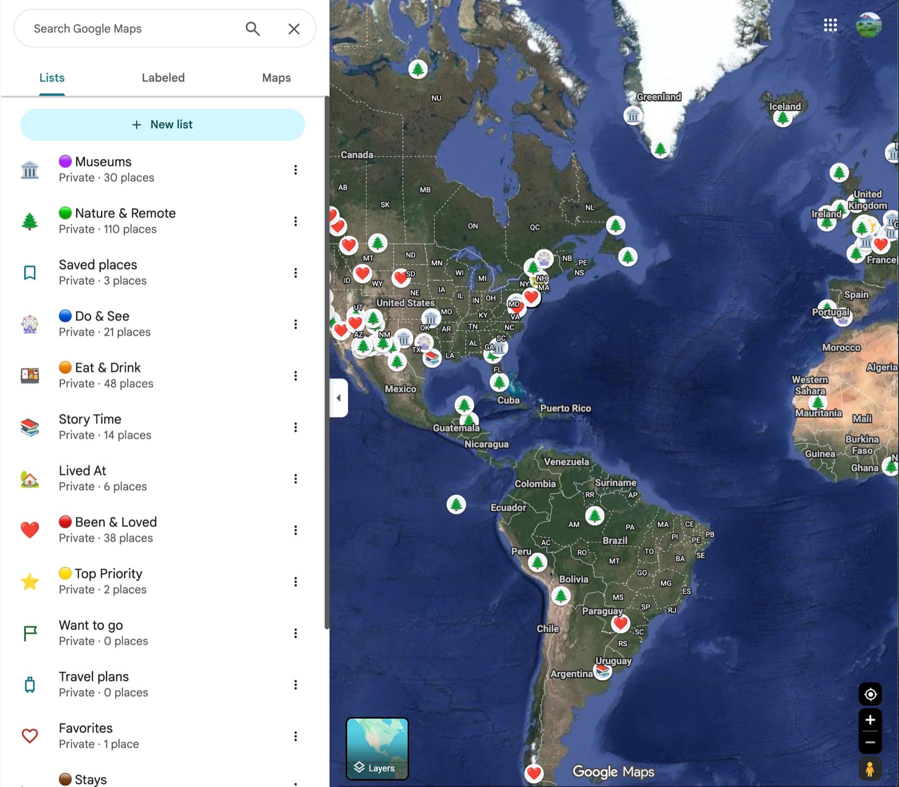
The list of lists
Start with the thing I touch most, which isn't a place. It's the sidebar of lists.
There are a dozen of them and they sit in an order I don't control. The order is last-write-wins: touch a list and it moves. So the sidebar is sorted by my most recent edit, which is simultaneously the one fact about my lists I already know and the one I care least about. The four lists that are actually how I think sink underneath the one I opened by accident last Tuesday.
I cannot drag them. There is no way to say these live at the top, which is the entire content of what I know about my own collection and would take one gesture to express.
The toggling is worse, and it's the thing I want most. What I'm constantly trying to do is walk down the sidebar flipping lists on and off and watching the map answer. Museums on, Eat & Drink on, everything else off, now show me Lisbon. That's not an exotic workflow - it's the only way to make a map of three hundred points say anything. But each toggle is a round trip that costs me the list I was reading, so an operation that should be six flicks and a glance is six navigations and a re-scroll.
The interaction I'm describing is a layers panel: a stable order I set, a checkbox on every row, the canvas updating live underneath while the panel holds still. It is not a novel idea. It's forty years old, every GIS tool has it, and Google's own My Maps has it, one product over, with the drag handles and the checkboxes right there.
The obvious explanation for the gap is the phone. Maps is a mobile product first, and its design language is map full-bleed with everything else a sheet that slides over it and slides away. A layers panel has to persist beside the canvas, and on a phone there is nowhere to persist it. My Maps gets one because My Maps is desktop-only.
That explanation dies on my own screenshot. This is Maps on a desktop, and the persistent left panel already exists - it is the thing listing my lists. The panel is built. It is sitting right there. It just has no checkboxes in it and nothing to grab. Whatever kept the interaction out isn't the constraint that would have justified keeping it out, and desktop Maps ships as a port of the phone app rather than as its own product, so it inherited the phone's limits without inheriting the phone's reason for them.
I've written before about last-write-wins quietly destroying data in a sync path. This is its cosmetic cousin, and it's the same mistake wearing a nicer coat: a system resolving something on your behalf that it could have simply let you decide.
A second list costs you the first
Back to the zero, because it's the most expensive thing here.
On paper a saved place can belong to many lists. In practice a pin can only look like one thing, and when memberships disagree about what it should look like, the system picks. Not me. That single rendering decision converts a many-to-many relationship into a one-to-one one for every purpose I care about, because the reason I put a place in a list is so I'll recognize it later on the map.
So membership acquires a price, and users do what people always do with a priced resource. They ration it. One list per place. I suspect a meaningful fraction of the empty Want to go lists on Earth are empty for exactly this reason, which would make it one of the more quietly costly defaults in consumer software.
There's a second-order effect I didn't notice until I saw my list names in a column. Museums and Eat & Drink are categories. Been & Loved is a state. Top Priority is a priority. Lived At is biography. Story Time is a reason - the places attached to something I want to tell someone. Those are five independent axes, flattened into one namespace.
That isn't disorganization. It's rational behavior under the constraint: if a place gets one slot, then naming the slot means deciding which single fact about the place is worth spending it on. A museum in Lisbon I've been to and loved has three true things about it and room for one.
The fix is one change with two payoffs. Stop letting list membership be the pin's whole identity. Keep the category glyph, express membership as a ring or a tint around it, and let me say which list wins when I actually care. Membership becomes free, so I stop rationing it - and as a side effect the map stops turning into a uniform sheet of identical markers every time I switch a list on, which is the other half of why I keep them switched off.
Saving is free. Asking is impossible.
Every collection tool has a write path and a read path. Maps built one of them beautifully.
Saving costs one tap. It's so cheap I do it reflexively - a friend mentions a place, I pin it, I move on. Over years that reflex produced a few hundred points, which is the system working as designed.
There's no way to ask my own map a question. Not a complicated question - I mean which of these am I near, is open, and haven't I been to yet, which is the only question I have ever actually had. Every signal that would answer it already lives in this app: hours, distance, transit time, whether I've been, seasonal closures, how far off my route it sits. Maps computes all of that for the entire planet, continuously, better than anyone. It just never points any of it at the places I told it I cared about.
The sharpest version of this is smaller and more embarrassing. Open Nature & Remote and you get 110 entries, each a fat card with a photo, an address, a rating and hours. There is no search inside the list. Finding one place means thumb-scrolling a wall of them, reading names as they pass.
This sounds like a small complaint, but sit with how absurd it is. Google Maps has the best place search on Earth. It will find a half-remembered noodle shop from a misspelled fragment across hundreds of millions of businesses. That search is pointed at everything except the 110 places I personally curated and told it were important. The one corpus in the app where I know the answer is present is the one corpus I have to scroll.
Tags that can't travel
There are tags. They're capped per list, and they don't port between lists - build a vocabulary in one and you rebuild it by hand in the next.
That constraint isn't an oversight, it's a confession. Tags were built as decoration on a list rather than as a data model of their own, so they inherit the list's boundary. They live inside the folder instead of cutting across it, which is the one thing tags exist to do. A tag that can't leave the container it was born in is a sub-folder with a nicer shape.
Four changes
None of these need a new data source or a new model. Three are re-plumbing something the app already has, and one of them Google already ships in an adjacent product.
Give me a layers panel.
Drag to reorder, an order that persists, a checkbox on every row, and a map that updates live while the panel stays exactly where it was. Nothing about my list sidebar should ever move because of something I did to a list. This is the change I'd want first and it's the least novel thing on the list.
Let me choose which list owns the pin.
Or better, stop making lists fight over it: category glyph stays, membership becomes a ring or a tint, and a place can belong to five lists without any of them being erased. This is the change that makes the empty lists fill up, because it's the change that makes a second membership cost nothing.
Put a search field inside a list.
Then a filter row above it - open now, within a walk, been or not been, on this trip. The signals are already computed for every place on the planet. Scoping them to the few hundred I've personally vouched for is the shortest distance between this app and the question I actually have.
One tag vocabulary per account.
Uncapped, portable, applying to any saved place regardless of which list it came from. Then a list can be a saved filter over that vocabulary rather than a box, and the five axes I've been smuggling through one door get five doors.
The part I'd argue about
The strongest objection is the honest one: I'm not the median user. Most people have four pins - home, work, mom's house, a hotel. Layer panels and tag vocabularies are complexity they'll never open, and Maps carries billions of people who'd pay for that complexity without ever using it.
I think that's right, and I think it argues for staging rather than for doing nothing. None of this has to exist at four pins. Reordering appears when you have enough lists to want an order. Search appears when a list crosses a few dozen. The tag vocabulary is invisible until you make a second tag. Products that serve everyone can still ship depth on a delay - the constraint is that the depth has to be earned by the user's own behavior, not buried in a preferences pane. My account has been signalling for years that it crossed that line. It has 110 items in one list and a search box in none of them.
There's one complaint I left out of the four, because it's a different kind of problem. The features aren't the same across platforms - sorting and filtering options that exist on Android are missing on iOS, and the reverse. That isn't a design failure. Nobody designed it. It's what a surface looks like when it has no single owner: each platform team ships what it gets to, nothing contradicts a spec because there isn't one, and the drift is never anyone's bug.
And I'd argue that explains the rest. A sidebar you can't reorder, a list you can't search, tags scoped to the wrong container, a pin that silently overwrites its own meaning - none of these are hard problems, and that's exactly why their survival is informative. They aren't unsolved. They're unowned. Saved places gets treated as storage attached to a navigation product, and storage doesn't get a read path, because the person who saved the thing already got what they came for. My Maps has the layers panel because My Maps is an editor, and editors get layers as a matter of course. Maps never got one because nobody ever decided that saved places was a thing you edit.
There's a less flattering answer available too, and I'd hold it loosely. Maps makes its money on discovery - sponsored pins, places near you, the thing you haven't tried. A tool that is genuinely excellent at moving around inside the set you already chose is a tool that shows you fewer new things. I don't think anybody sabotaged saved places. I think no roadmap argument was ever won by help users look at only the places they already picked, and that is entirely sufficient. Features don't need an enemy to go unbuilt. They just need to never be anyone's best idea that quarter.
But the saving was never the point. A collection isn't the places in it - it's everything you do to it afterward, the reordering and the re-filing and the toggling on and off until the map finally says something back. Maps gave me somewhere to put things and nowhere to keep them.
I design and ship products end to end - see the work or get in touch.