Untwine / iOS & macOS
Make room for the hard part.
Can naming the feeling make a task easier to approach?
My role: Product design, visual identity & implementation
Design decision 1
Make room for the hard part.
A task can be quick and still feel impossible. Untwine makes that distinction visible, then offers a gentle way forward.
The design challenge
A productivity interface should help someone approach a task without turning discomfort into another performance score.
Design decision 2
The feeling belongs to the task.
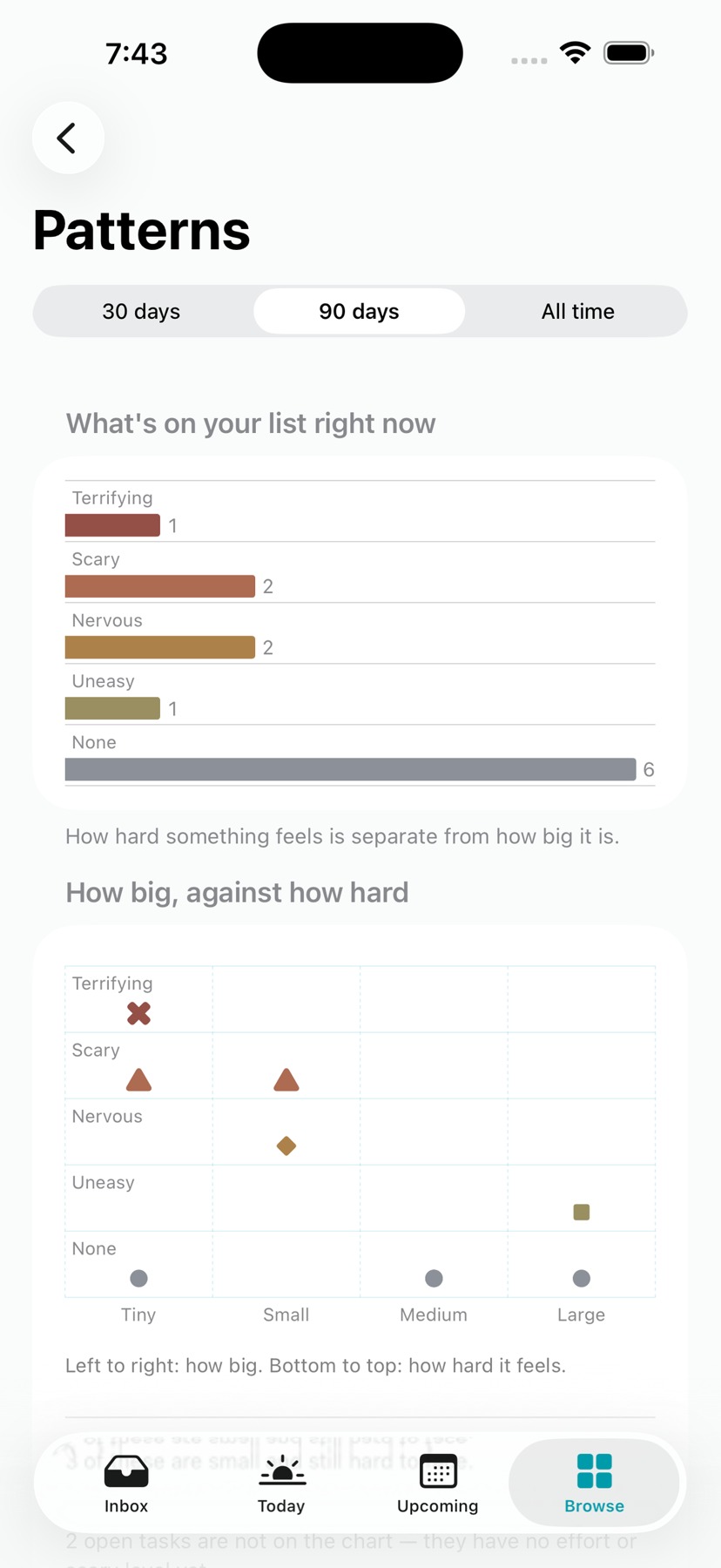
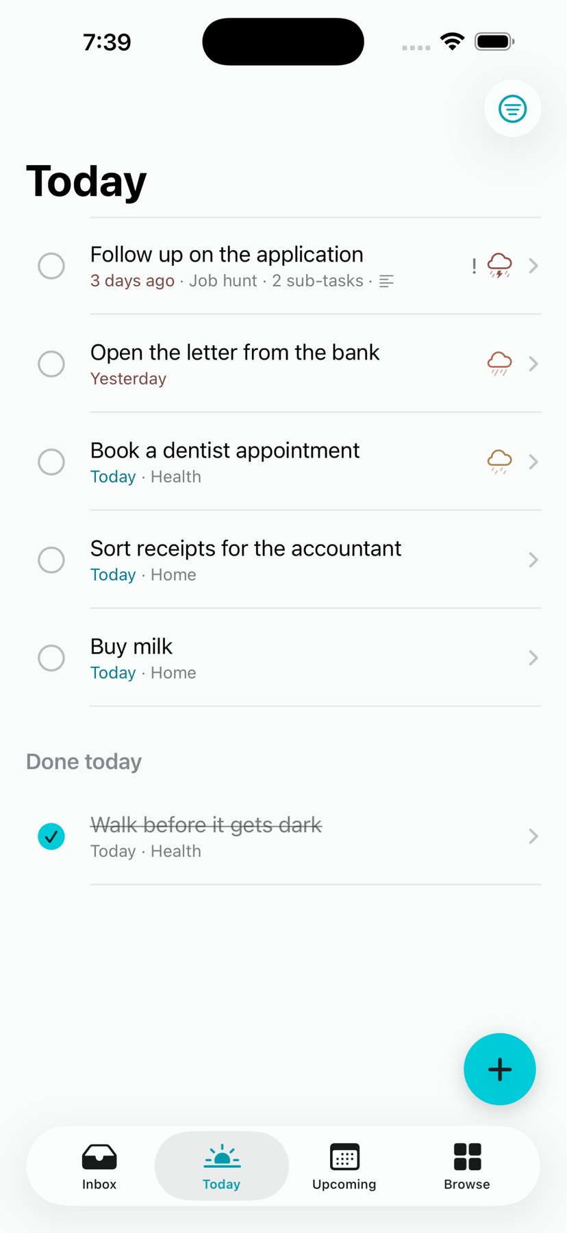
Emotional difficulty sits alongside priority and effort. Weather symbols give that feeling a compact visual language.
Separate the dimensions
Urgency, effort and emotional weight answer different questions.
Pair symbols with language
Weather is a metaphor, not a diagnosis. Labels make the meaning explicit.
Design decision 3
Offer a smaller next move.
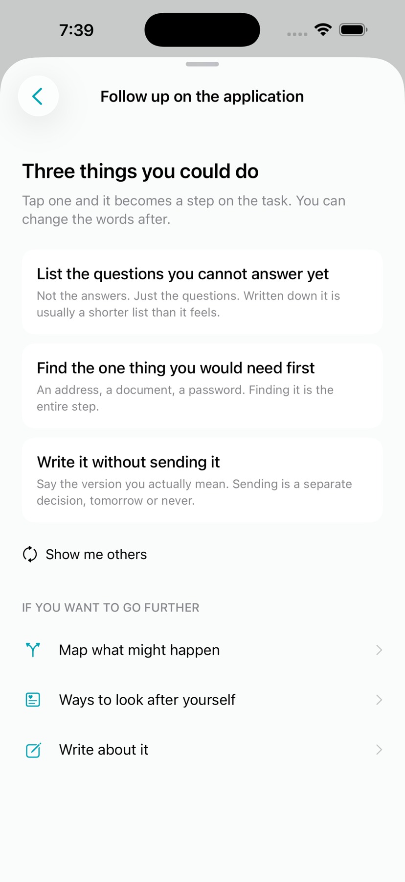
When a task is difficult, the interface opens possibilities: find a small action, make space, or set it aside.
Lower the commitment
The next step can be smaller than finishing the task.
Keep agency visible
Suggestions support a choice; they do not prescribe one correct response.
Design decision 4
Two endings. Equal care.
Completing a task and choosing to stop receive the same final swan mark. The identity belongs to the experience, not to a reward.
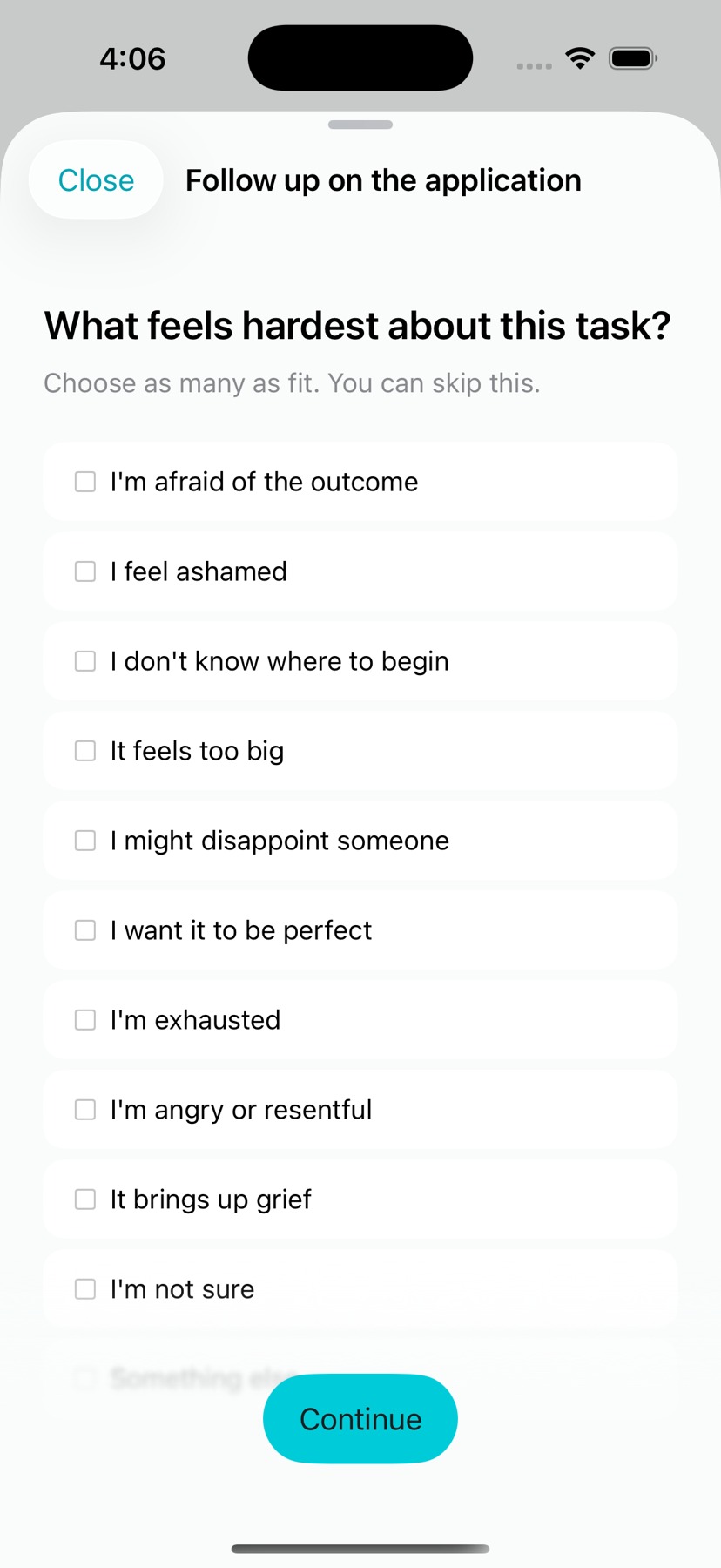
Before
The flow used its earlier header treatment.
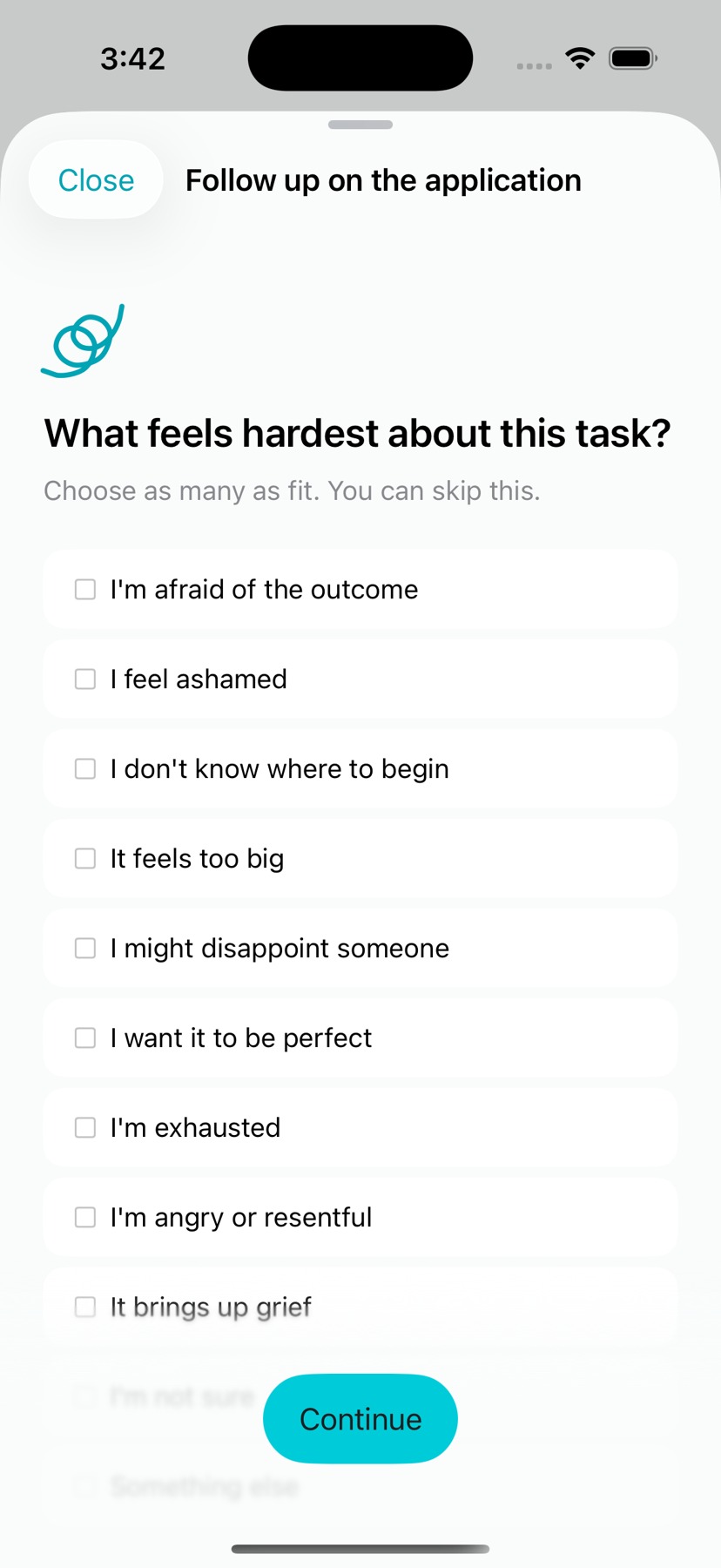
Kept iteration
A small morphing mark follows the flow. All three swan variants were retained after controlled visual comparison.
A deliberate constraint
No celebratory hierarchy between completion and setting aside.
Design decision 5
One character, two platforms.
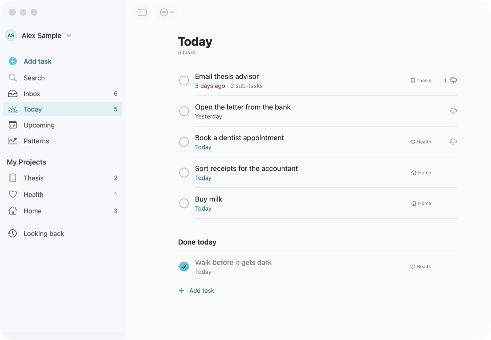
A quiet visual language travels from a compact phone list to a spacious desktop workspace.
Consistency without duplication
Shared typography, weather language and line art; layouts respond to the platform.
Next research question
Do people understand emotional difficulty separately from effort when first adding a task?