Ambi,
a first look.
A calm first impression.
A few “wait, what?” moments.
And some details I really loved.
Ambi feels refreshing: a light workspace, generous space, and simple calls to action. The accurate listening recap and already-connected calendar gave me an early reason to trust it. The main opportunity is making navigation and AI task ownership equally clear.

Personal first-use critique on Mac, November 13, 2026, around 4:57–5:27 AM. Notes follow my narrated exploration order, including the 5:07:45 capture before 5:07:29. One person's impressions, not a usability study or accessibility audit. Motion is reported from use; still images cannot establish it.
This is a critique of the work, not the team, and written to learn from them. How I critique →
Part 1Getting inA calm door, and a question about which way is back.
One role doesn’t quite fit
“There were about two dozen options on “What’s your role?”, but I could only choose one (Where I got stuck). What if more than one describes me? (What I expected)”
Wait, can I go back?
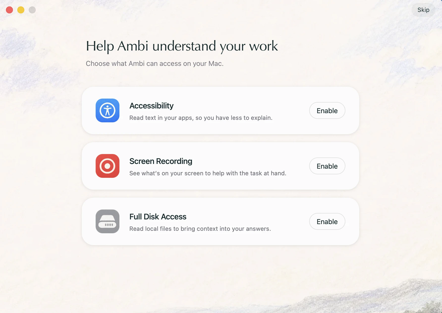
“I wanted to go back to the role question (What I expected), but I couldn’t find a back button (Where I got stuck) here.”
A simple invitation to try it
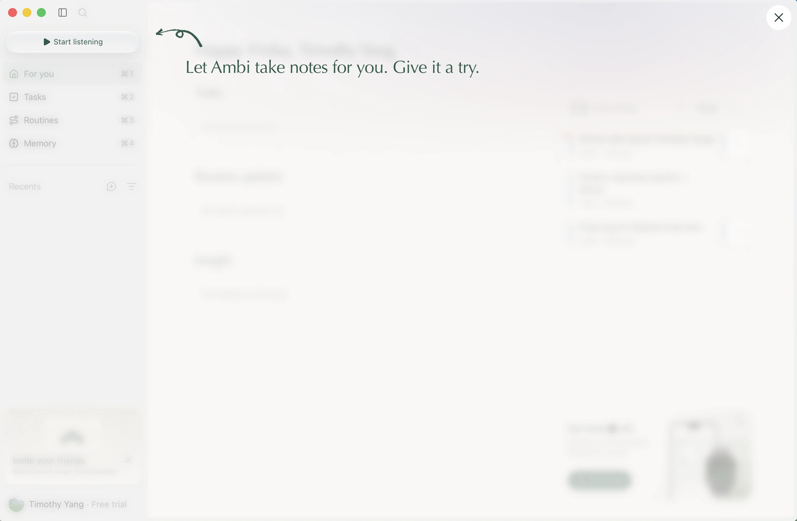
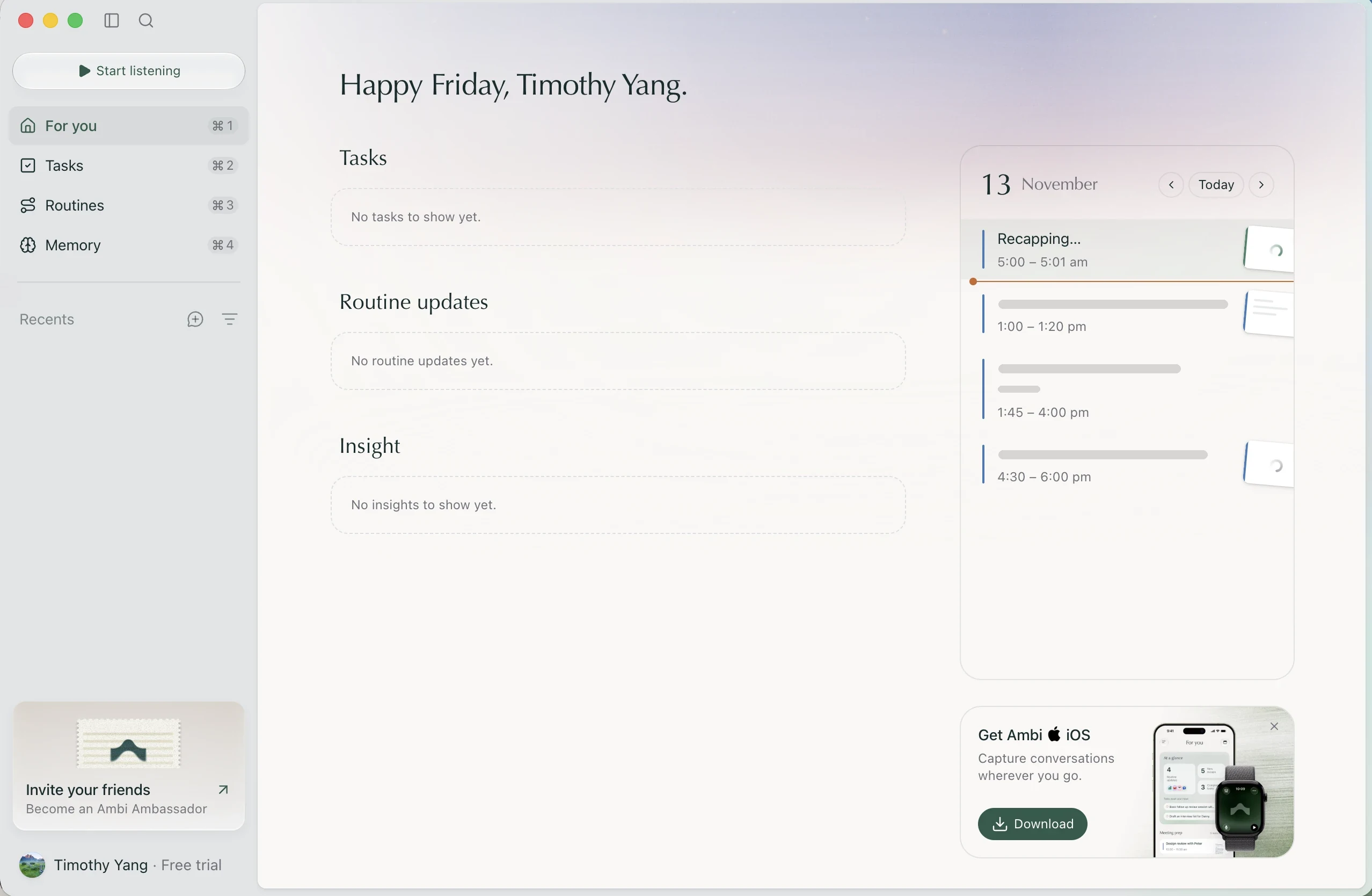
“I finally got in. I like the simplicity (What I loved) and the call to action that gets people started (What I loved).”
What should I say?
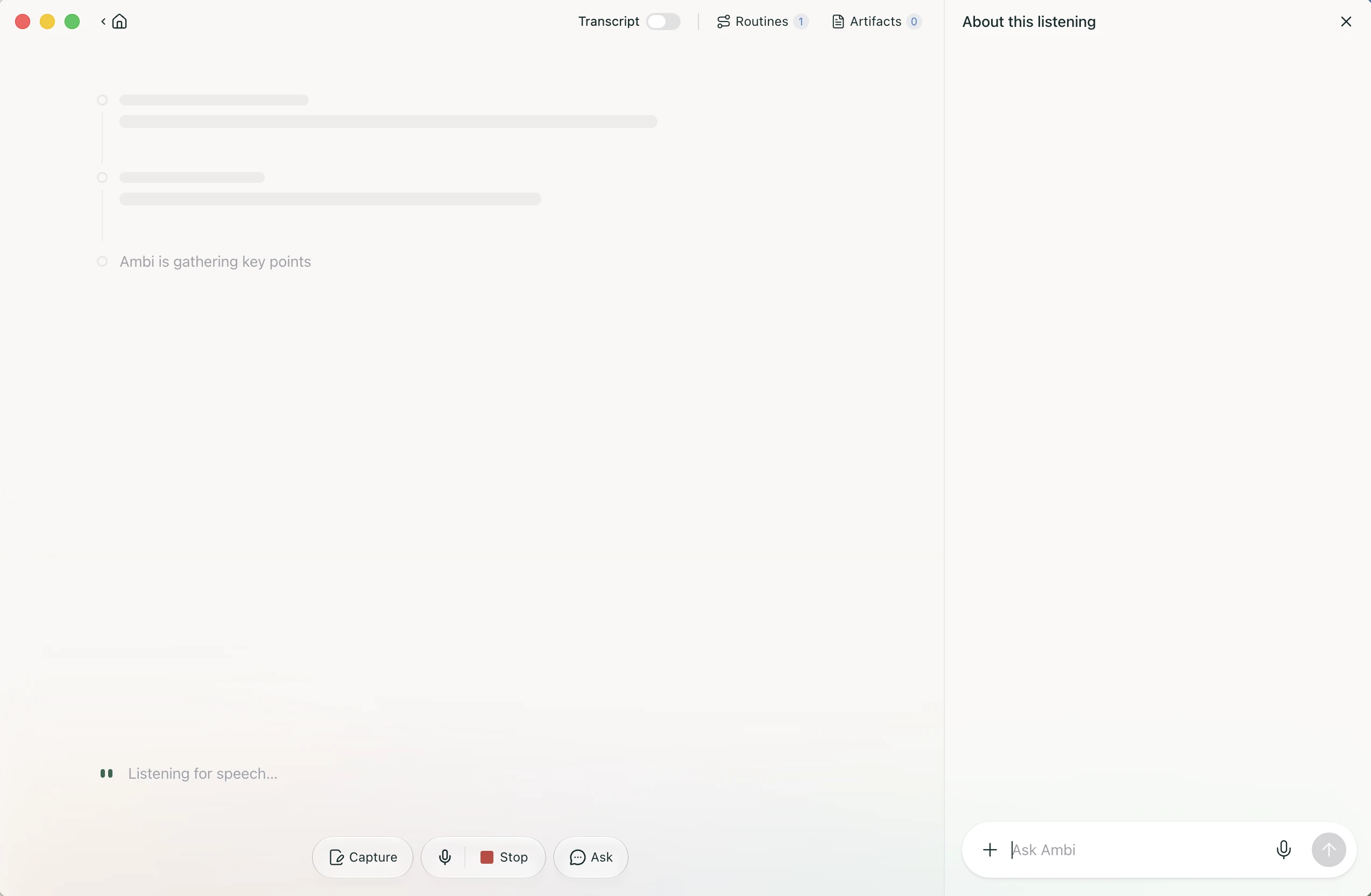
“Ahh, I don’t know exactly what to say (Where I got stuck). I’ll try talking about my current day. I do like how white and minimal everything is—good use of space, really refreshing (What I loved).”
Part 2First trustIt already knew my calendar, and the recap was right.
Useful before I do much setup
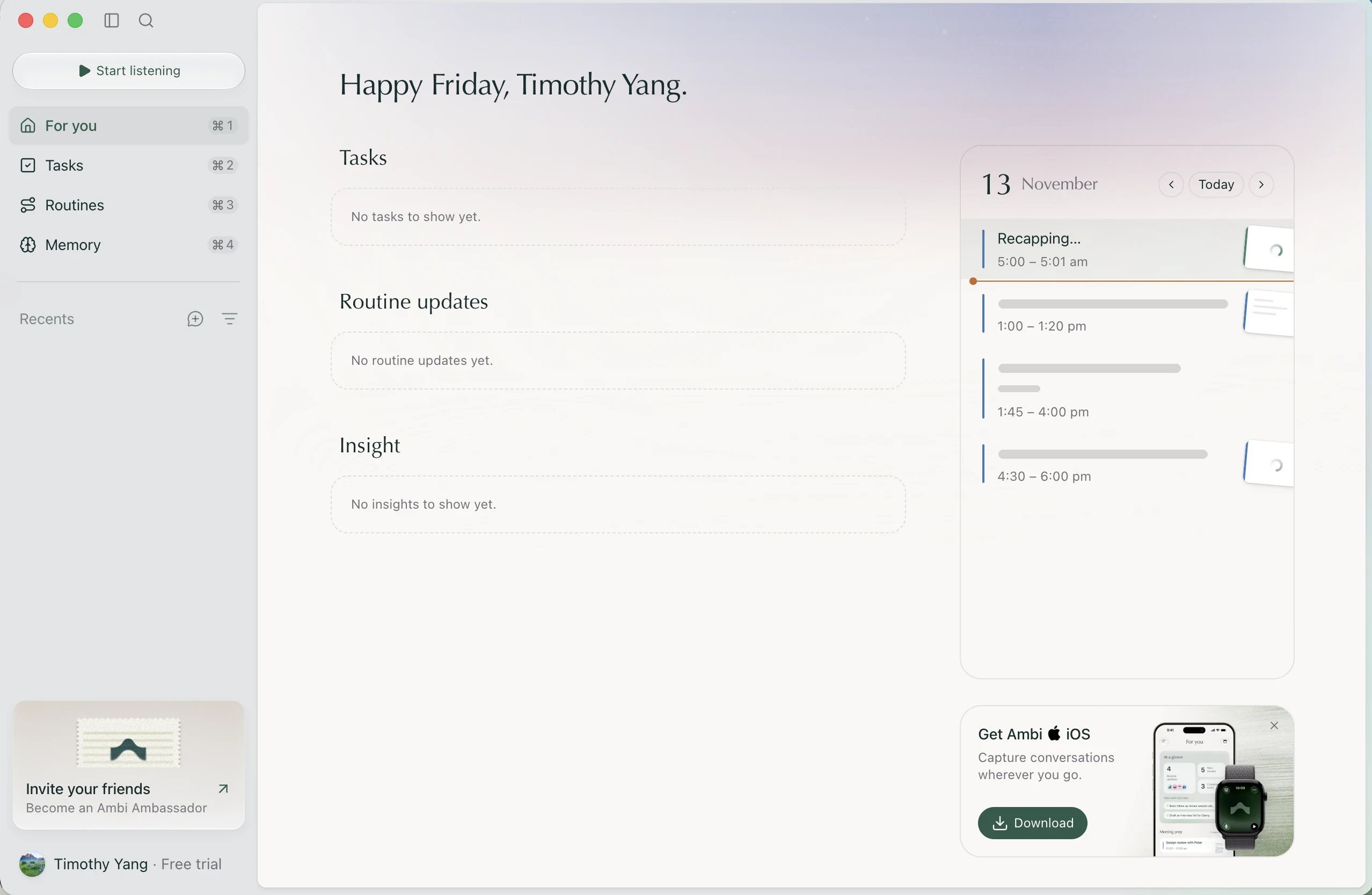
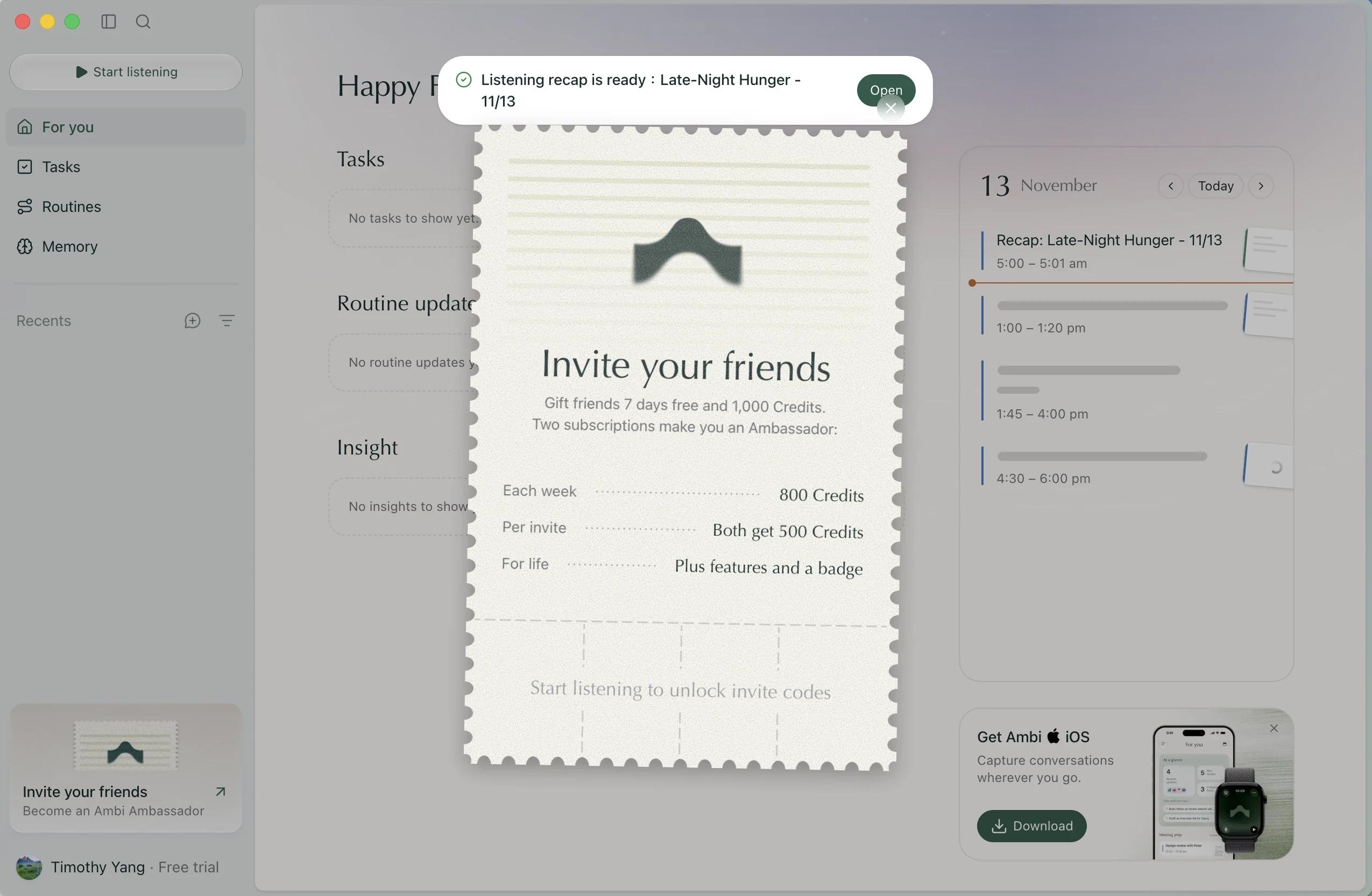
“I like that my Google Calendar is already connected (What I loved). I also like that I can dismiss the Apple Watch promotion (What I loved). I wish I could dismiss the invite-a-friend card too (What I expected).”
The invite ticket is lovely
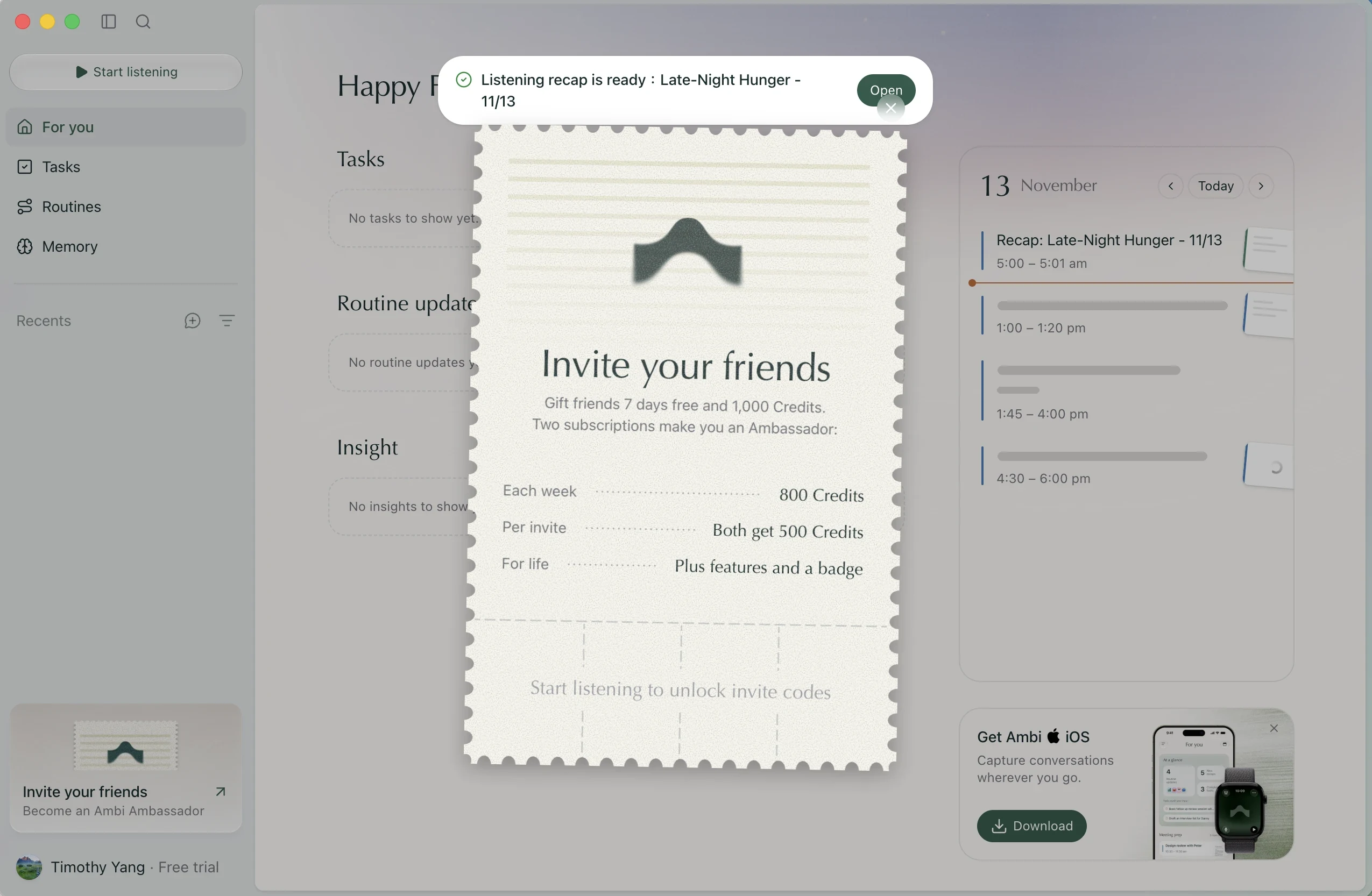
“The invite ticket card looks nice (What I loved), though.”
It heard me. Could it care, too?
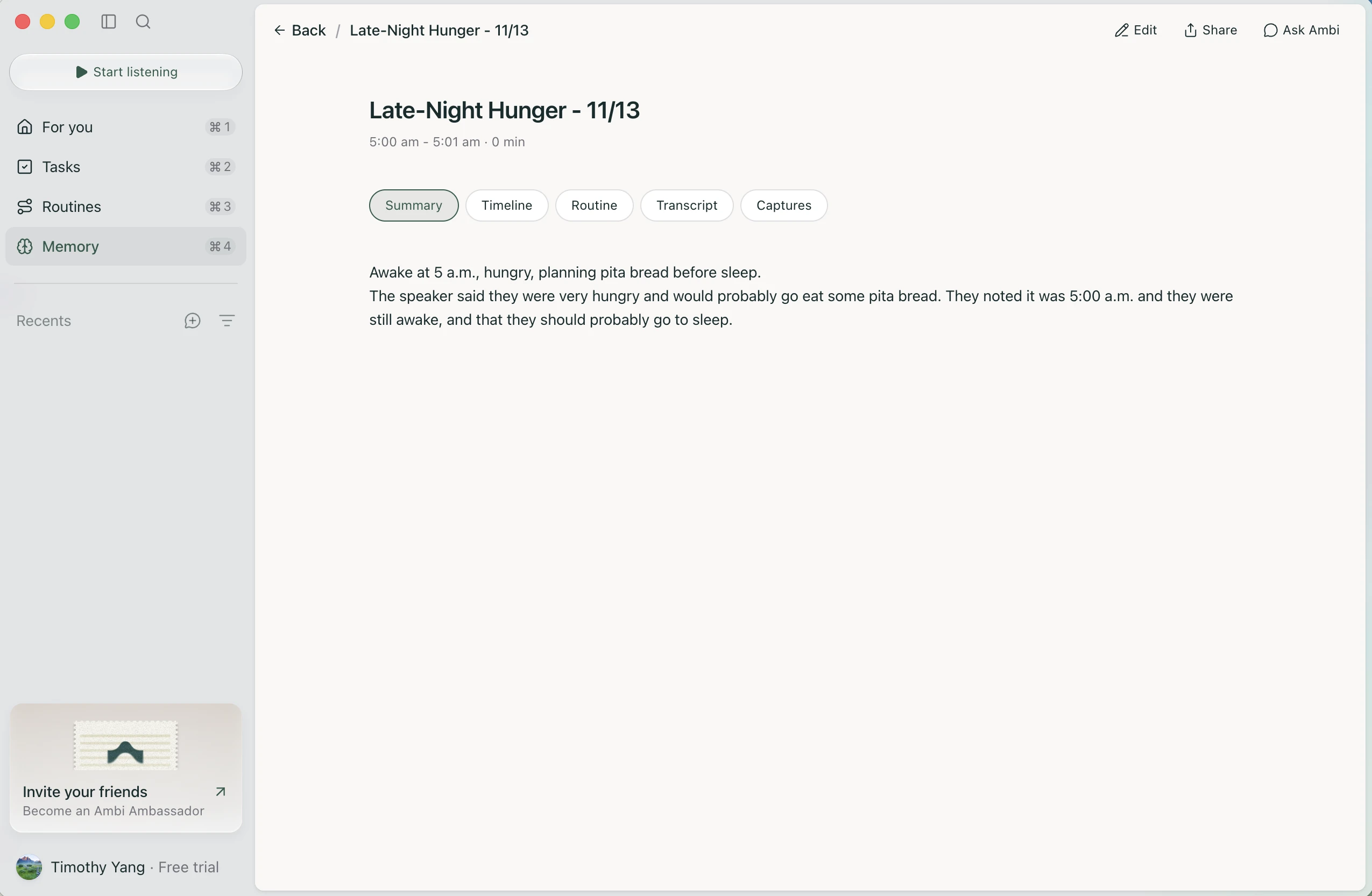
“Yay, the summary showed up! I like how accurate it is (What I loved). I wish there were an AI persona that would really listen and tell me to go to sleep already (Ideas & wishes), lol.”
Part 3Whose task is it?The longest stretch, and most of the “wait, what?”
An interesting task board
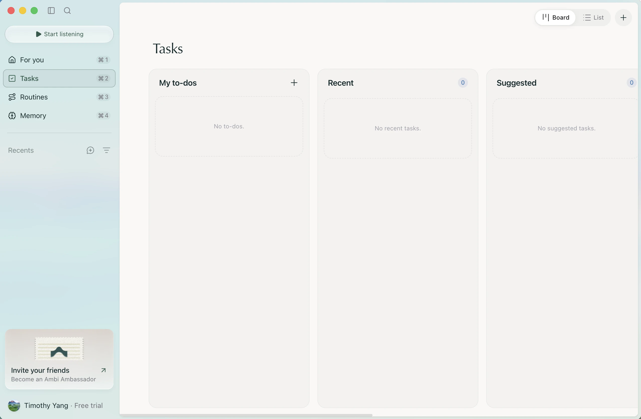
“Interesting kanban board (What I expected) for tasks.”
A straightforward creation screen
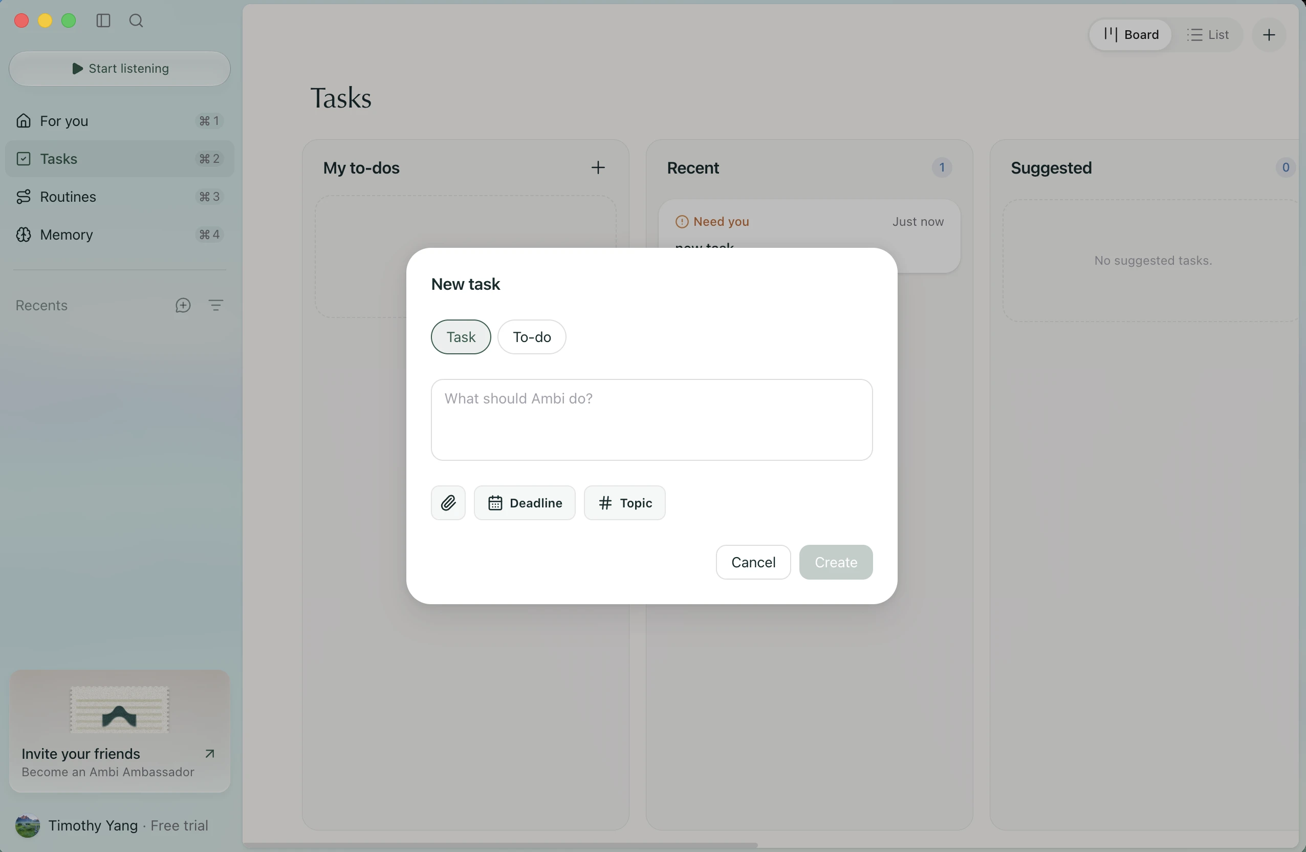
“Simple create-new-task screen (What I loved). That’s fair.”
Wait, who is doing this task?
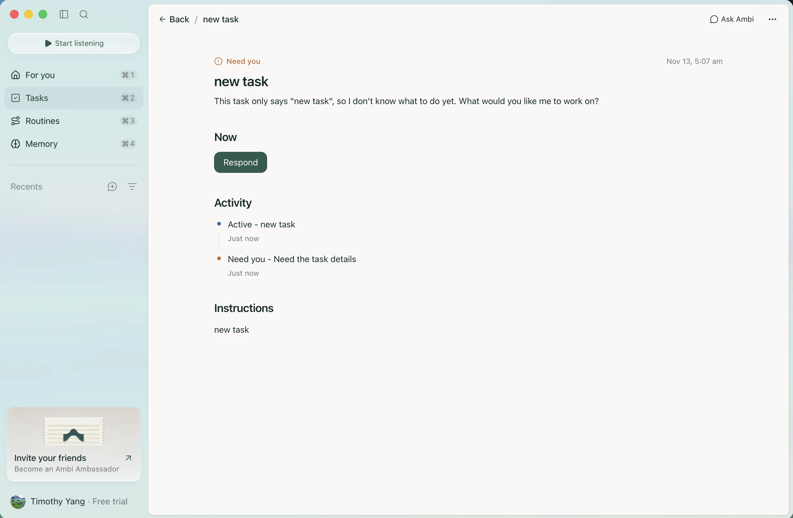
“Hmm, I don’t know what you mean (Where I got stuck). I don’t need Ambi to work on anything for this task—I was treating this as task management (What I expected).”
I want to drag the card
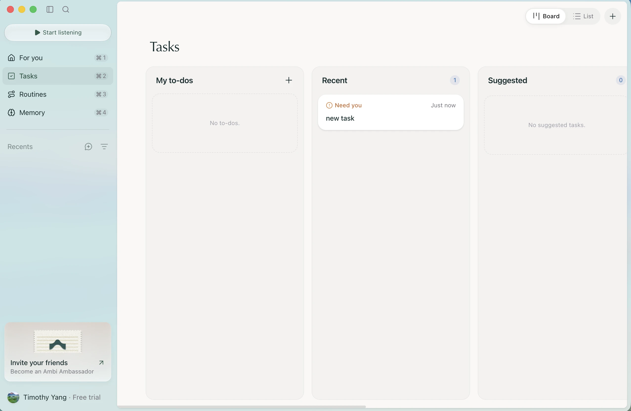
“I wish I could just drag and drop here (What I expected).”
One task, or two?
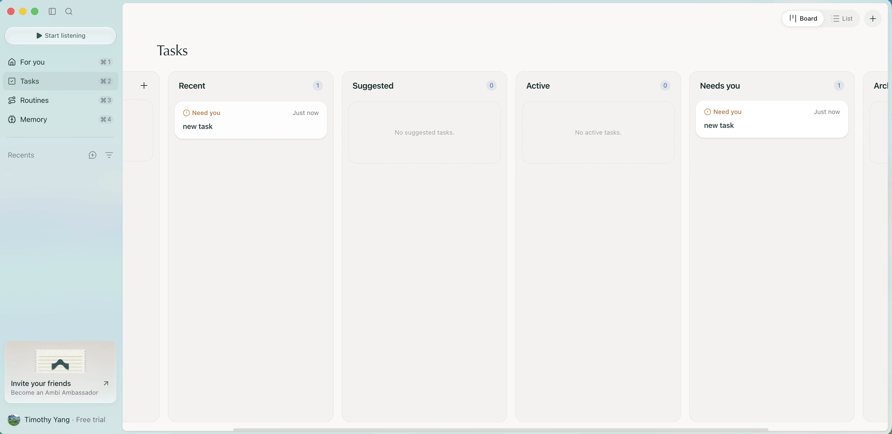
“Showing the same task on two parts of the board feels weird. I can’t tell whether they’re the same or different (Where I got stuck) just by looking. Maybe a tiny ID could help? (Ideas & wishes)”
Okay, a to-do is for me
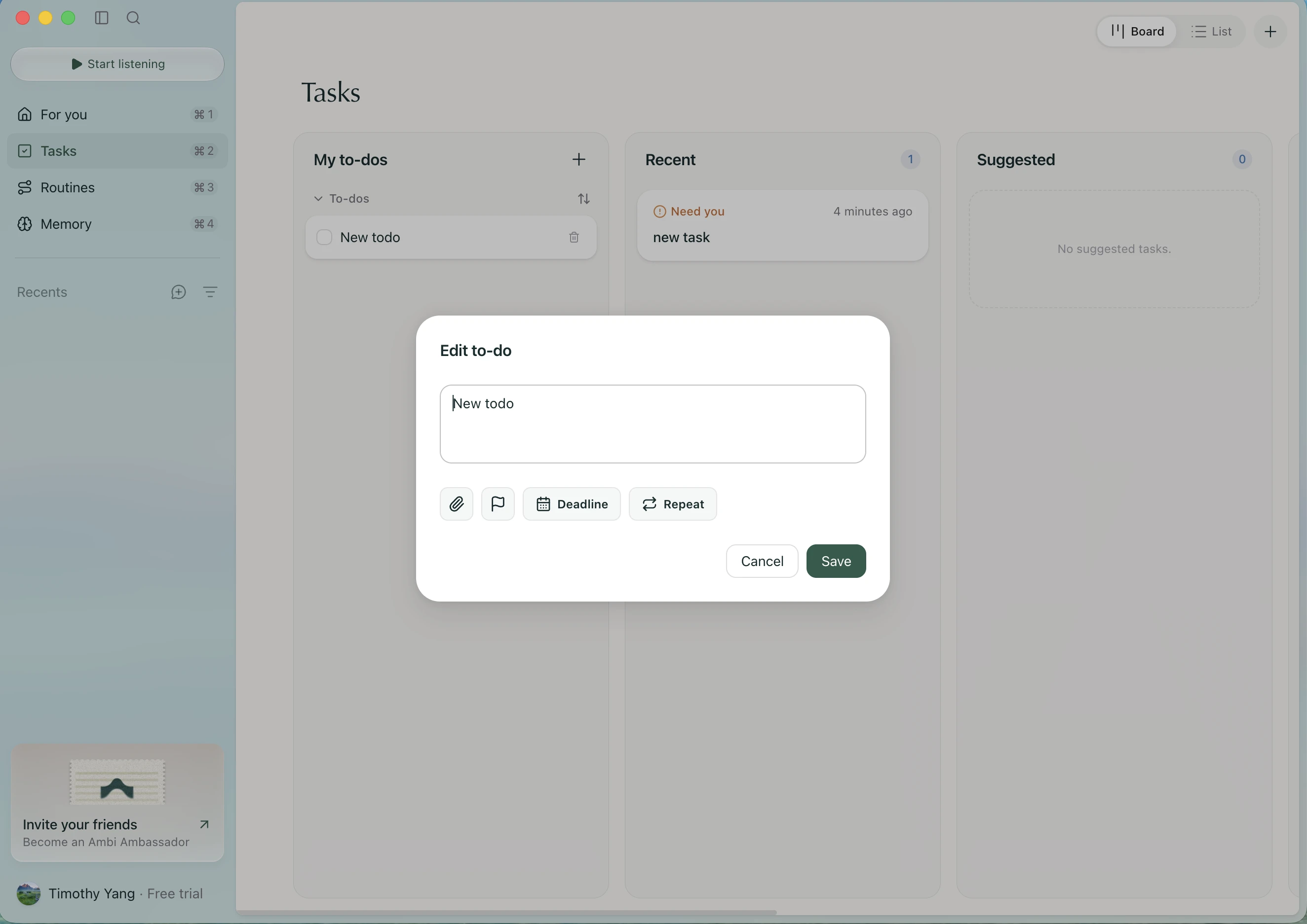
“Oh, I see: a to-do is something I keep for myself, not a task for the AI (What I loved). Got it. Still, interesting that clicking it doesn’t show a full task detail page (What I expected).”
The calendar feels out of place
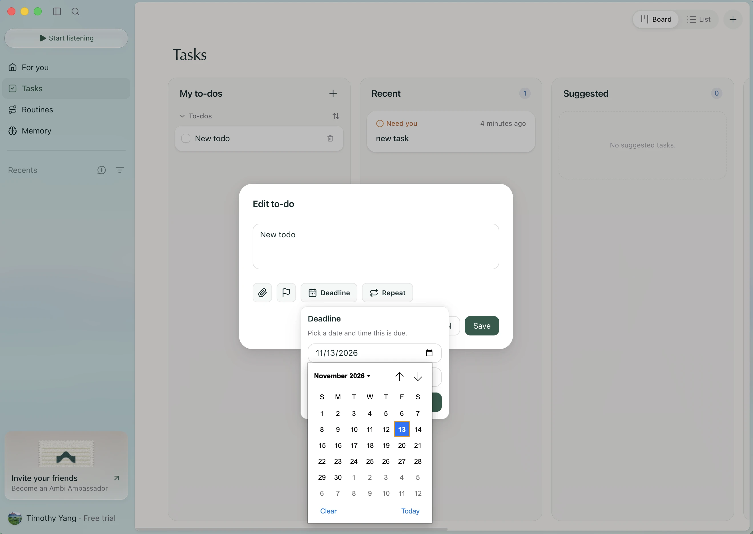
“No custom calendar treatment? (What I expected) This looks a bit ugly to me compared with the rest of Ambi (Where I got stuck).”
A different visual language
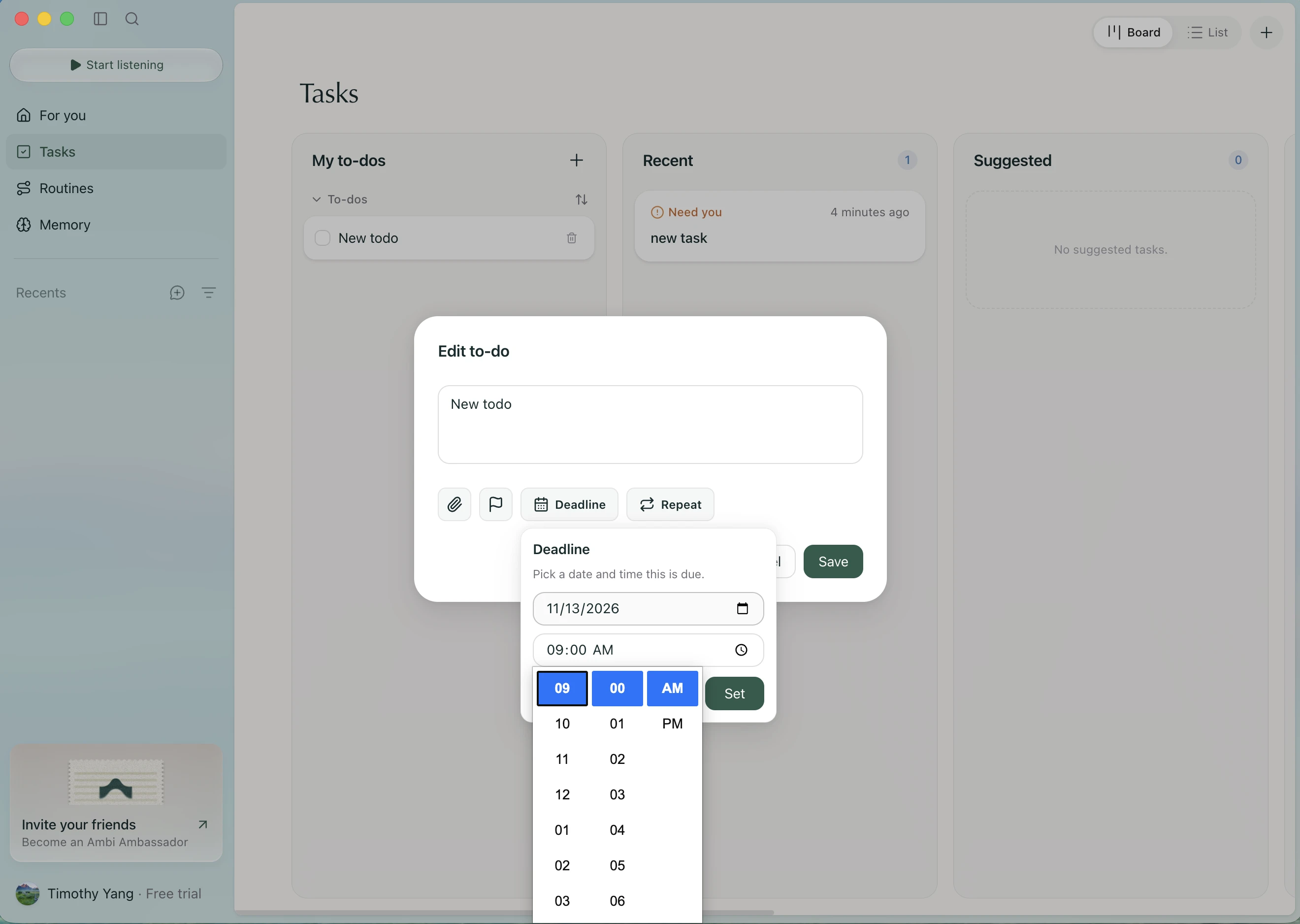
“Standard components are fine, but Ambi is supposed to have a different vibe (What I expected). This doesn’t quite fit (Where I got stuck).”
What about specific weekdays?
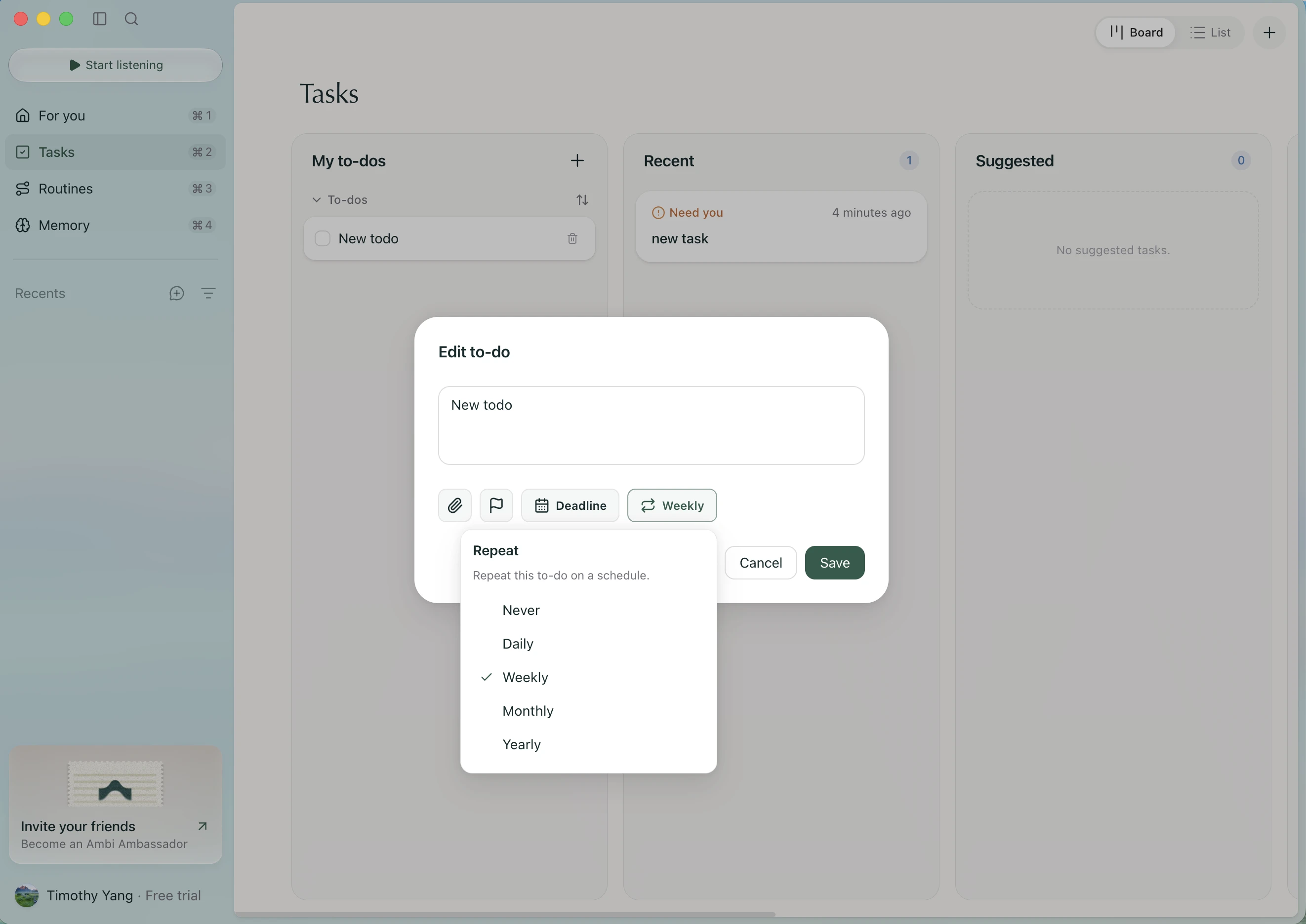
“For weekly repeat, what if I want certain days? (What I expected) It doesn’t seem very customizable (Where I got stuck).”
Nice list. Where’s the other task?
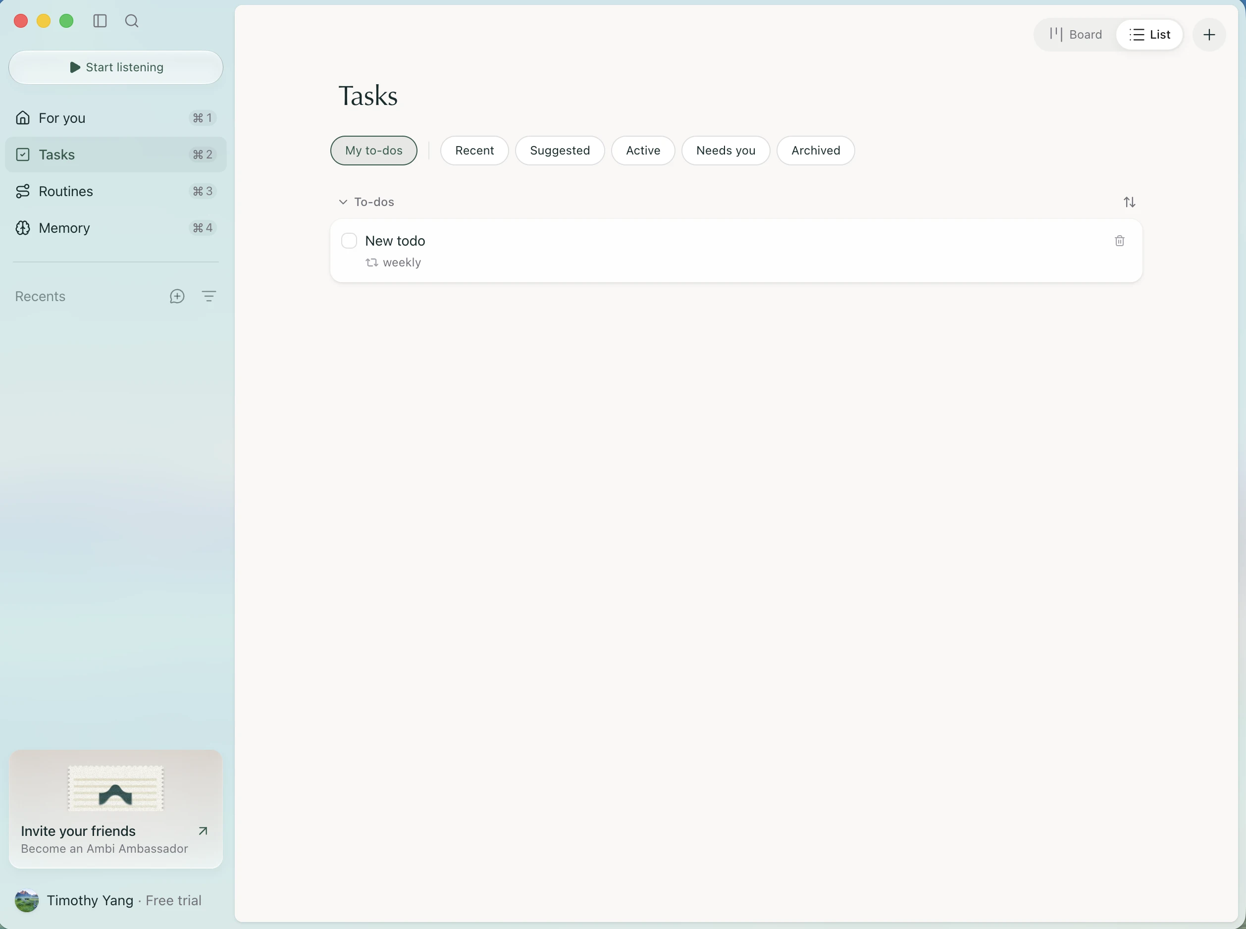
“List view looks nice (What I loved). But then again, where’s my other task? (Where I got stuck)”
Part 4Routines and MemoryGood ideas, a lot at once, and a missing Back.
A lot to trust all at once
“These all look cool (What I loved), but as a new user who doesn’t quite trust the system yet, so many routine templates feel overwhelming (Where I got stuck).”
One click makes it click
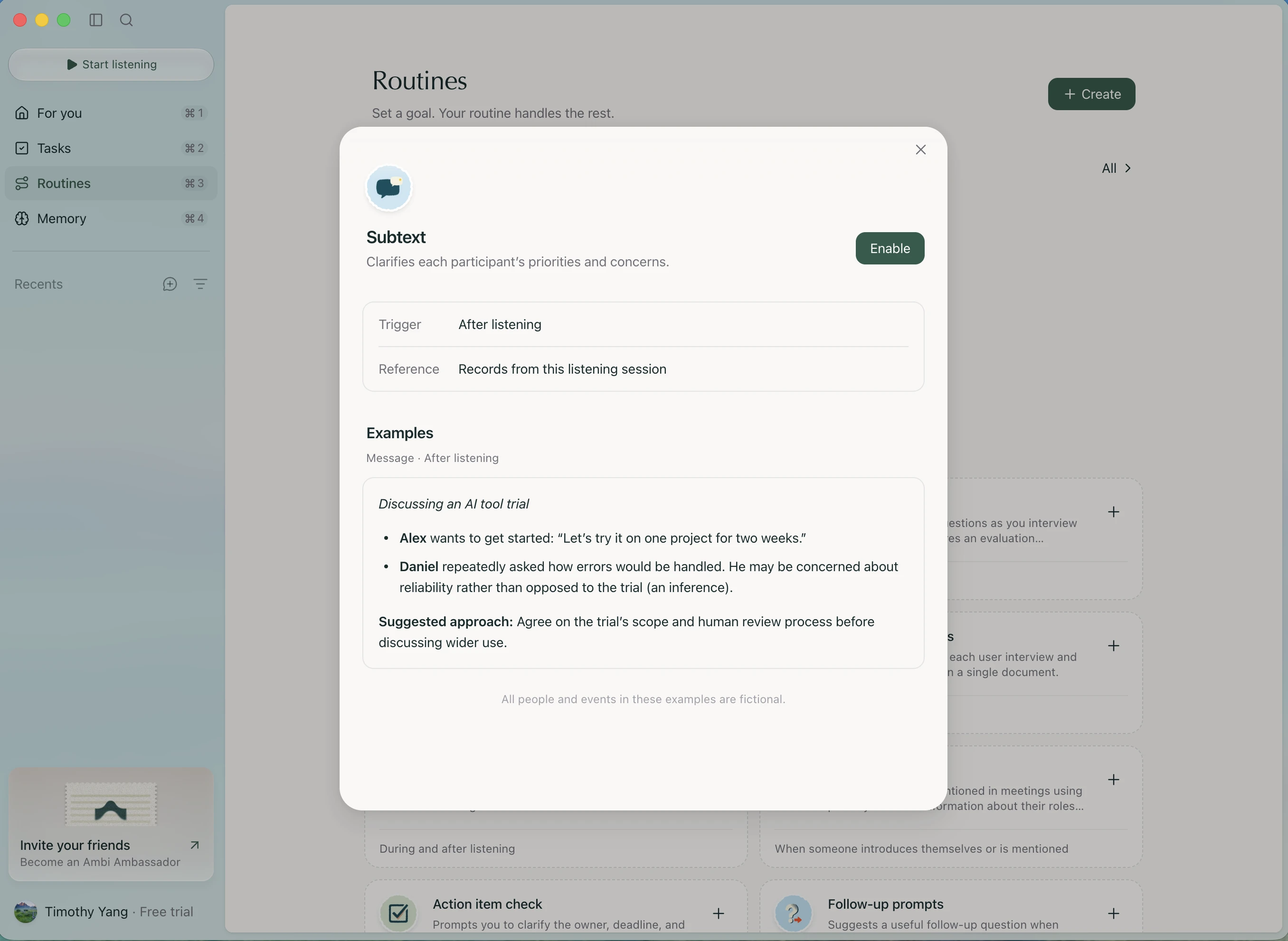
“Huh. A simple click makes it quite clear what these are (What I loved). That’s intuitive and nice (What I loved).”
I like this. Let me return to it
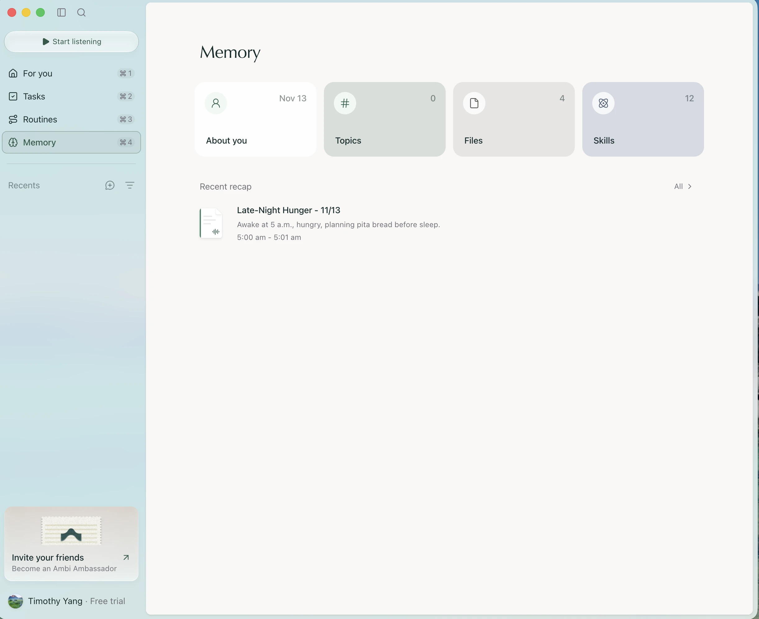
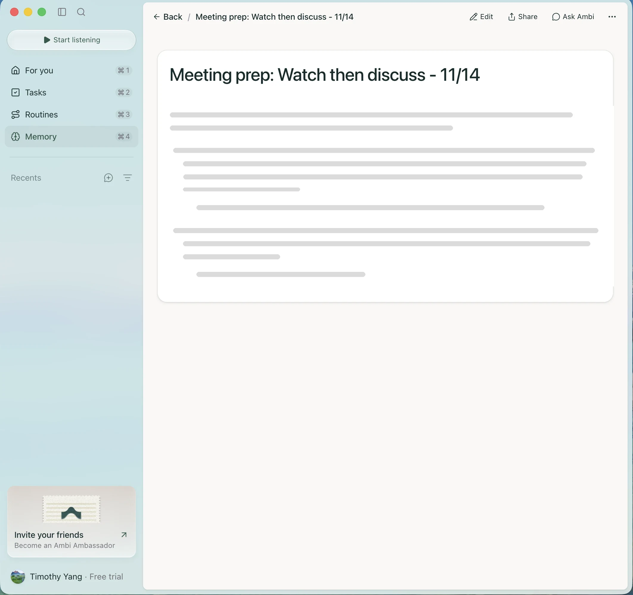
“I like this overview (What I loved). I just don’t like that when I click into these sections, there isn’t a back button up top (Where I got stuck).”
For example: Topics
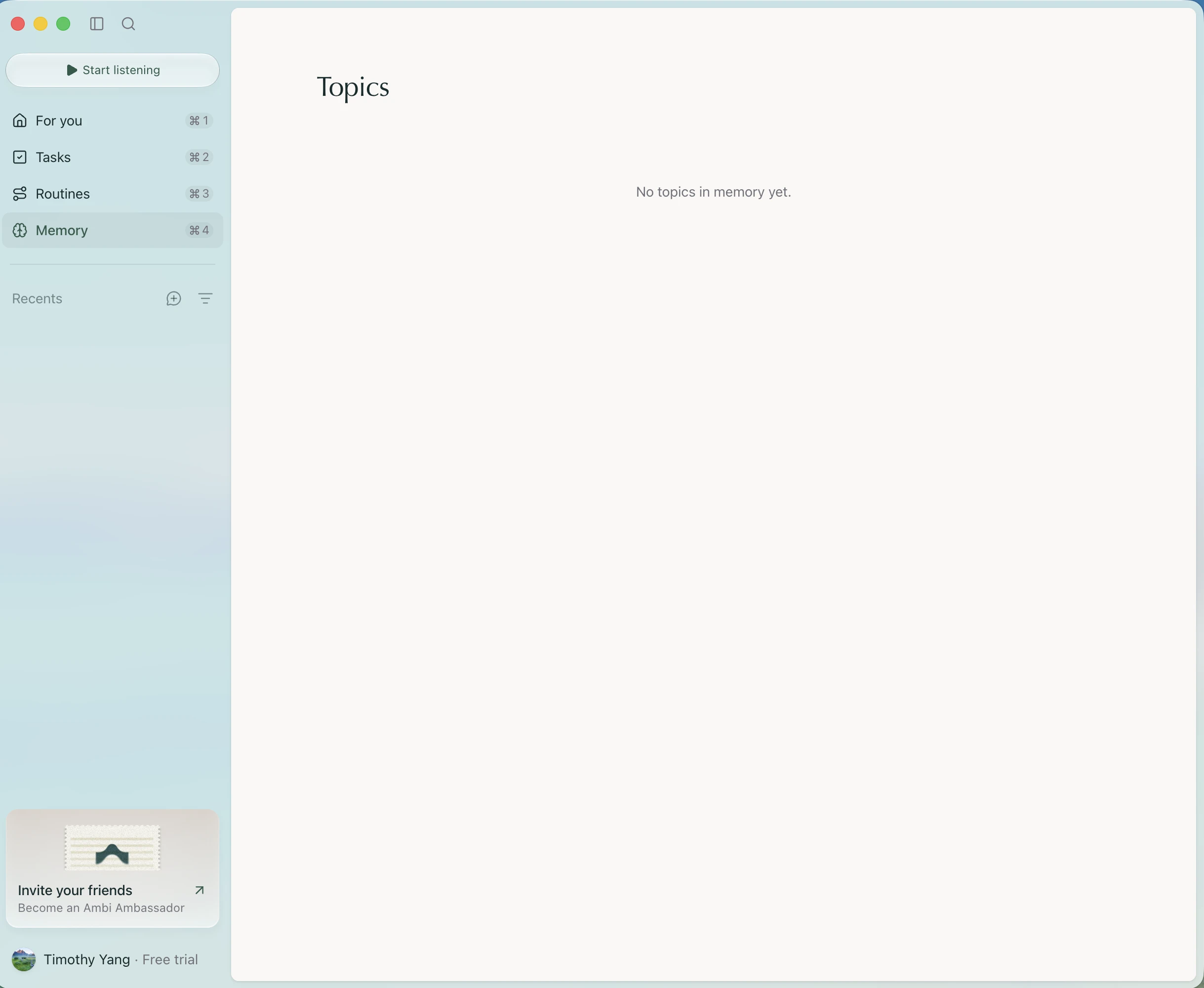
“Here’s an example of where I wanted to go back (Where I got stuck).”
About you feels a little basic
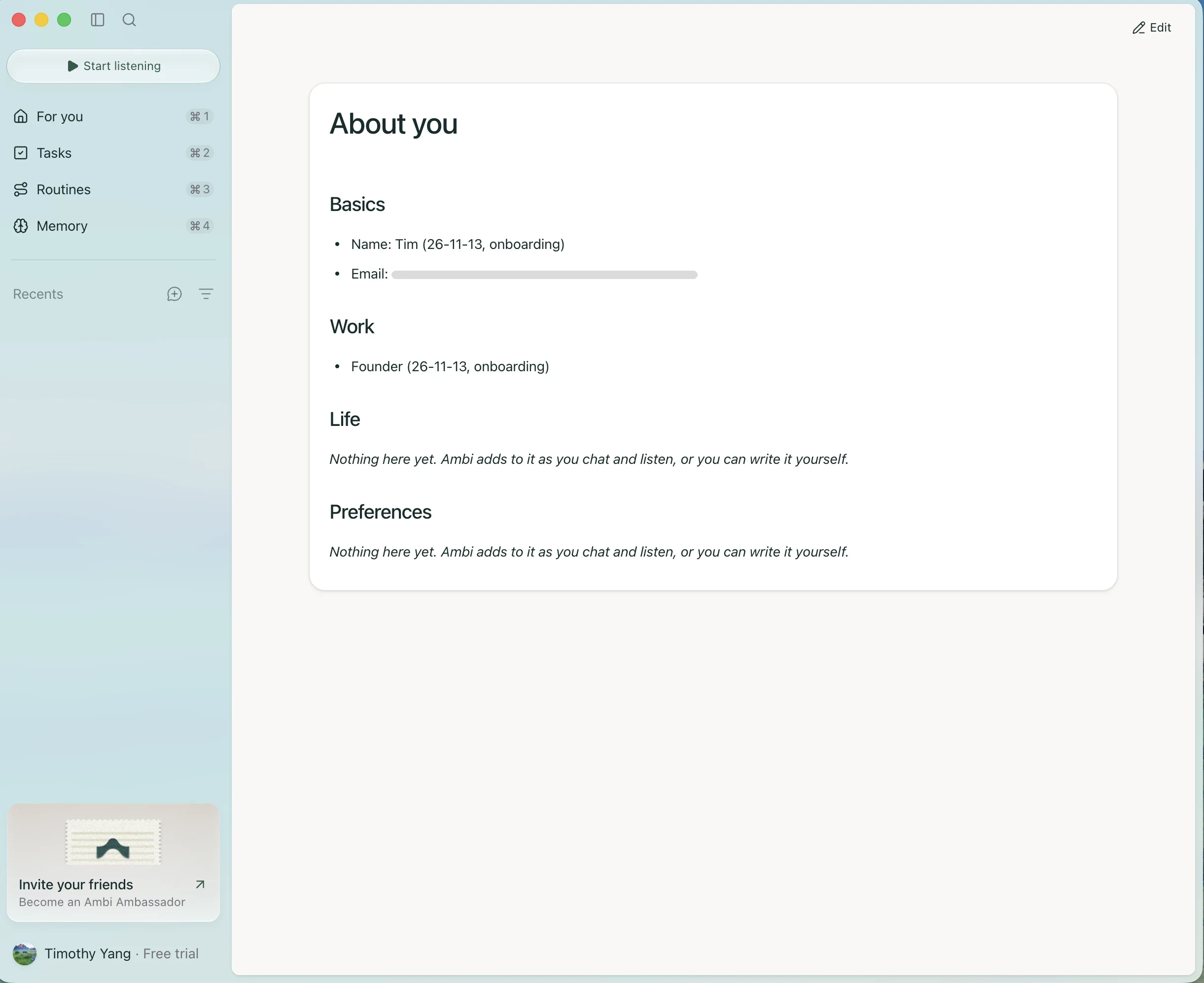
“This screen feels a bit basic (Where I got stuck).”
Again, looking for Back
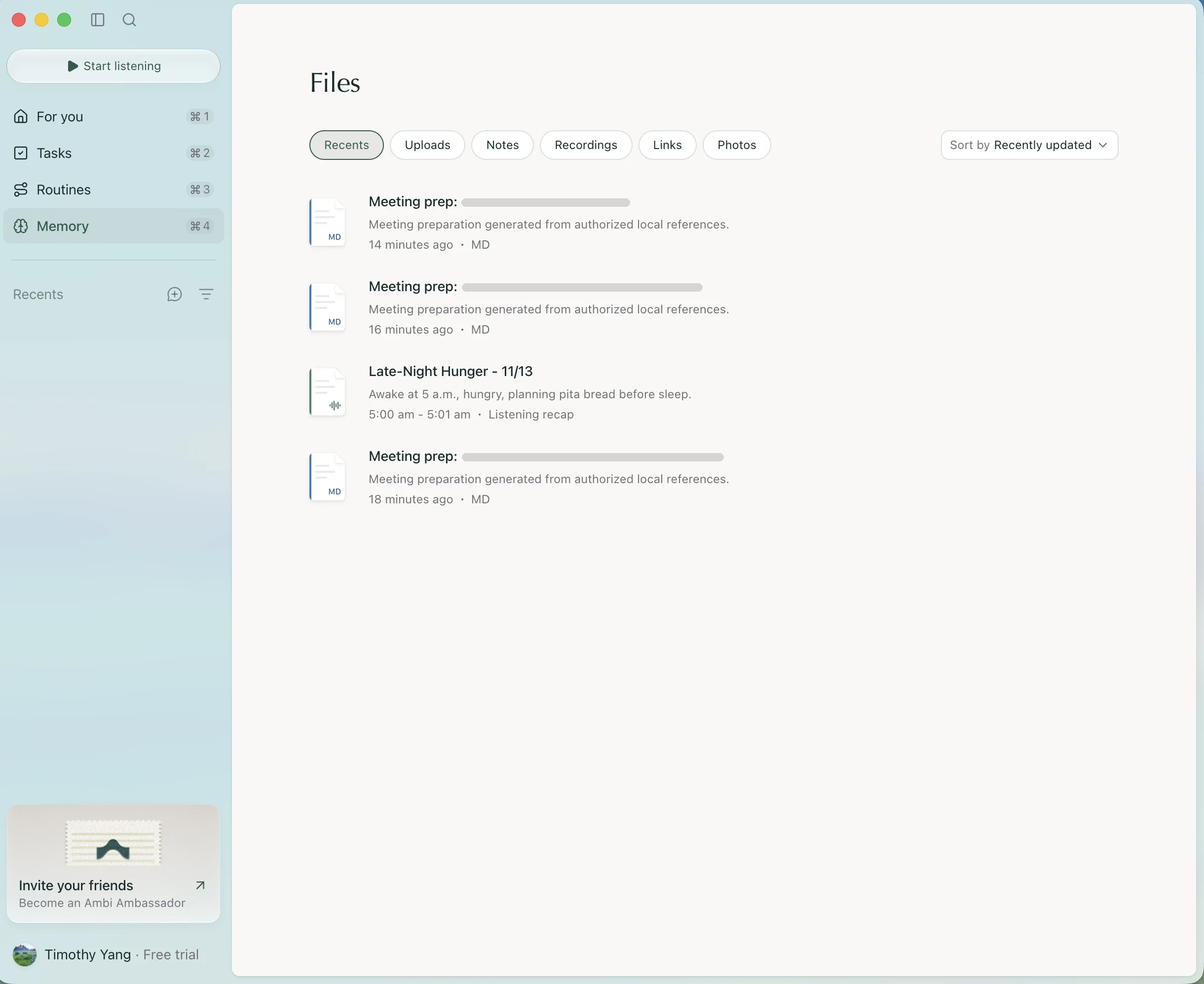
“Again, no back button where I expect it (Where I got stuck).”
Helpful explanation, dense presentation
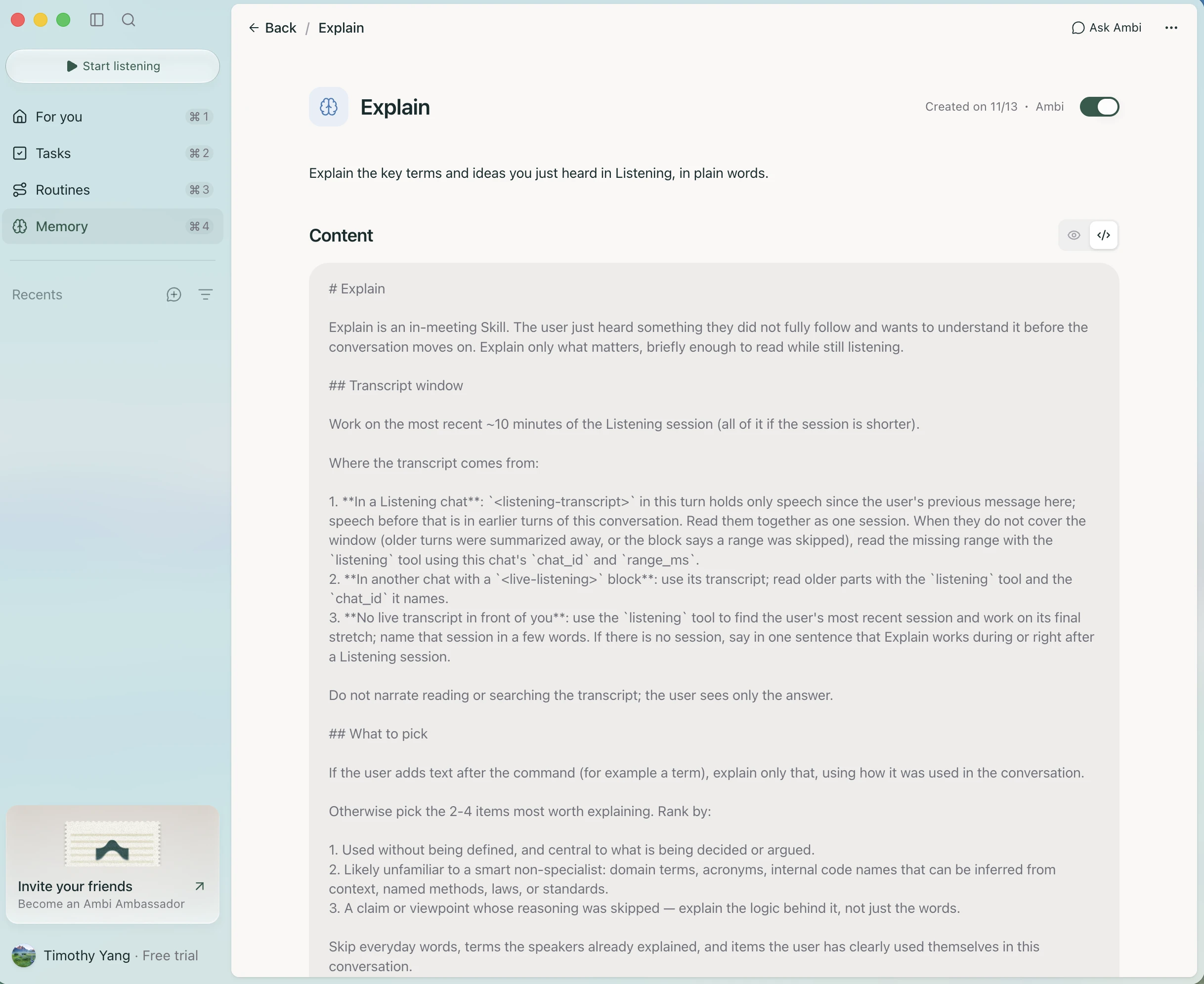
“This feels a bit overwhelming (Where I got stuck). Cool explanation, though (What I loved).”
Part 5Settling inRoom to think, and a little motion I loved.
Room to think
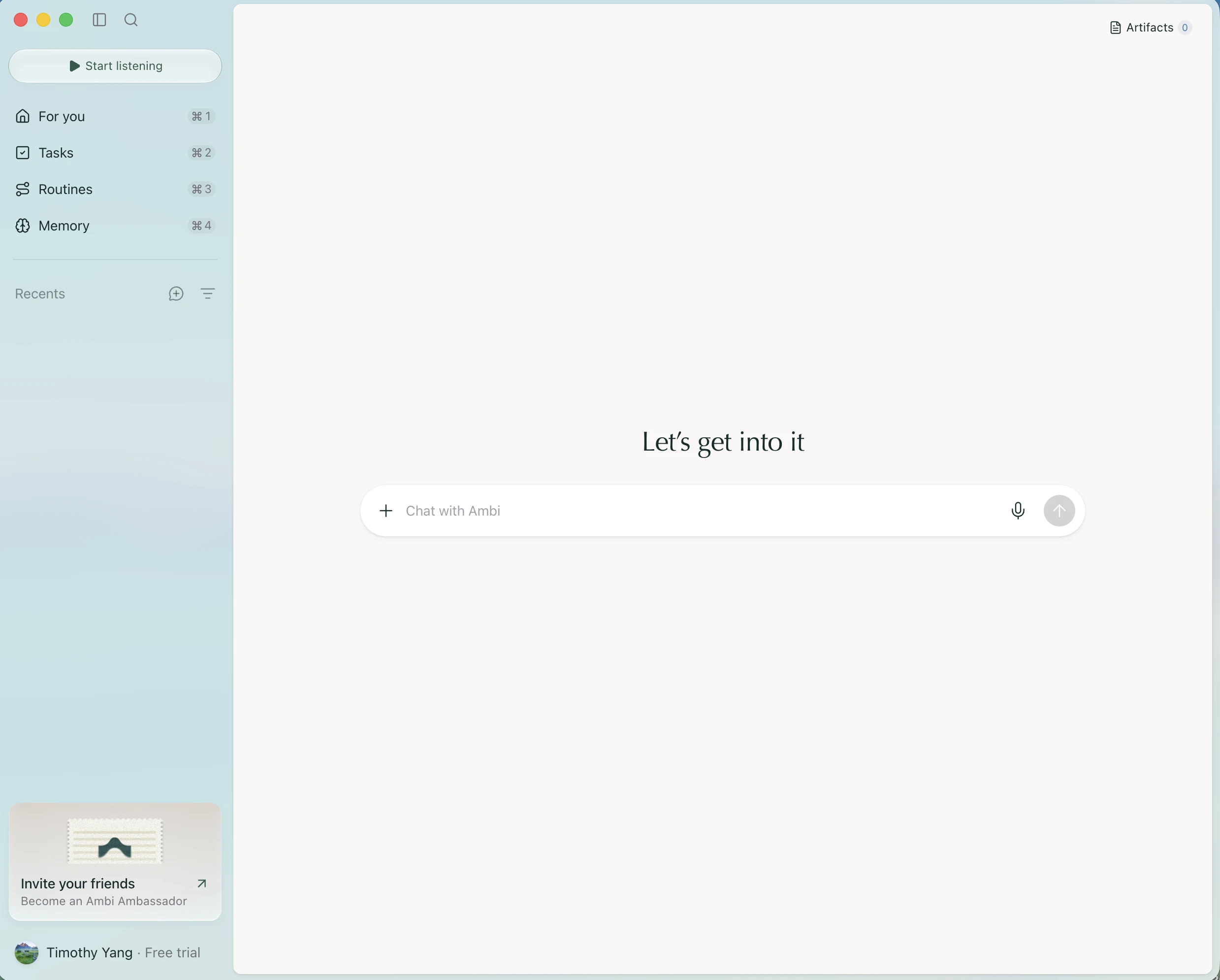
“I like the simplicity and nice use of space (What I loved). I’d expect the first-chat button right under Recents (What I expected) so it’s easier to navigate.”
Settings feel fine
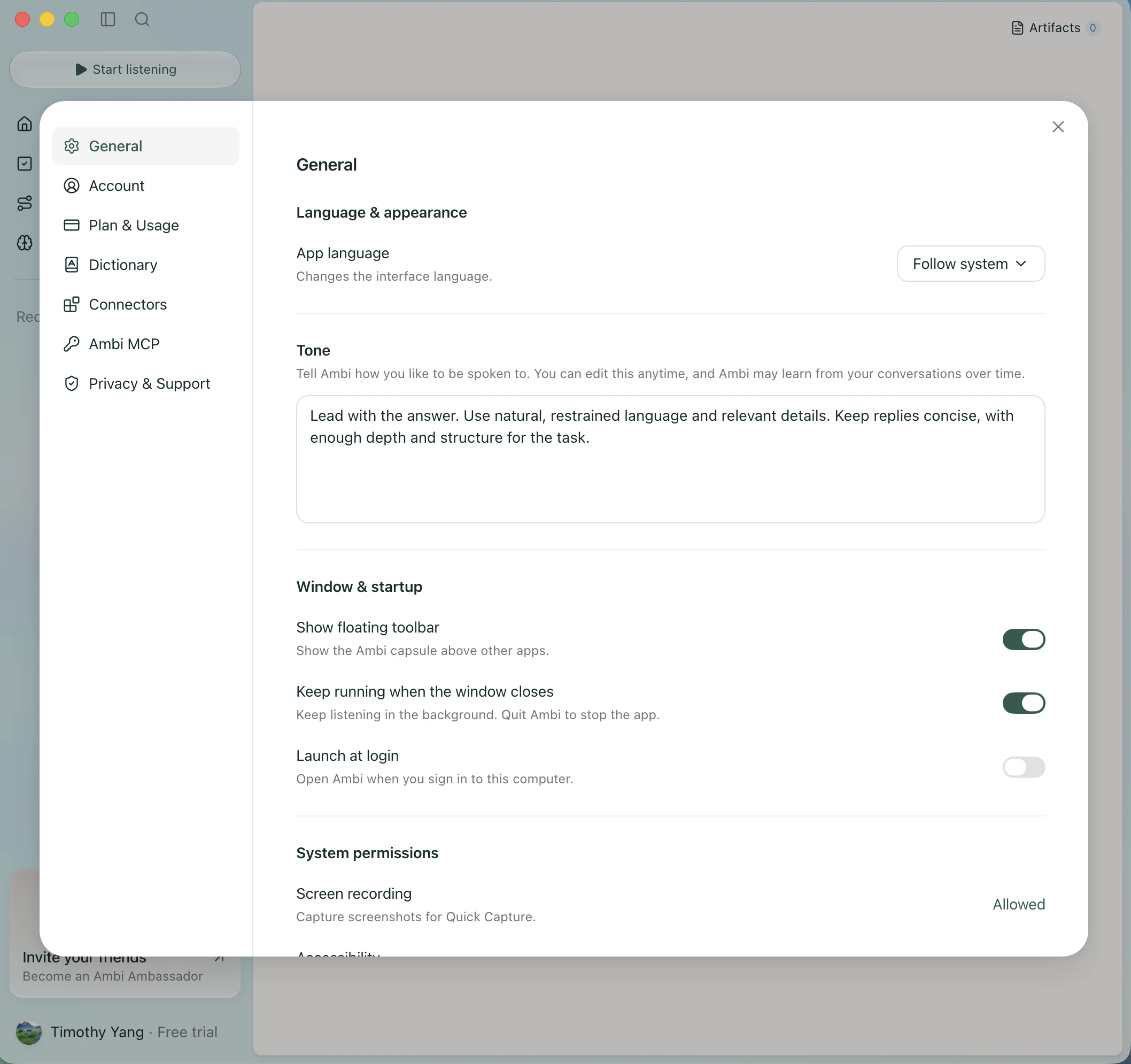
“Settings are generally fine (What I loved).”
A nice way to bring in context
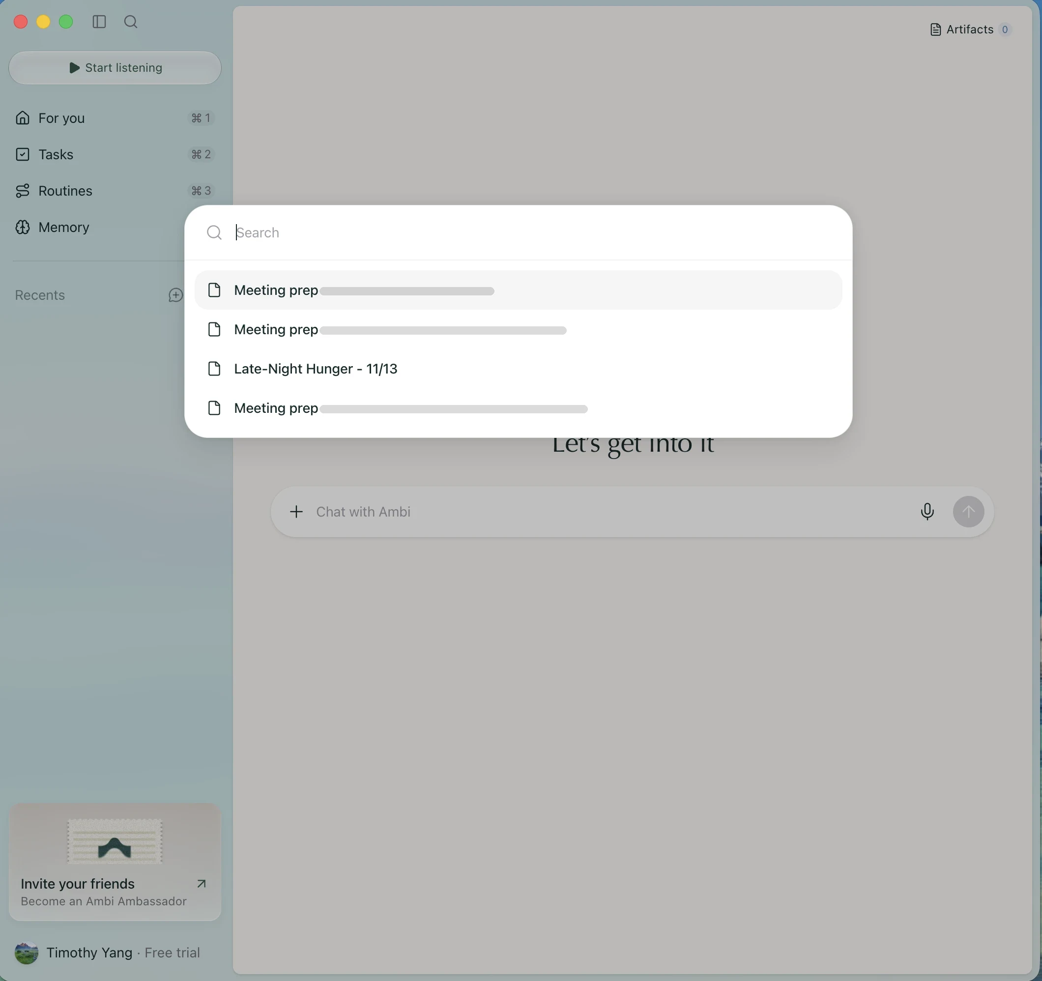
“Nice chat feature (What I loved).”
Something useful for what’s next
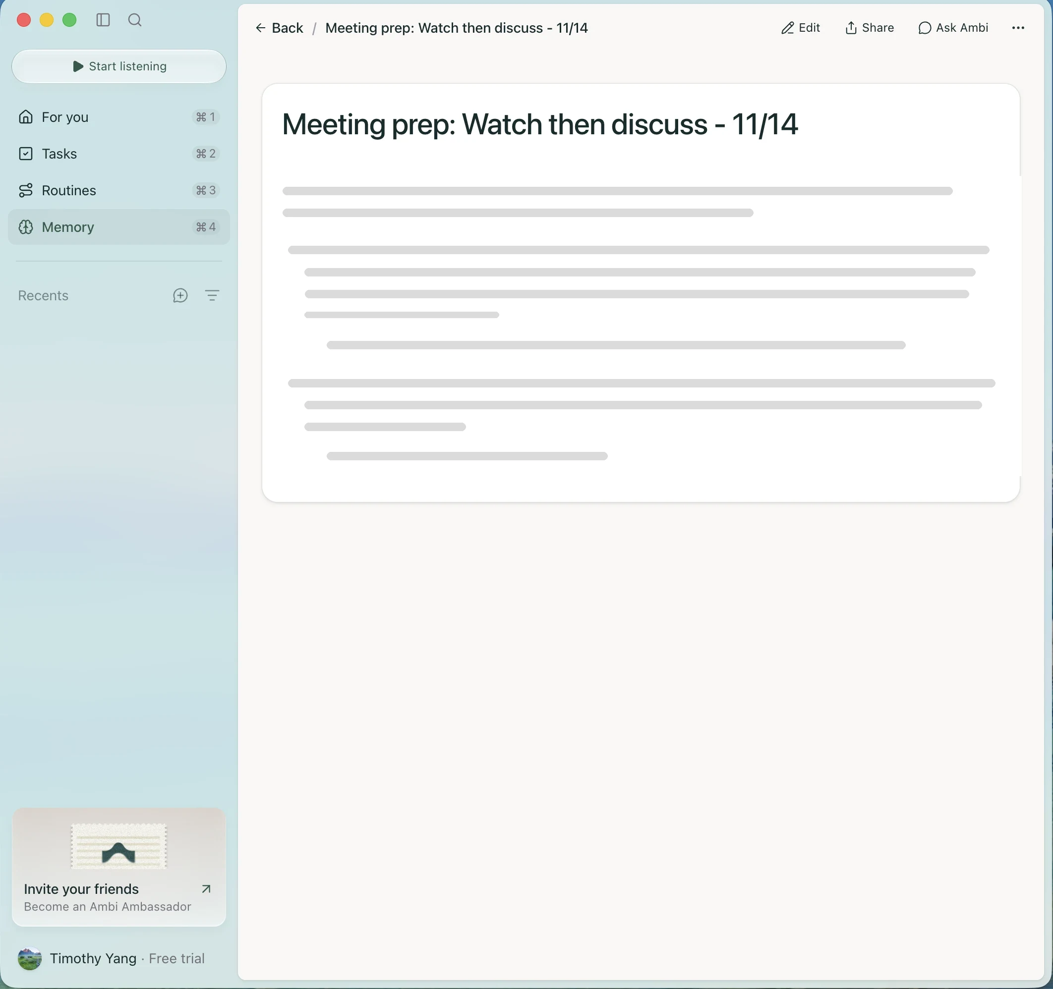
“Cool future-event feature here! (What I loved)”
A place to give a command, I guess
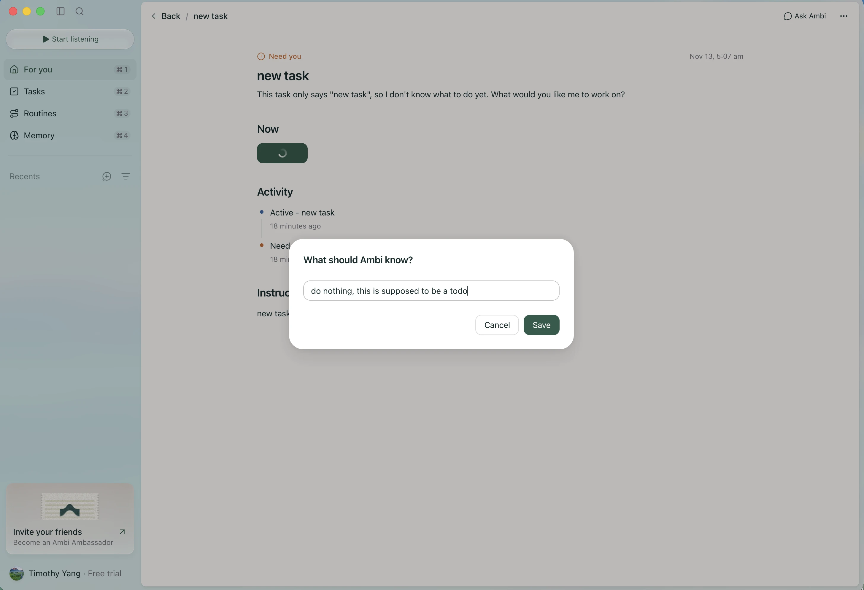
“Interesting… a place for a command, I guess (What I expected).”
Done isn’t quite the outcome I meant
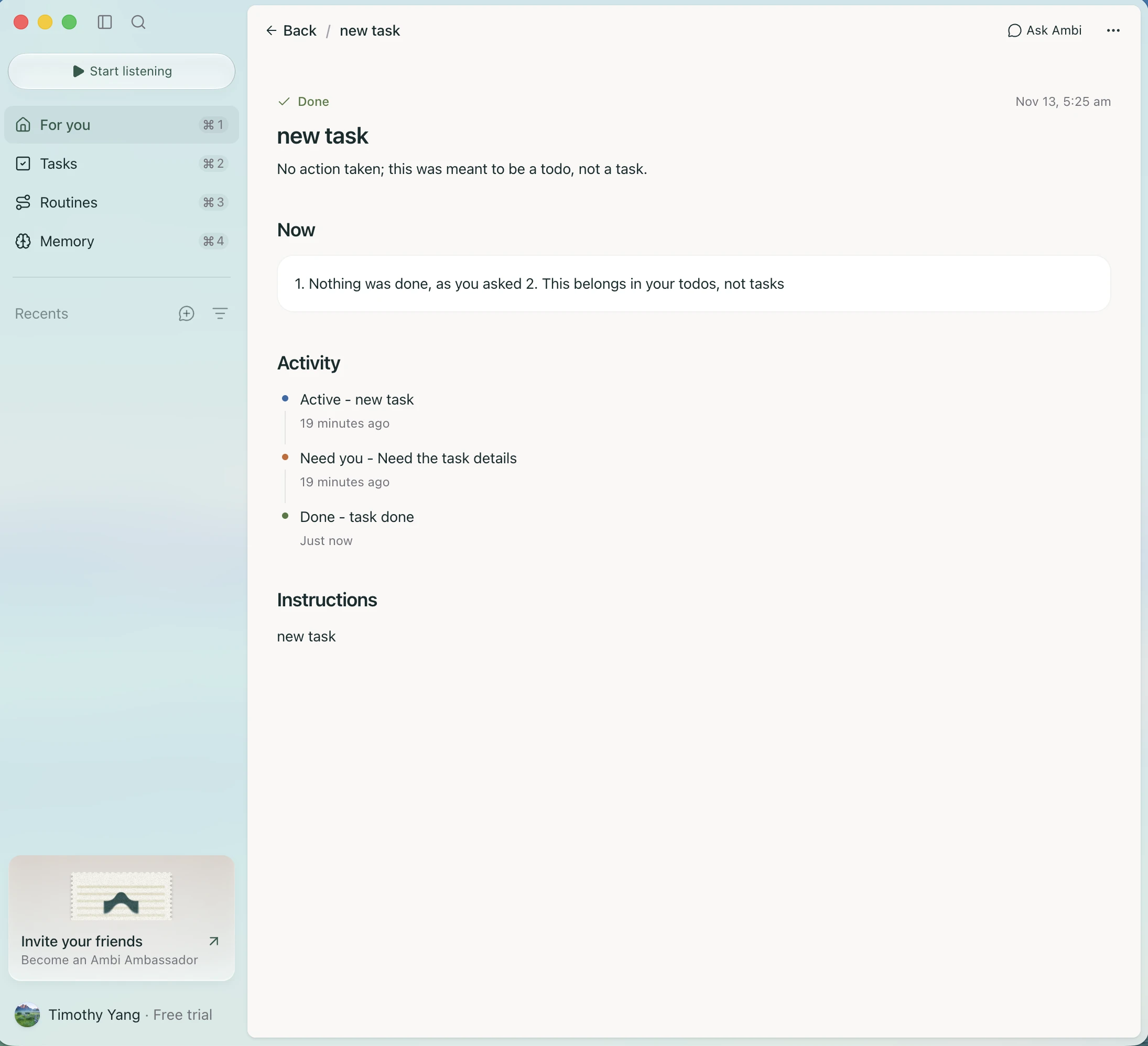
“Hmm, it’s marked done (Where I got stuck), even though maybe it should be reclassified as a to-do? (Ideas & wishes)”
A little motion, a lot of personality
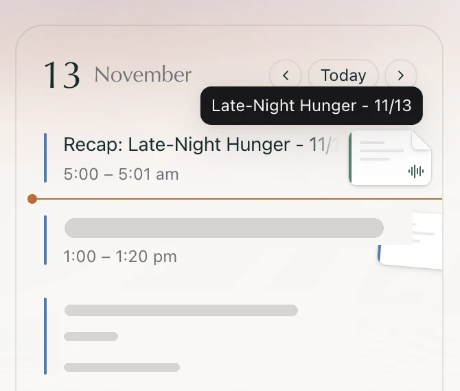
“Cool motion interaction here! Love it. (What I loved)”
What I’d capture next
A second pass can answer the questions these first impressions opened up.
- Capture the role-selection rules and a complete Memory → Topics → return journey.
- Open both matching task cards to establish identity, record a drag attempt, and compare Board and List with filters visible.
- Check controls after selecting Weekly and whether the sidebar invitation has a discoverable dismissal.
- Capture the unobscured routine catalog and record the calendar motion I liked.
Contrast check
I measured 17 pieces of text across three screens against WCAG AA (4.5:1 for regular text, 3:1 for large). 9 pass and 8 fall short, mostly for one reason: the secondary gray #717179 just clears 4.5:1 on the main canvas, but drops below it wherever the background is tinted, like the sidebar, empty-state cards and the promo card.
- Secondary gray
#717179→ about#5f5f66(passes on every background measured here) - Input placeholder
#a1a1a9→ about#76767c - “Need you” orange
#bc6c3b→ about#a76034 - Sidebar “Recents” label
#7e8688→ about#5e6466
Each is the smallest step darker that reaches 4.5:1, so the calm, quiet look stays.
| Sample | Text | Ratio | AA |
|---|---|---|---|
| Aa | Input placeholder · 'Chat with Ambi'Chat · #a1a1a9 on #ffffff | 2.57:1 | ✕ Below 4.5:1 |
| Aa | Section label · 'Recents' (blue sidebar)Chat · #758688 on #d0e4e6 | 2.88:1 | ✕ Below 4.5:1 |
| Aa | Section label · 'Recents' (sidebar)Home · #7e8688 on #e2e4e5 | 2.91:1 | ✕ Below 4.5:1 |
| Aa | Shortcut hint · '⌘1'Home · #717179 on #d8dadb | 3.45:1 | ✕ Below 4.5:1 |
| Aa | Status label · 'Need you' (orange)Task detail · #bc6c3b on #f9f7f5 | 3.68:1 | ✕ Below 4.5:1 |
| Aa | Calendar month · 'November'Home · #717179 on #e9dfe1 | 3.71:1 | ✓ Passes · large text |
| Aa | Plan label · 'Free trial'Home · #717179 on #e2e4e5 | 3.79:1 | ✕ Below 4.5:1 |
| Aa | Sidebar promo subtitle · 'Become an Ambi Ambassador'Home · #73737b on #ebeae8 | 3.91:1 | ✕ Below 4.5:1 |
| Aa | Empty state · 'No tasks to show yet.'Home · #717179 on #f5f2f0 | 4.34:1 | ✕ Below 4.5:1 |
| Aa | Calendar event timeHome · #717179 on #f9f7f5 | 4.53:1 | ✓ Passes |
| Aa | Promo subtitle · 'Capture conversations…'Home · #717179 on #f9f7f5 | 4.53:1 | ✓ Passes |
| Aa | Timestamp · 'Nov 13, 5:07 am'Task detail · #717179 on #f9f7f5 | 4.53:1 | ✓ Passes |
| Aa | Activity time · 'Just now'Task detail · #717179 on #f9f7f5 | 4.53:1 | ✓ Passes |
| Aa | Primary text · 'For you' (sidebar)Home · #38594b on #d8dadb | 5.55:1 | ✓ Passes |
| Aa | Button · 'Download' (white on green)Home · #fcfcfc on #38594b | 7.58:1 | ✓ Passes |
| Aa | Button · 'Respond' (white on green)Task detail · #fcfcfc on #38594b | 7.58:1 | ✓ Passes |
| Aa | Body text · task descriptionTask detail · #1a2b2d on #f9f7f5 | 13.77:1 | ✓ Passes |
How I measured: colors sampled from the Retina screenshots (background from around each label, text from the glyph cores), then WCAG’s contrast formula. Thin text can read slightly lighter in a screenshot, and the translucent sidebar shifts with the desktop behind it, so treat these as close estimates. Light mode only; focus states and dark mode weren’t checked.
The feeling I’m leaving with
Calm, beautiful and genuinely useful. The interaction model just hasn’t caught up with the visual design yet.
- the calm
- the accurate listening
- the thoughtful little details
- go back
- understand who a task is for
- know what just happened
Treat my desire for a caring AI persona as a preference to explore, rather than a recap defect.
Decisions I could see
- 01
The first listening CTA makes the next action concrete, and the recap accurately reflected what I had said.
- 02
Personal to-dos use a compact editor, while AI tasks have a fuller detail page; I only understood the distinction after creating a task.
- 03
Recent and Needs you showed matching task titles. The list view had My to-dos selected when I wondered where the AI task went.
- 04
Memory subpages lacked the top Back control I expected, while some other detail pages had one.
- 05
Routine previews clarified the feature with one click. The initial catalog and deeper configuration felt more overwhelming.
- 06
After I clarified that a task was meant as a to-do, the visible response acknowledged it but the task was marked Done; conversion was not established.
Tradeoffs
Minimal screens feel calm
⇄Can leave a new user without enough guidance or an obvious return path.
Overlapping task groups can surface work in more than one context
⇄Making a board resemble a status workflow.
Routine templates communicate possibilities
⇄Ask a new user to evaluate automation before trust has developed.
Hypotheses to test
- Explaining personal to-dos versus work for Ambi beside the creation choice could prevent the ownership confusion I experienced.
- Consistent return controls and more visible list filters could reduce navigation uncertainty.
- A smaller initial set of routines with previews could make the catalog more approachable.
When I tell Ambi that an AI task should be a personal to-do, can it offer an explicit conversion instead of simply marking the task Done?
One person’s first impressions, not a usability study. Keyboard navigation worked when I checked it. Contrast was measured from screenshots (above), not audited in the app. Calendar entries, other meeting names and contact details in the screenshots are redacted.