Field Notes /Interface studies
Design observations
A journal of interfaces, decisions, and tradeoffs.
Why did they design it this way? What I see, kept apart from what I think.
- 2–3 a week20–40 minutes each
- One product, one taskOne useful takeaway
01 / Published
Completed studies 2
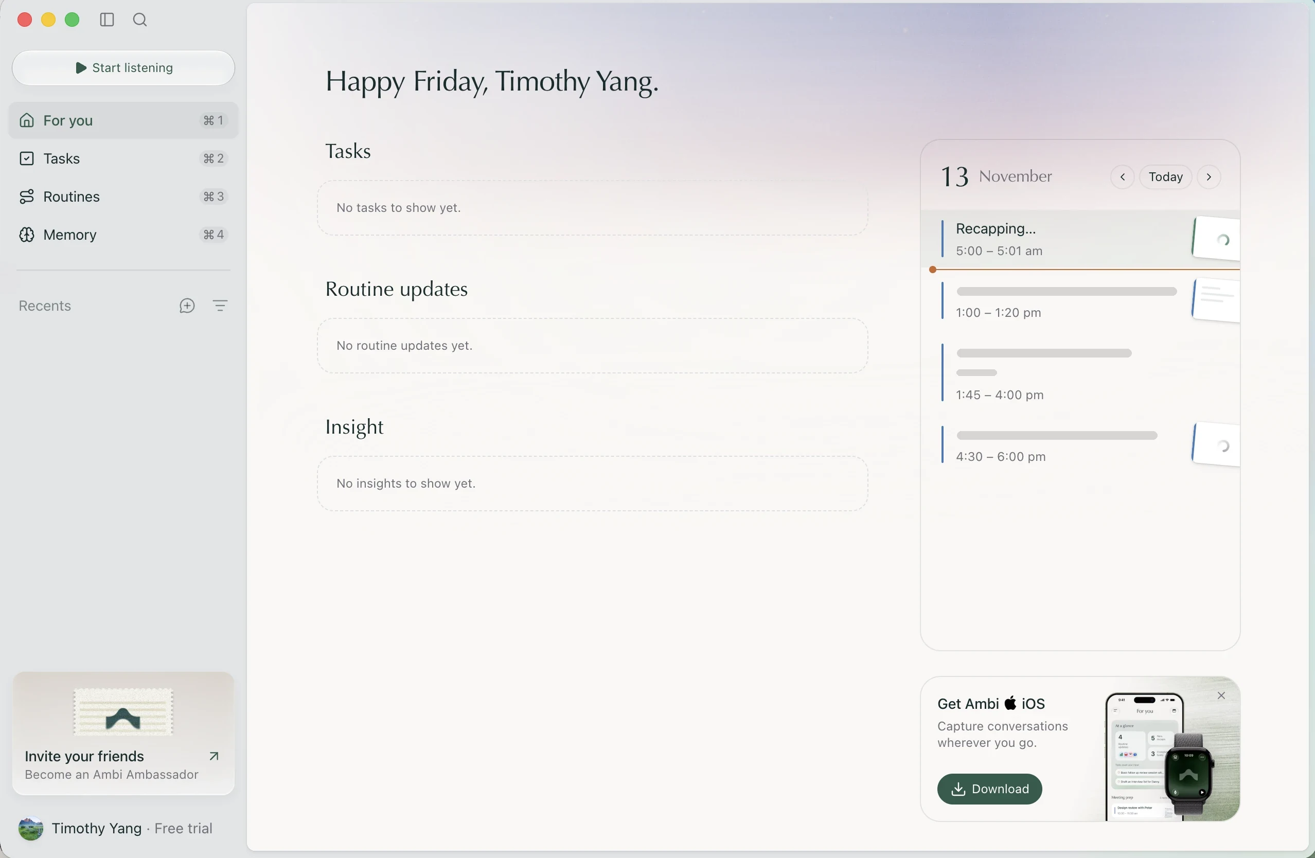
 Ambi
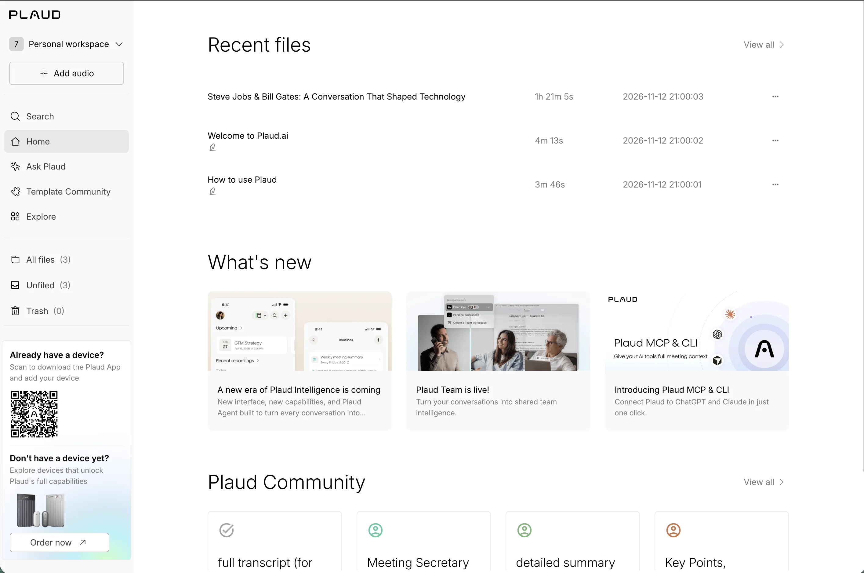
 Plaud
02 / In progress
Research targets 1
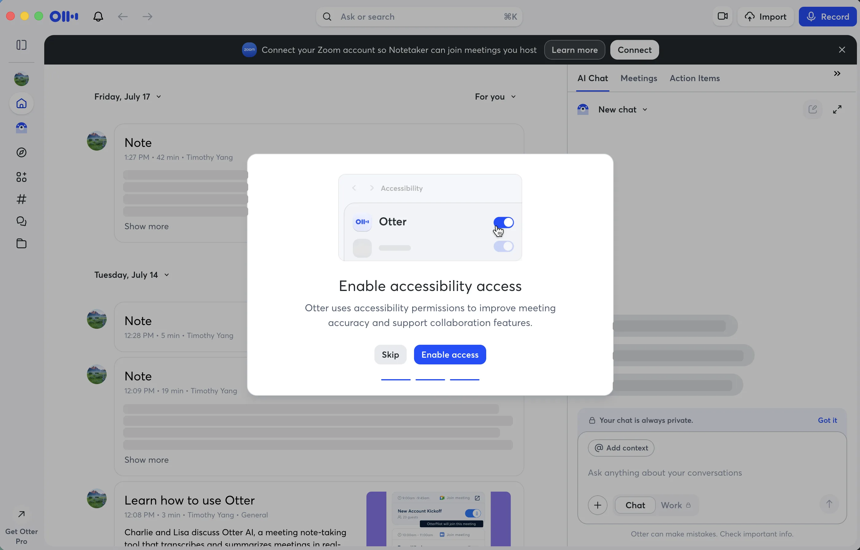
Otter.ai
First-use walkthrough: onboarding · macOS
Added
How does Otter's onboarding ask for permissions and set up meeting capture, compared with Ambi and Plaud?
Plan & sources
Approaches: Interface study
Planned next steps
- Walk through onboarding from a fresh account, capturing each step and my reactions.
- Note every permission request and what it says it's for.
- Compare the first useful moment with Ambi's and Plaud's.
03 / What I check
My principles
UIHow it looks
- Hierarchy
- The most important information and action are the easiest to find.
- Alignment
- Things share edges and a grid, so the screen reads as one structure.
- Simplicity
- Keep what the task needs; remove extra choices and decoration.
- Space
- Spacing groups related things, separates decisions, and gives controls room.
UXHow it works
- Consistency
- The same kind of action looks and works the same, here and in what people already know.
- Accessibility
- It works for different abilities and inputs: keyboard, contrast, clear labels.
- Intuitiveness
- People can find the next action, recognize familiar choices, and get useful help where they need it.
- User-centricity
- Real tasks and user needs shape the experience: approachable for newcomers and efficient for experienced users.
- Feedback & state
- People can tell what is happening, whether an action worked, and what comes next.
- Control & recovery
- People can prevent costly mistakes, change course, and recover without losing unnecessary work.
04 / Where I look
Find & study interfaces
Academic & university methods6
- University of Colorado · Cognitive Walkthrough: A Practitioner’s Guide (PDF)Cognitive walkthrough, step by step.
- MIT · Heuristic Evaluation & User-Centered DesignHeuristics vs. walkthroughs vs. testing.
- MIT OpenCourseWare · User Testing (2011, PDF)User testing basics.
- Stanford CS147 · Design Discovery (2022, PDF)Needfinding, users, tasks.
- Stanford CS147 · Contextual Inquiry (2006)Studying people in context.
- UCL · Test and RefineWalkthroughs and evaluation.
Accessibility standard guidance1
05 / Do one yourself
Plan a captureOne workflow, multiple research lenses
Plan a capture
One product. One user task. Multiple research lenses.
📋 Capture plan
Both — End-to-End Product Experience · Name a product and a task
Study context, focus & note depth
- Research lens: Both — End-to-End Product Experience
- Product: To choose
- Task: To define: start → done
- Platform: Web
- Audience: To establish
- User familiarity: Not established yet
- Research access: Solo inspection only
- Available evidence: Screenshots or recorded flows
- Learning goals: Why it’s designed this way; Check it against my principles
- Selected principles: Hierarchy, Accessibility, Intuitiveness
- Principle review: Focused
- Engineering areas: State & Data, Errors & Recovery, Performance & Responsiveness
Task → Interaction → System behavior → Recovery → Outcome
Before you start
- Record the source, date, platform, and captured path. Screenshots cannot establish live behavior, timing, persistence, or internal architecture.
- Capture screens or a recording only with permission; avoid private data. Use non-disruptive checks on your own test data; do not bypass access controls.
Task & expected outcome
- Choose one realistic workflow: name its start and what counts as done, rather than touring every feature.
- Research question
- Expected outcomeWhat would a successful result look like for this user?
Interaction & design decisions
Keep evidence beside each judgment.
- Identify the main action and the visual or interaction choices that help or hinder it. Separate what you saw from why you think it was chosen.
- UI · HierarchyIs the most important thing, and the one main action, the easiest to find?Observed strength / Potential issue / Not establishedEvidence / sourceObserved behaviorInterpretation / unknown
- UX · AccessibilityKeyboard, contrast, labels, focus: does it work without color or a mouse?Observed strength / Potential issue / Not establishedEvidence / sourceObserved behaviorInterpretation / unknown
- UX · IntuitivenessCan I discover the next action through familiar terms and visible choices, without remembering hidden information? Is contextual help available when needed?Observed strength / Potential issue / Not establishedEvidence / sourceObserved behaviorInterpretation / unknown
System behavior
Follow the normal path. These are observable questions, not claims about internal architecture.
- WorkflowInitial state → user action → resulting state; include loading or waiting where visible.
- State & DataWhat states and data change as the task progresses? What persists after navigation, refresh, or restart? What if data is incomplete?
- Performance & ResponsivenessHow does the product respond while work is pending? Is progress clear? Are there blocking states or unnecessary loading? Record conditions and timing only if measured.
Recovery & tradeoffs
- Errors & RecoveryIf an action fails, can the user retry, undo, or recover? Is progress preserved? Are errors understandable and actionable?
- Tradeoff or potential issueWhat does this approach gain, what might it cost, and what evidence supports the concern?
Step log
Repeat for meaningful steps, not every screen. Use only the fields that help.
- StepWhich part of the workflow?
- EvidenceScreenshot, recording, timestamp, direct observation, or exact source link; include date and conditions.
- Observed behaviorWhat actually happened? Include visible choices, state changes, and measured timing if available.
- InterpretationYour explanation or hypothesis, separate from what you observed.
- Tradeoff or concern
- Follow-upOptional: what would I investigate or test?
- Optional behavior detailUse as needed: initial state; user action; resulting state; waiting; error/recovery; timing only if measured.
- UnknownWhat cannot be determined from this evidence?
Evidence & limitations
- Observed = directly seen or measured. Inferred = an explanation or hypothesis. Unknown = not established by available evidence.
- A summary remaining after refresh supports observed persistence; it does not identify a database. Screenshots do not establish backend technology, scalability, security, or reliability.
- Coverage & limitsWhich states, devices, users, or failures could you not inspect?
Outcome & next step
- What workedWhat seemed effective, and what evidence supports that?
- What concerned mePotential friction, reliability, accessibility, or unclear behavior.
- What I’d applyOne approach worth considering in my own product.
- What I’d testOptional: a practical experiment, hypothesis, or comparison; include the expected signal.
- What remains unknownQuestions the available evidence could not answer.
Reading
Example plan · Plaud
Illustrative research plan. No product flow has been evaluated and no findings are claimed.
Turn a recording into an actionable summary
Can someone follow capture, understand progress, and retrieve a useful result?
- Inspect capture controls, progress feedback, and summary hierarchy.
- Investigate accuracy, correction options, retrieval, and interruption recovery where available.
Choose one accessible path. Compare what the interface promises with what actually happens; leave inaccessible behavior unknown.
Keep it manageable: 15–20 minutes for a quick observation, 30–45 for a focused investigation, or 60+ for a full workflow or heuristic review. These are guides. One capture is one observation, with any lens; aim for 2–3 focused observations a week, with occasional research sprints.
Copy the plan into a Field Note and add your evidence. Inputs stay in this page session; they aren’t saved automatically.