Plaud,
on the web.
Very busy, clearly a lot to offer,
and as someone new,
not sure where to begin.
Plaud clearly has a lot to offer: transcripts, summaries, a big template community, integrations. As someone new on the web, though, it felt very busy. I wasn't sure where to begin, and nothing gave me enough interest to stay.

Personal first-use critique of Plaud's web app (app.plaud.ai) on Mac, November 13, 2026, around 6:19–6:33 AM, with no Plaud device connected. Notes follow my exploration order. One person's impressions, not a usability study or accessibility audit.
This is a critique of the work, not the team, and written to learn from them. How I critique →
Part 1Getting inTwo consent screens, drawn rather than written.
Privacy, drawn as a promise
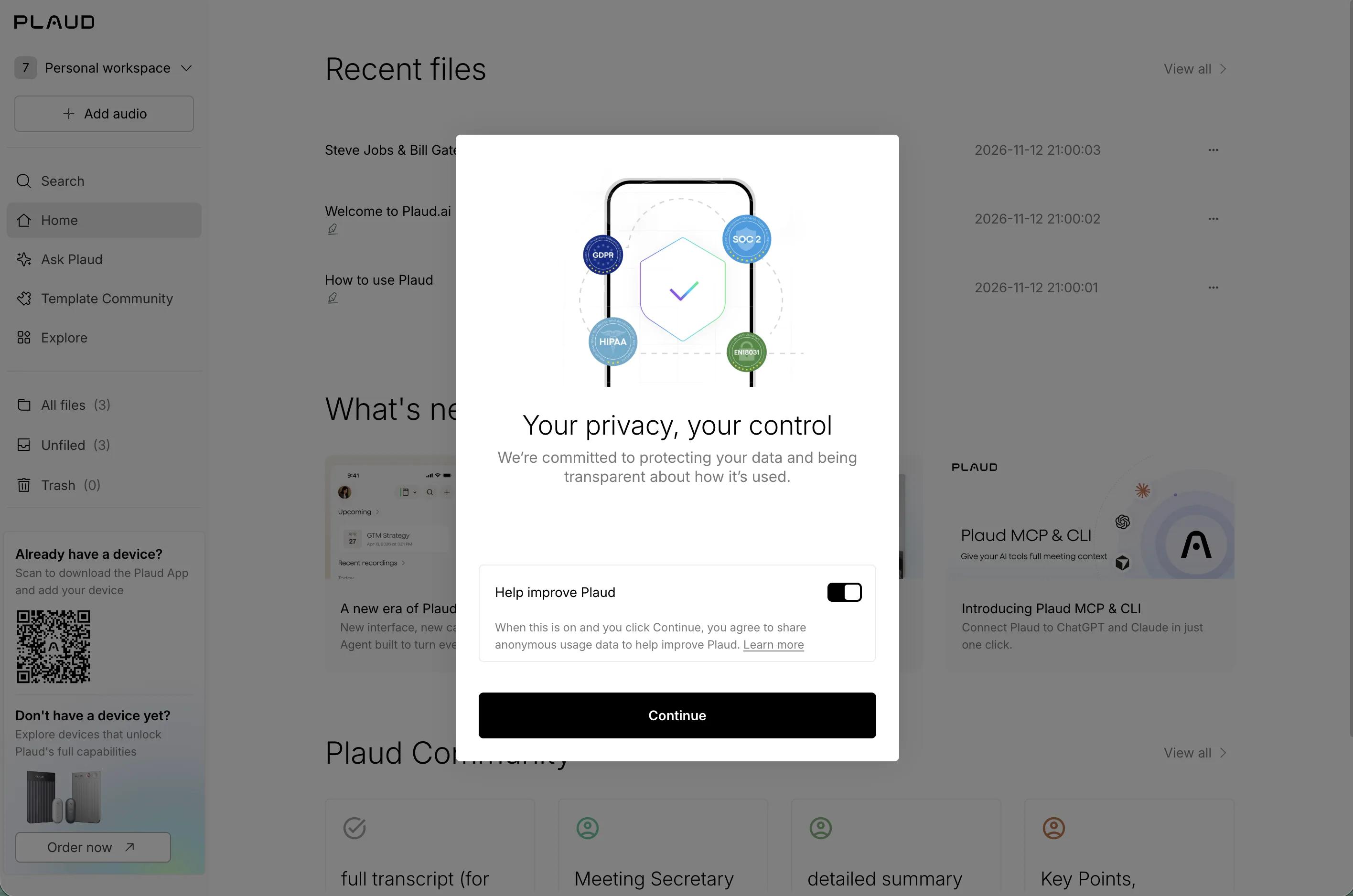
“Neat graphics (What I loved).”
Consent, drawn as a conversation
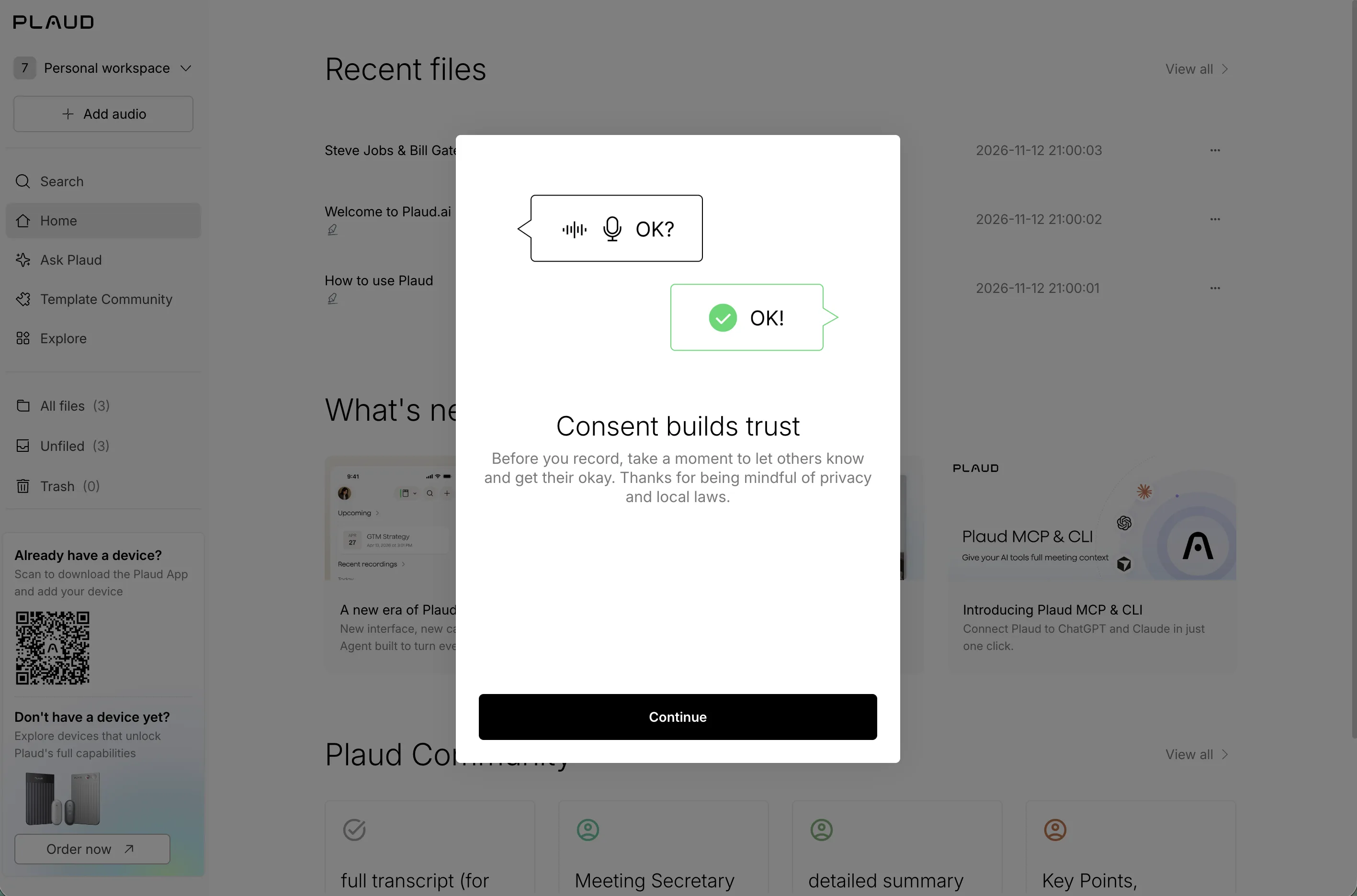
“Neat graphics (What I loved).”
Part 2First impressionsA busy home, long samples, and a device wall.
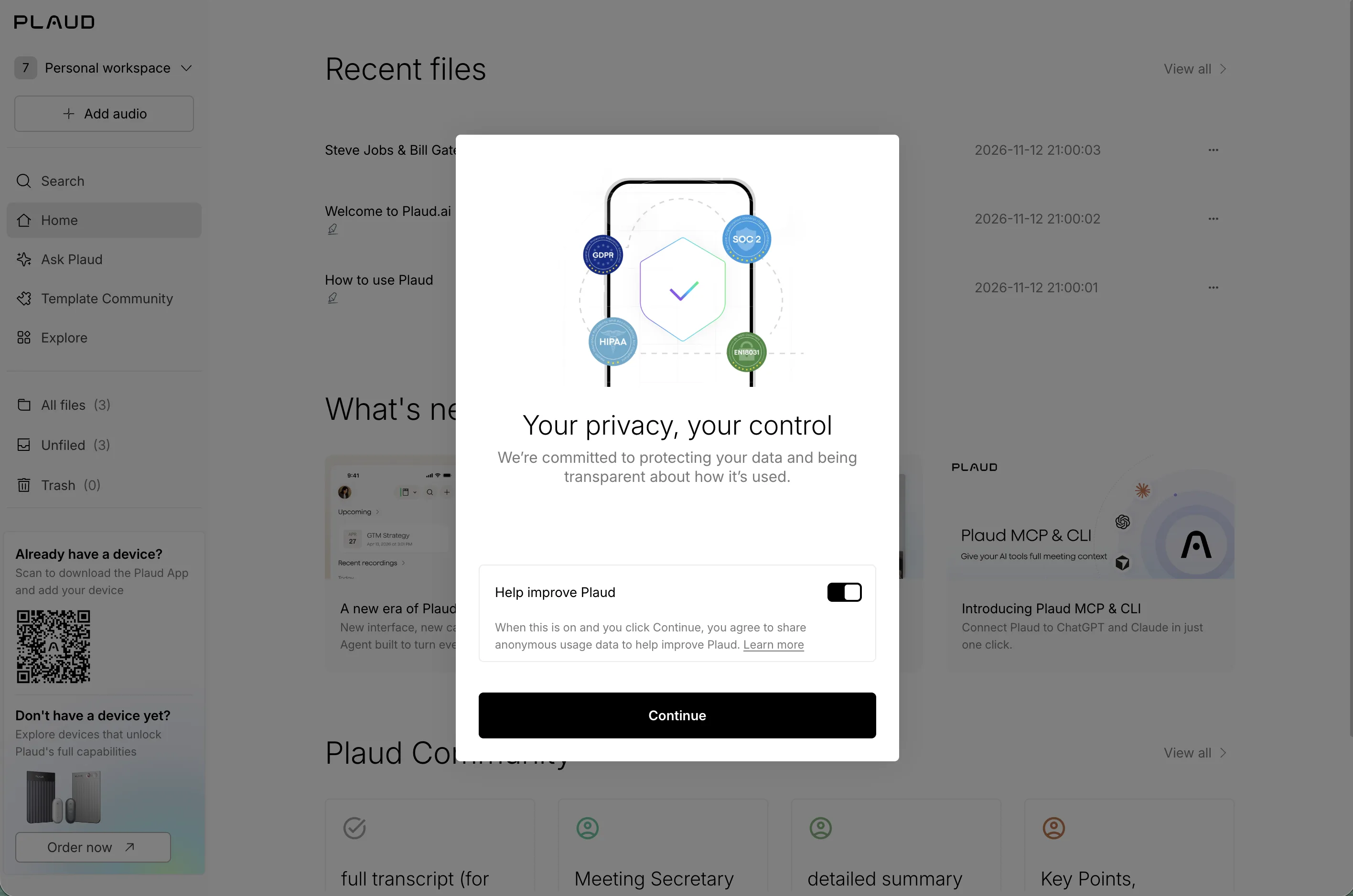
A lot on one screen
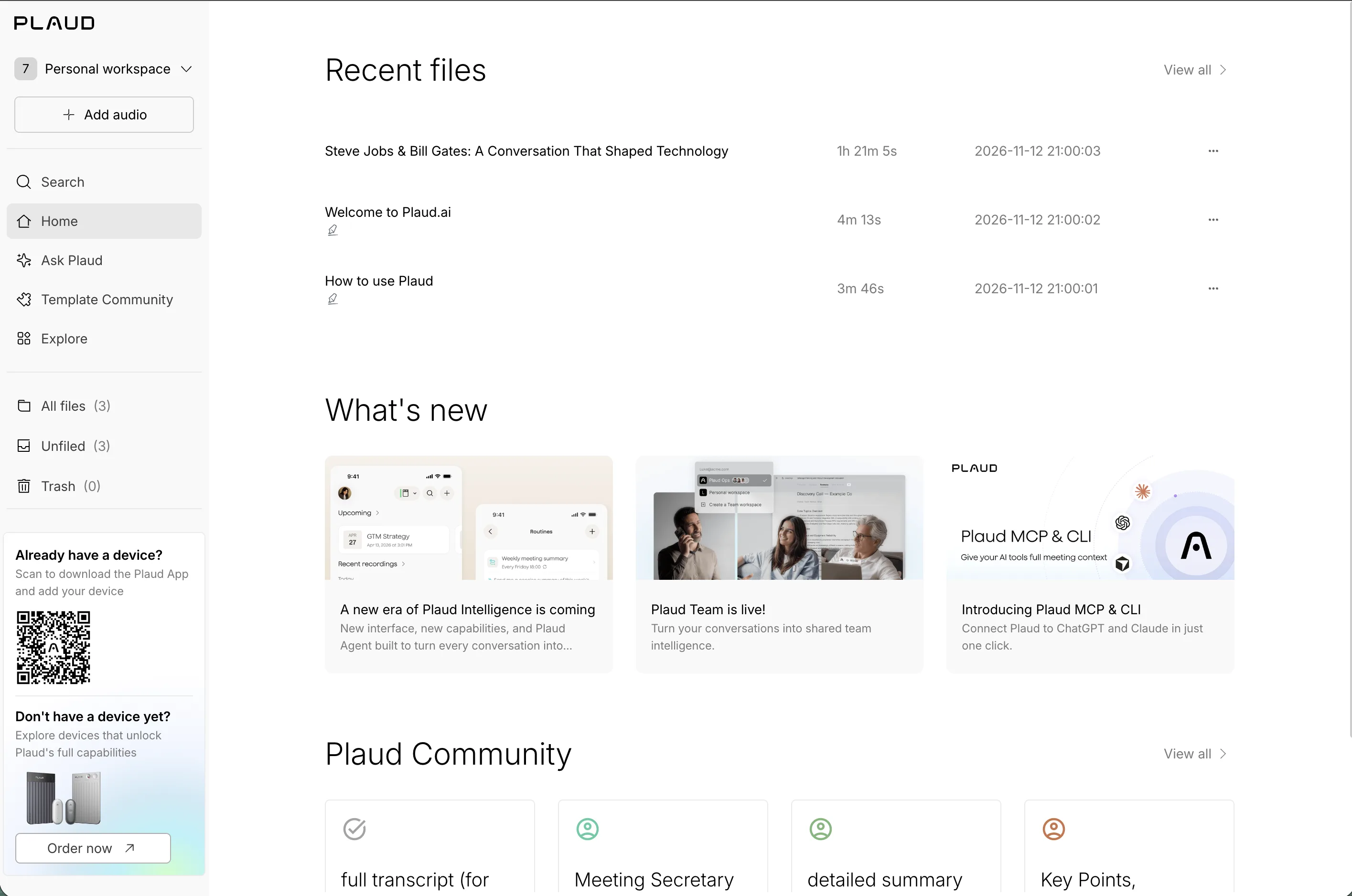
“Okay, a quick impression of the home page… definitely a bit crowded (Where I got stuck), lol.”
Steve Jobs and Bill Gates?
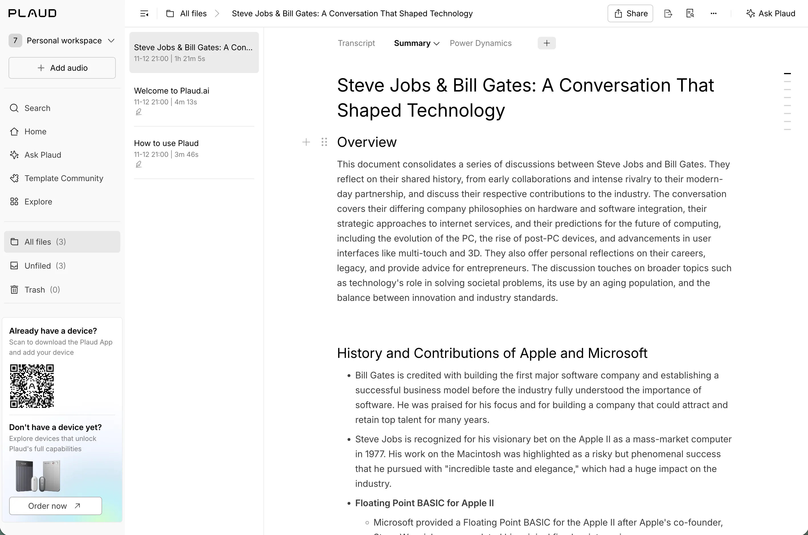
“Huh, Steve Jobs and Bill Gates as an example conversation? (What I expected) Interesting.”
Long reads, no visual interest
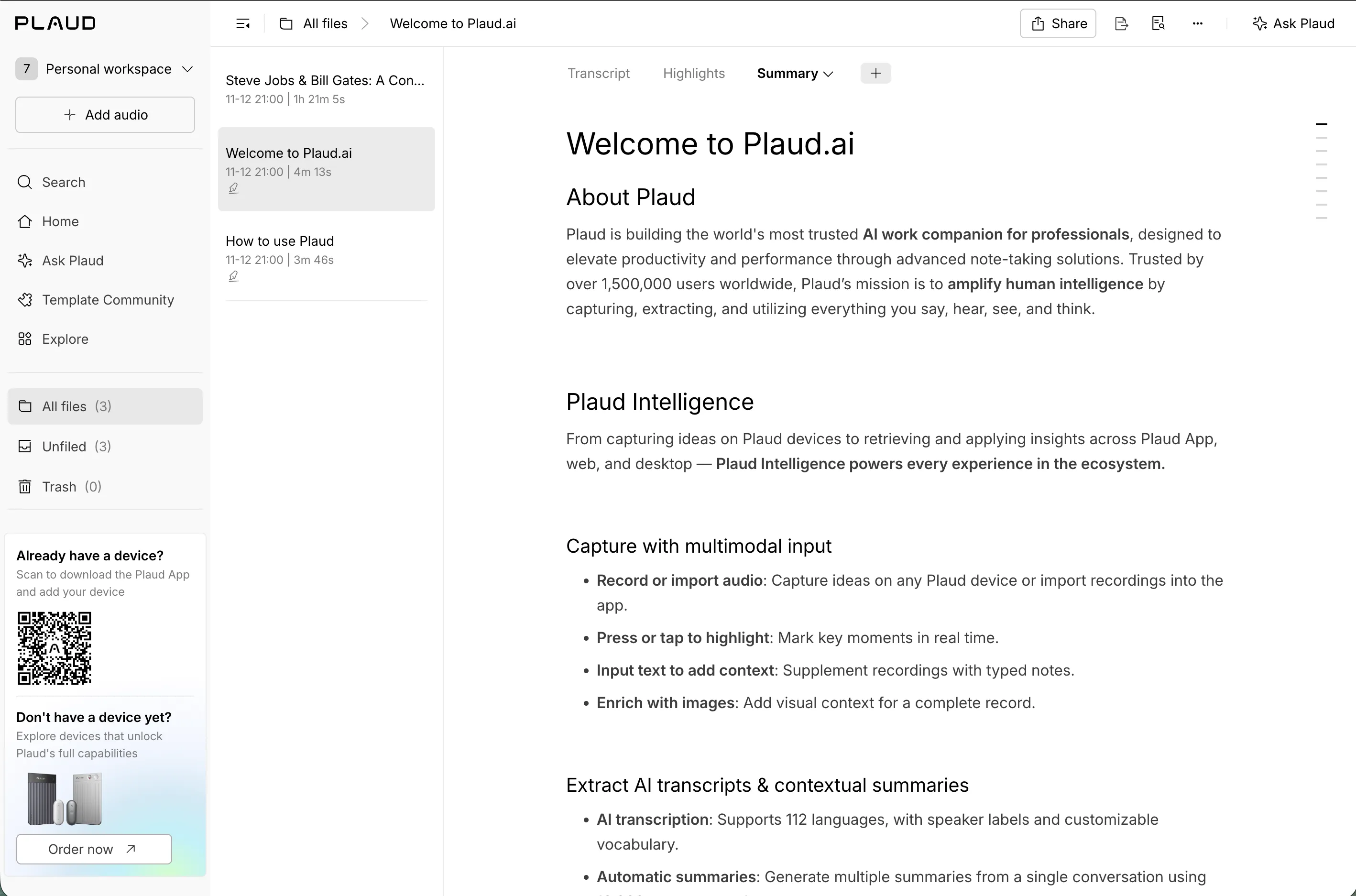
“Yeah, these articles are all quite long (Where I got stuck), and they don’t have any visual interest, like icons (Ideas & wishes). It’s boring me (Where I got stuck).”
What’s “Change template”?
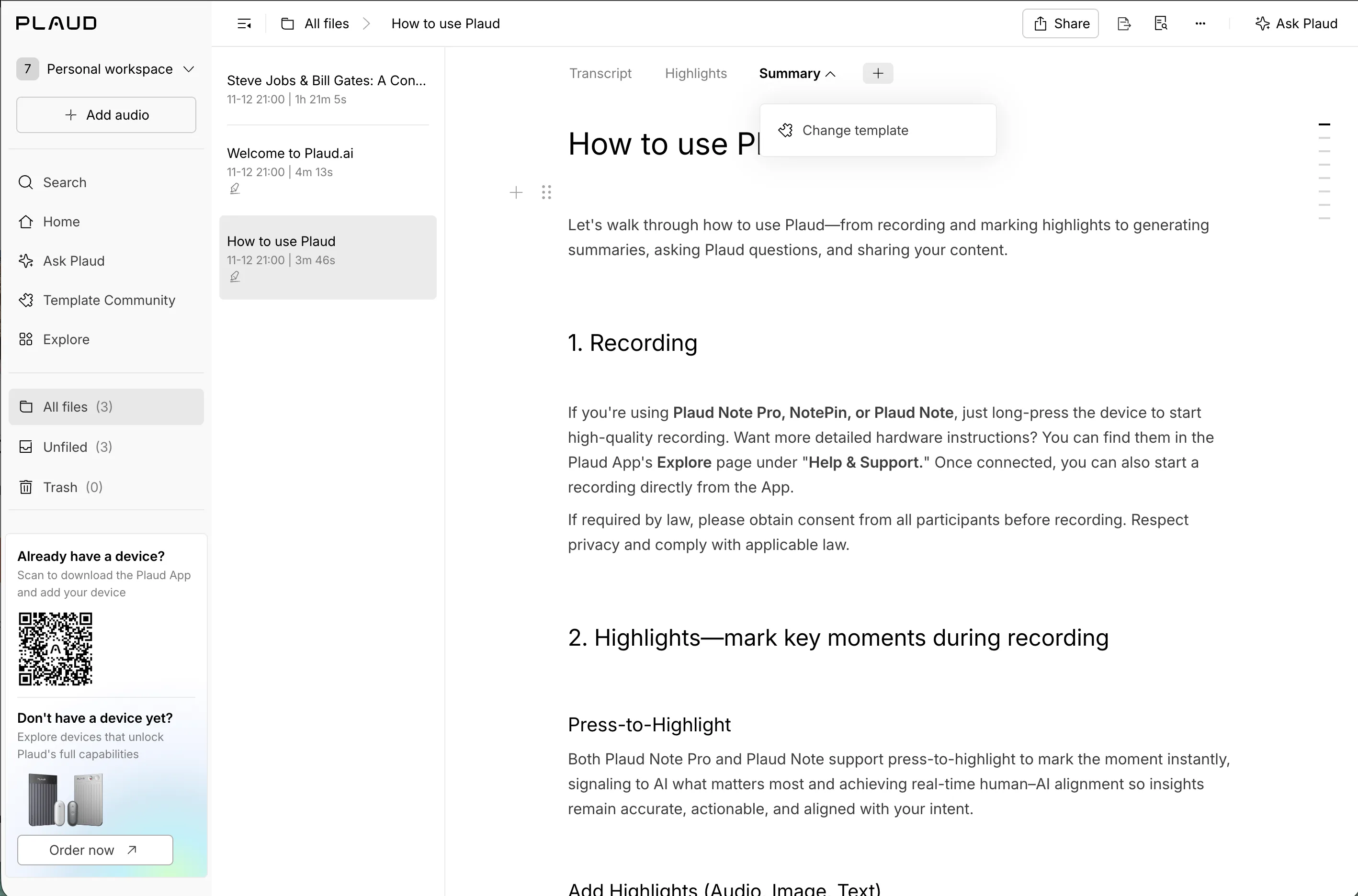
“Here, I don’t know what “Change template” means (Where I got stuck).”
A device wall, and a card I can’t close
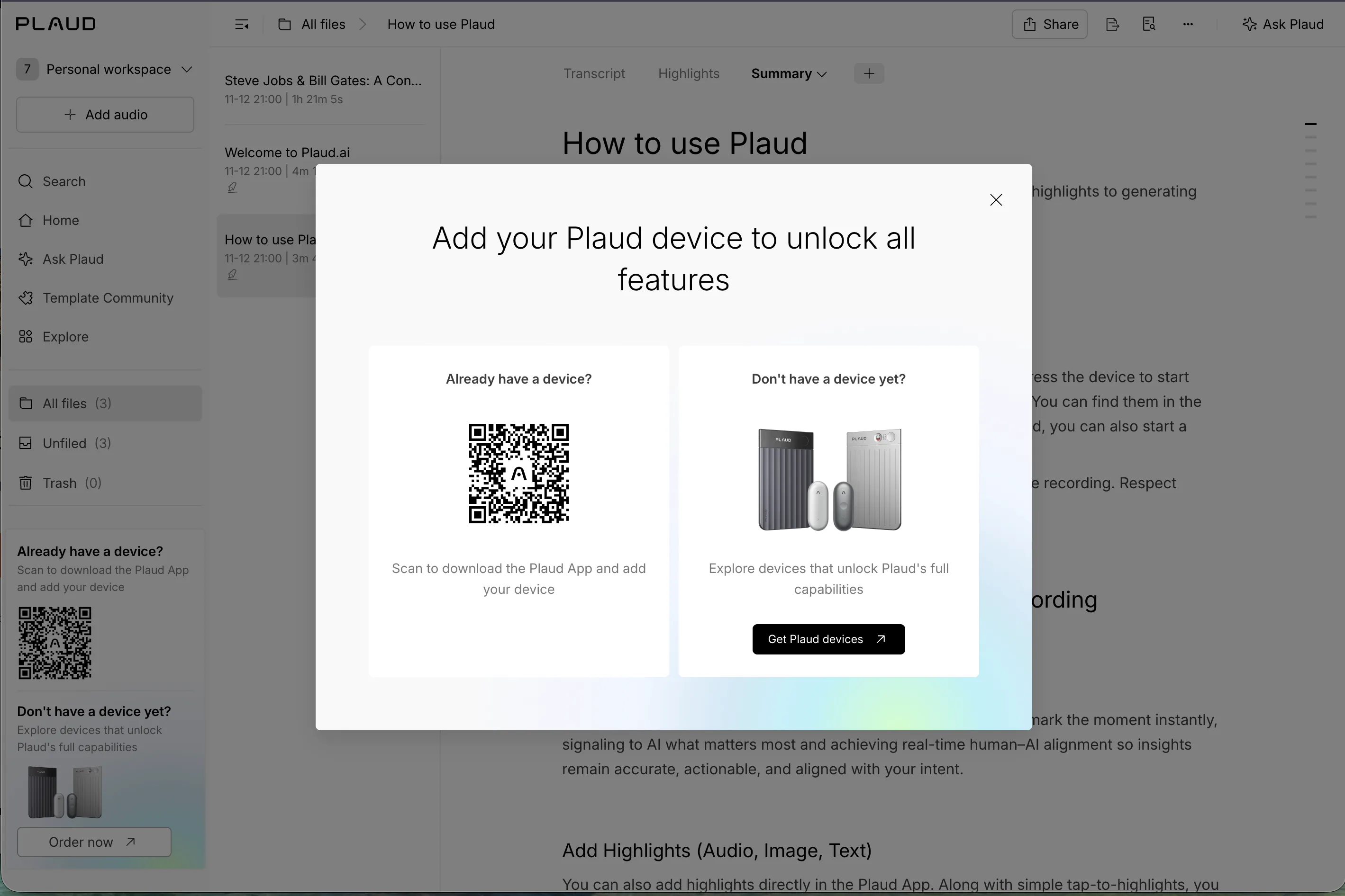
“Clicking on it, or the + button, just shows me this paywall ad (Where I got stuck)… And I don’t like that I can’t get rid of that thing on the side (Where I got stuck).”
Part 3The template communityA huge shared catalog, and no hint where to start.
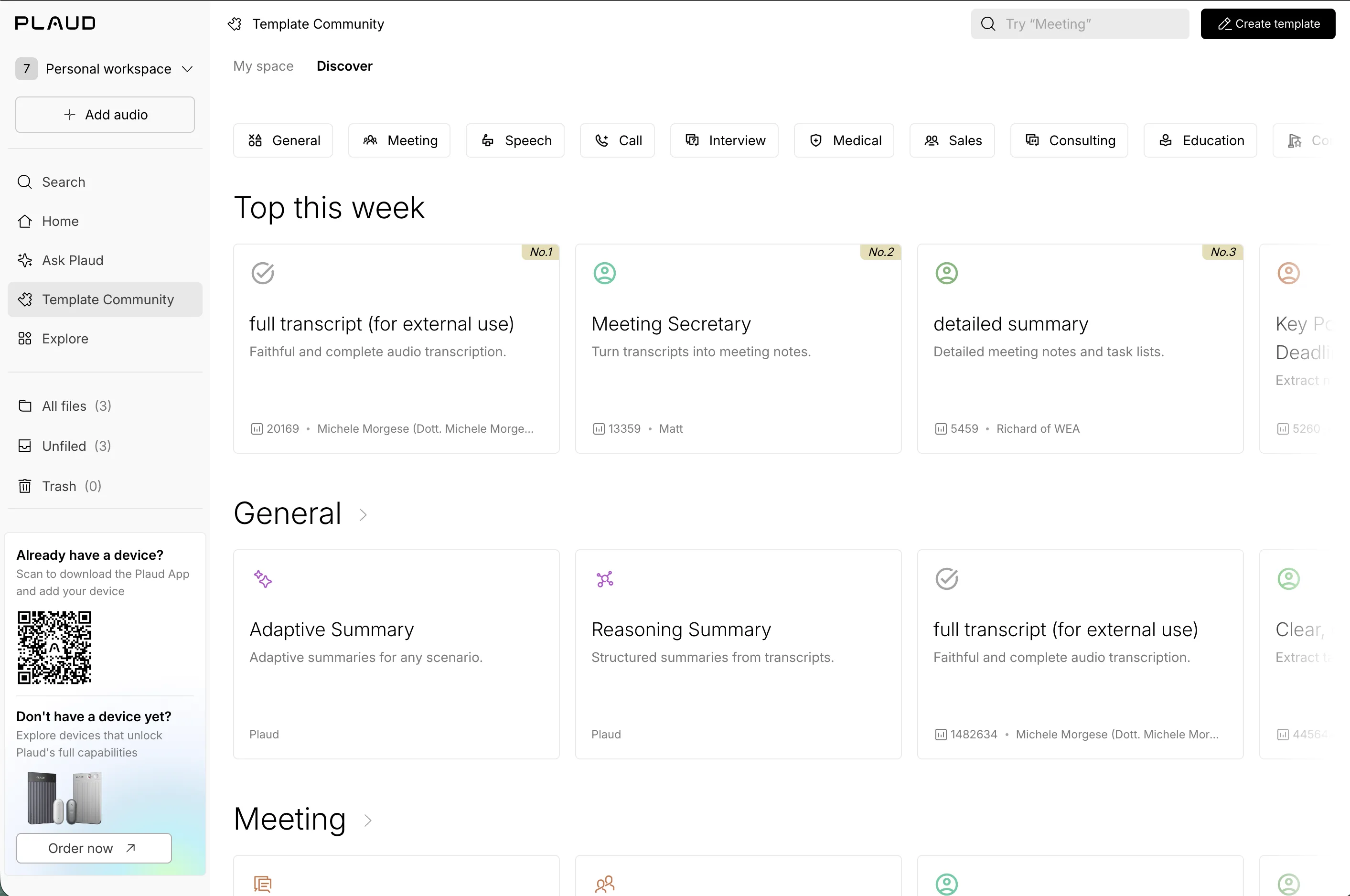
Interesting summaries?
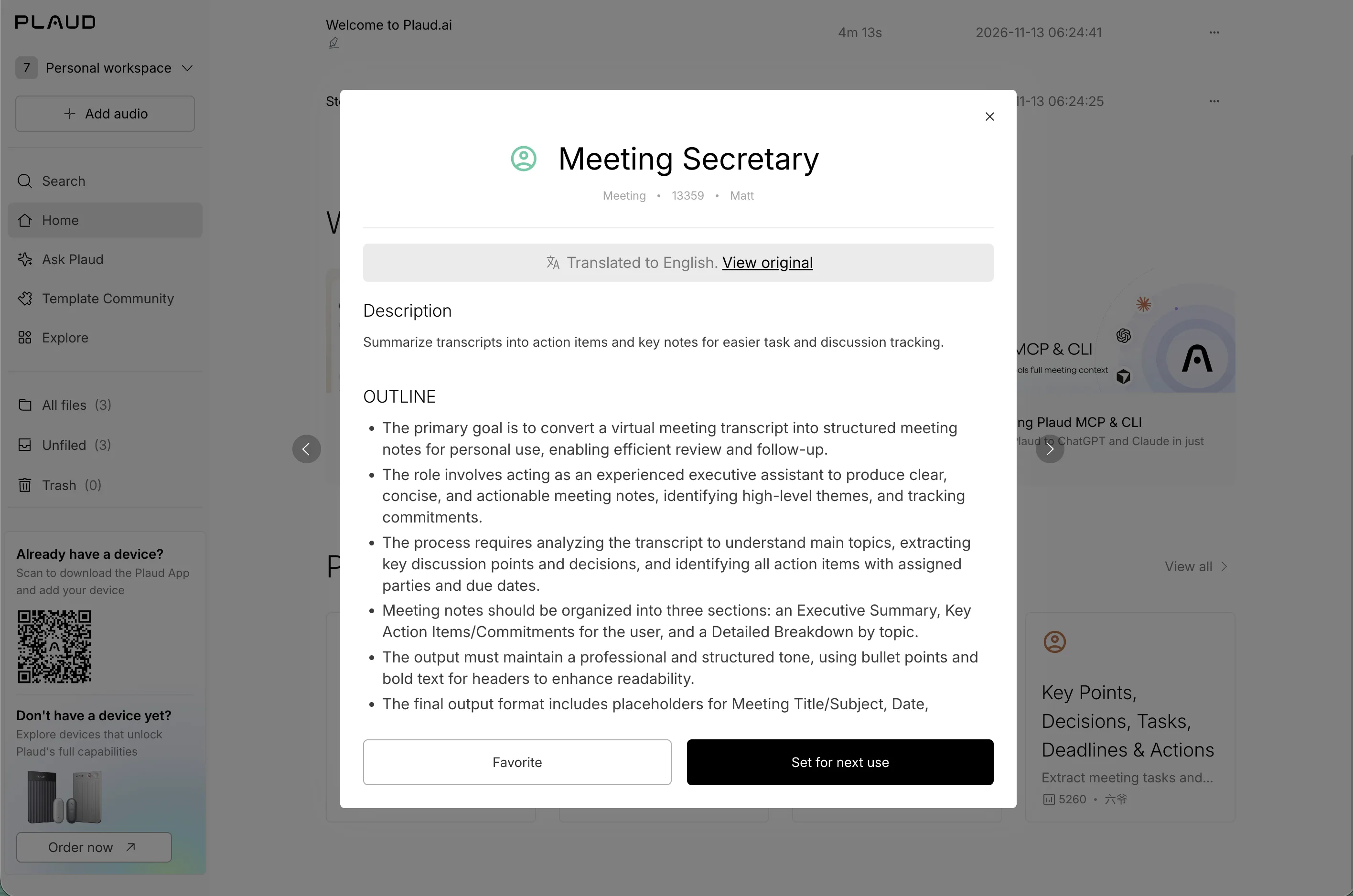
“Interesting summaries? (What I expected)”
So many templates
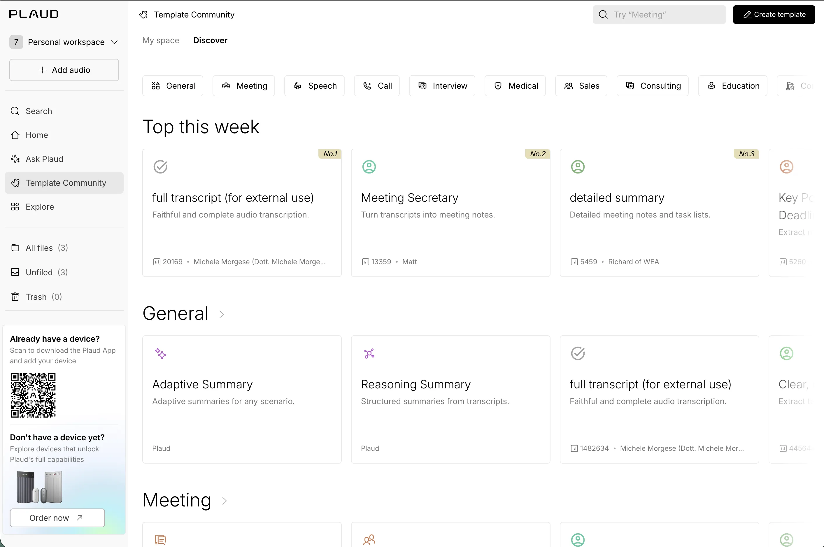
“Lots of templates… overwhelming (Where I got stuck).”
Who made these?
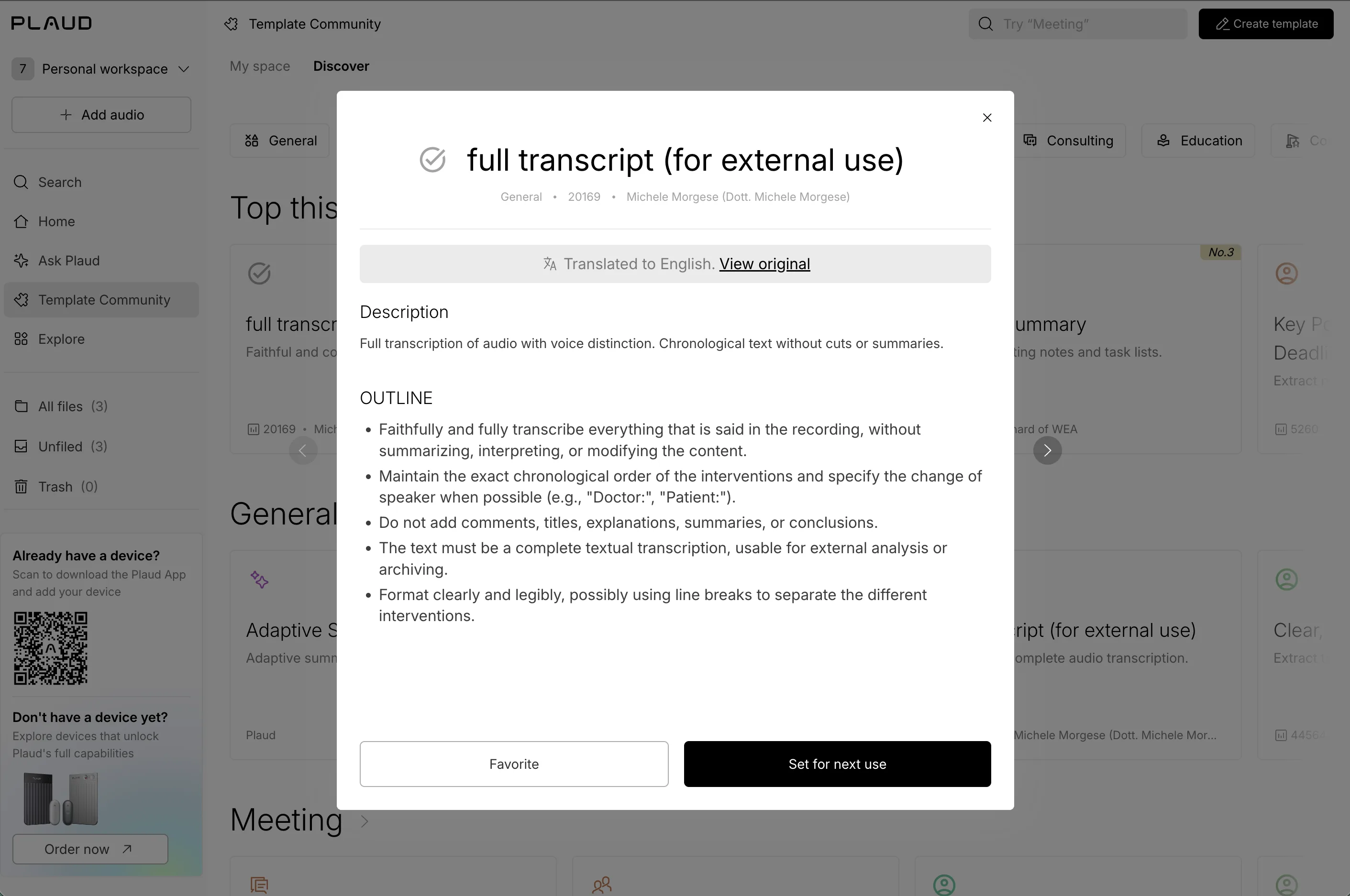
“Top this week… so what are these? (What I expected) People made these themselves, and others can reuse them? (What I expected)”
Templates for everything
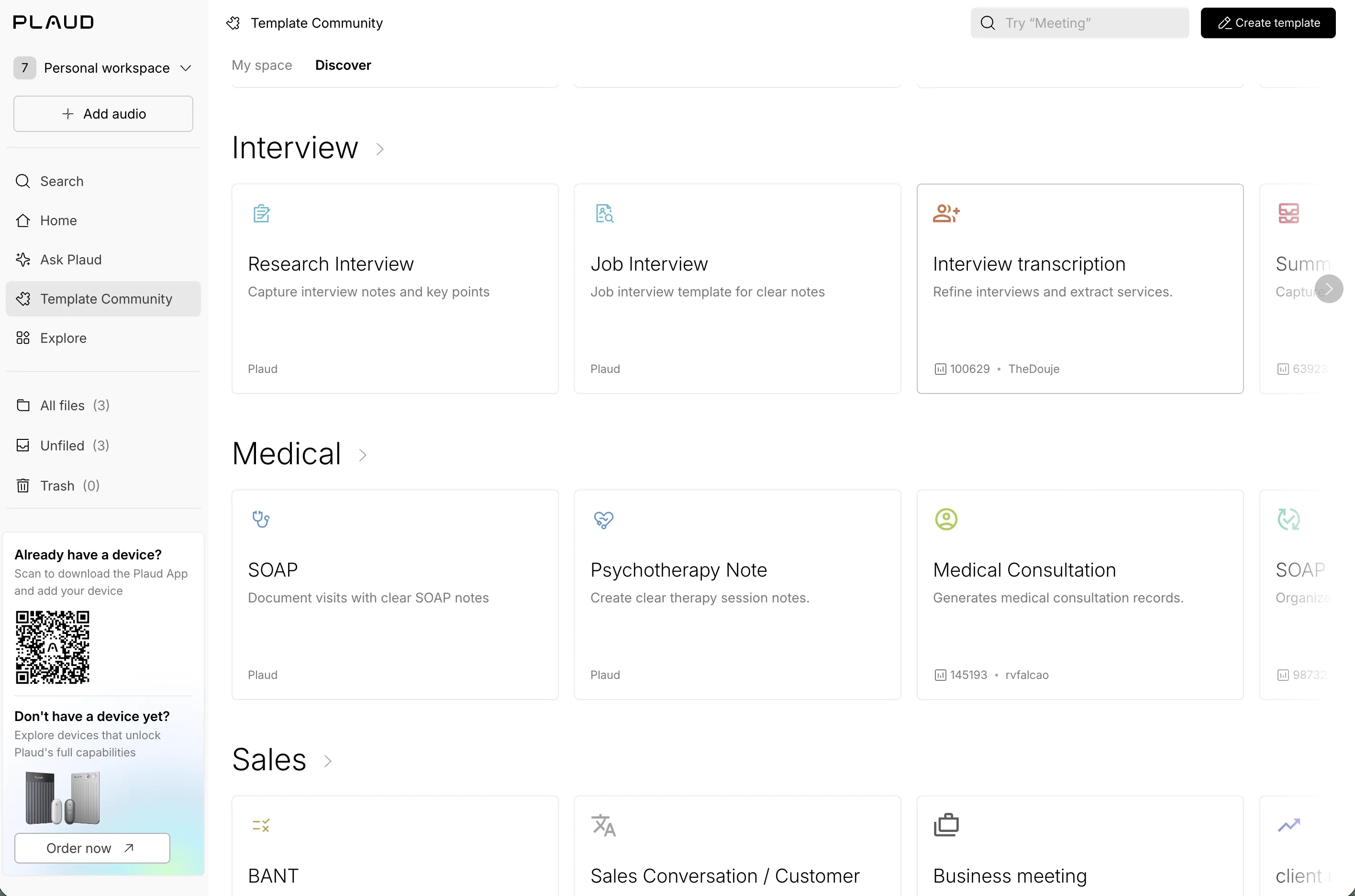
“I guess people can use these for all kinds of stuff (What I loved).”
Part 4Explore, and beyondSettings by another name, and a jump to another site.
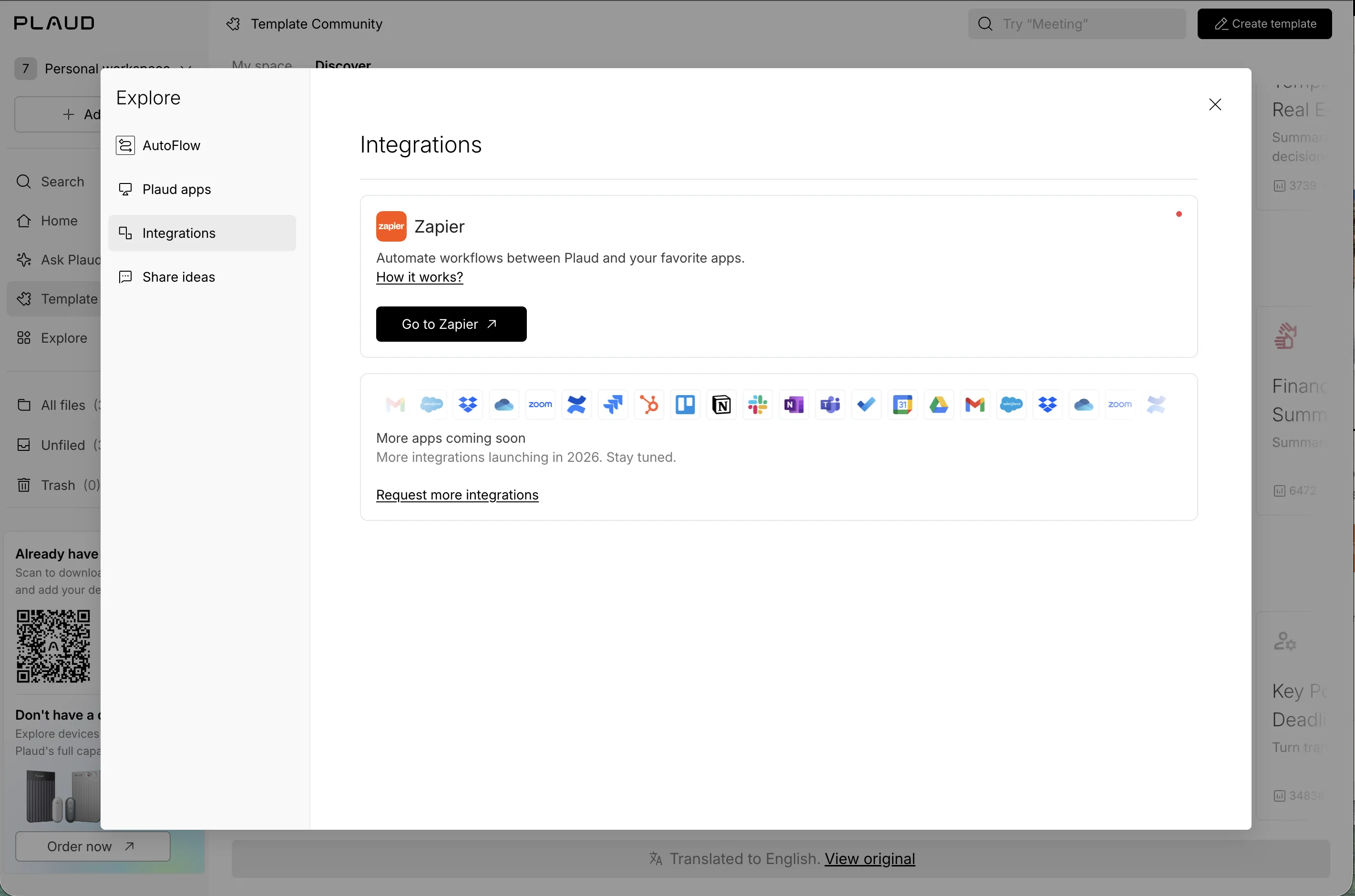
Explore feels like settings
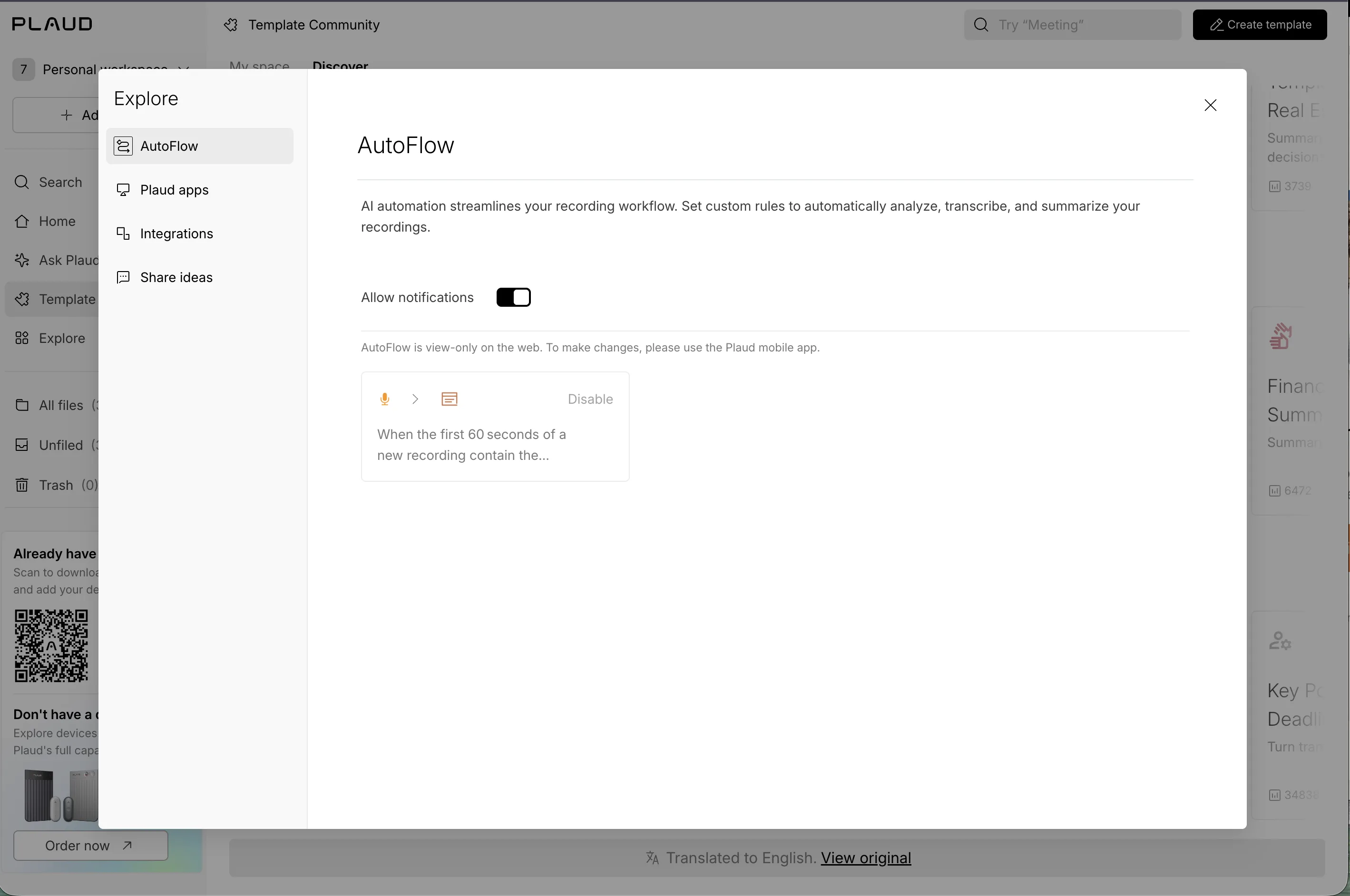
“While “Explore” just feels like settings? (Where I got stuck)”
Not quite interested
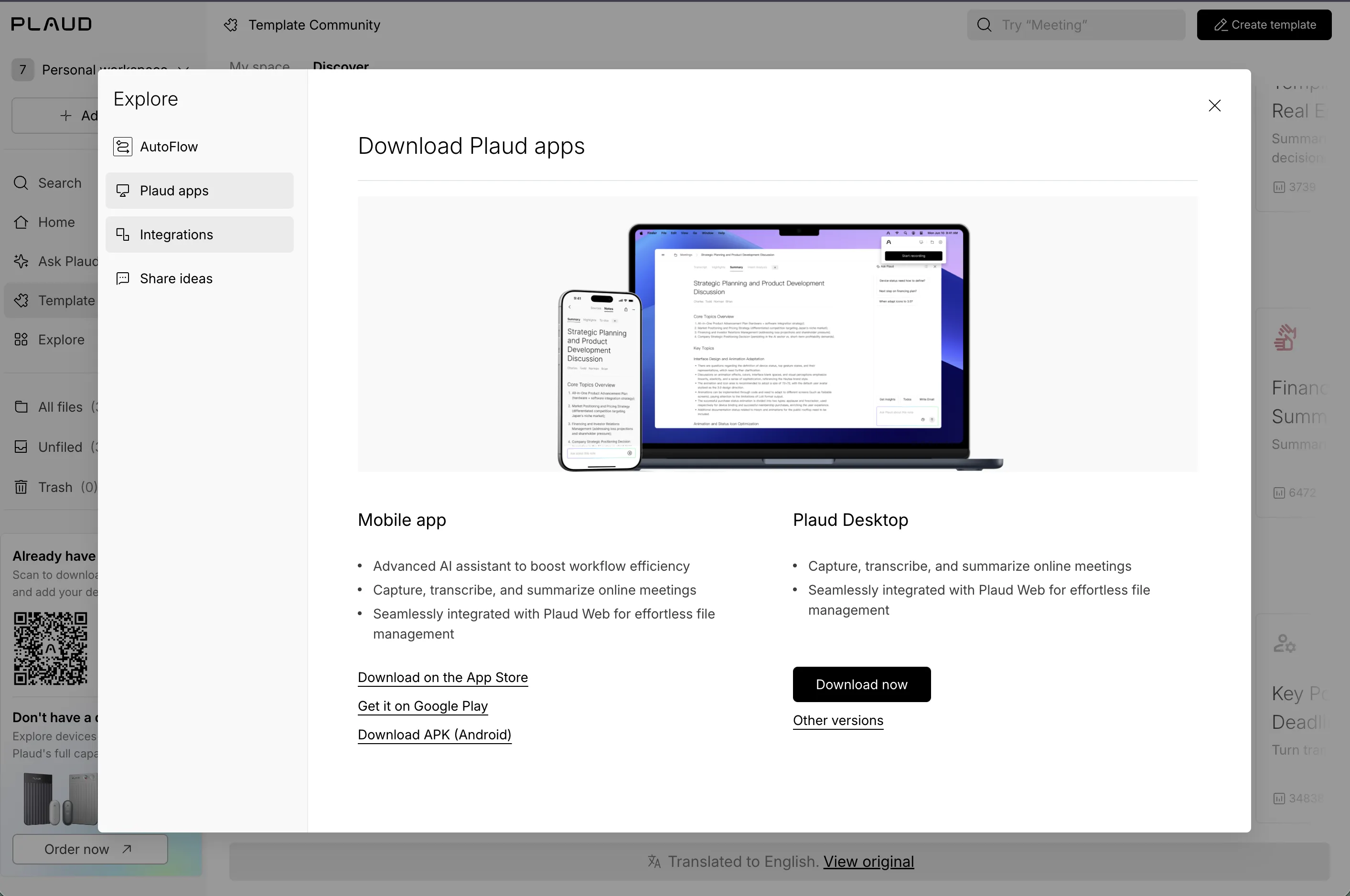
“Either way, not quite interested (Where I got stuck)…”
Nice integration icons
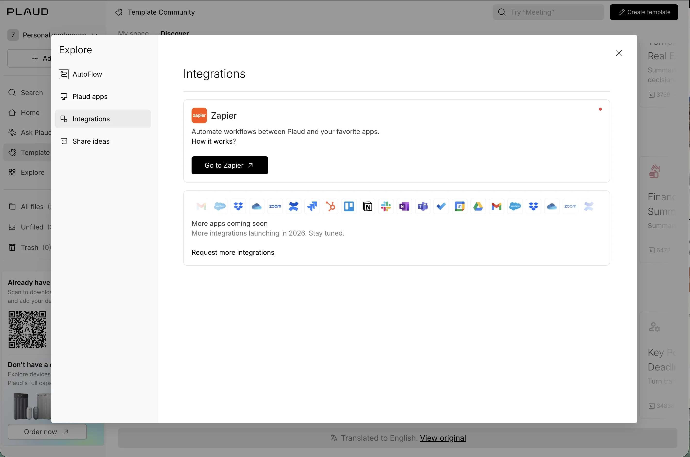
“Nice integration icons (What I loved).”
Out to a different website
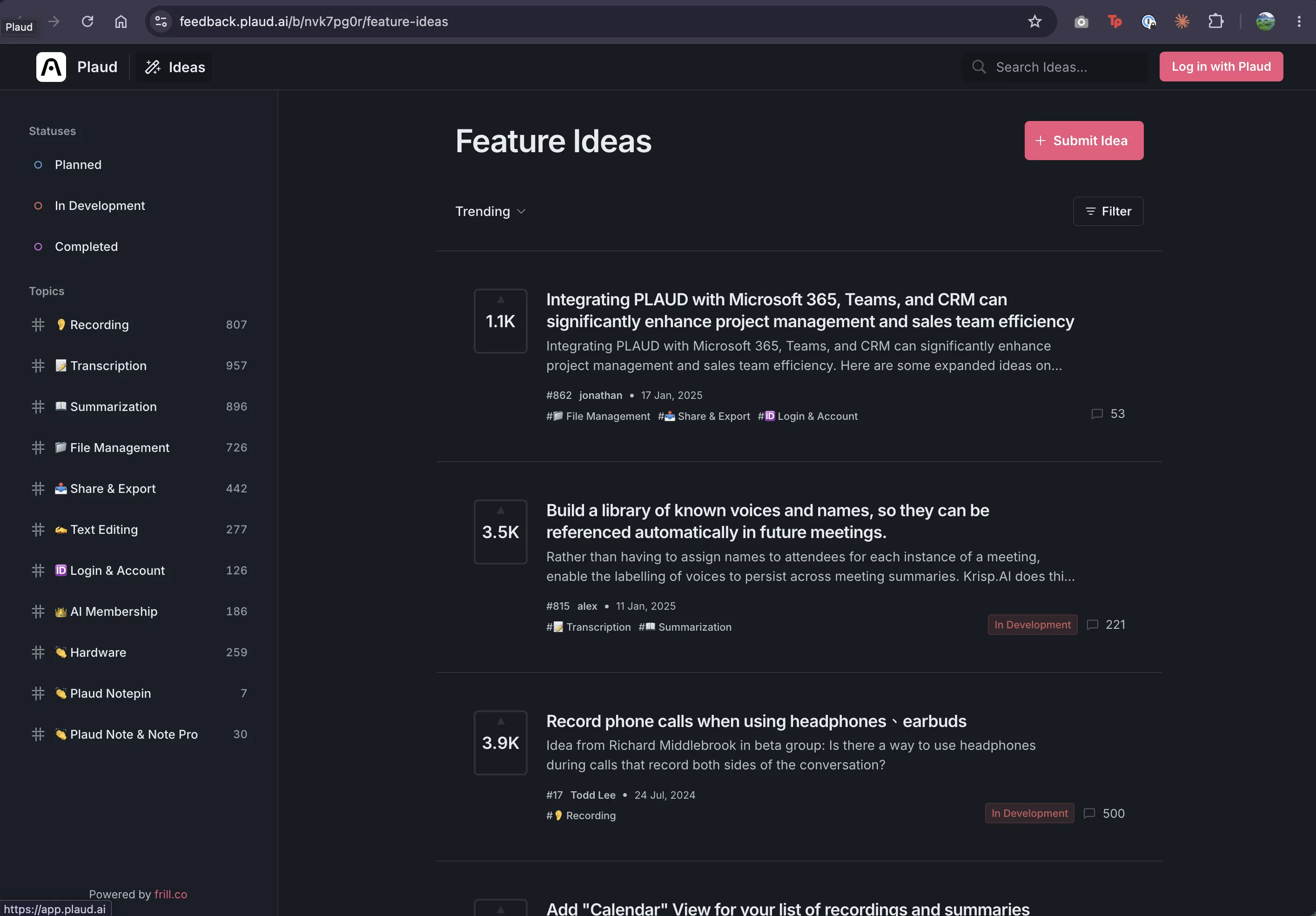
“And I don’t like how clicking “Share ideas” jumps me out to a different page (Where I got stuck), like a different website. And blogs are yet another website… How many layers of Plaud are there? (What I expected) So confused (Where I got stuck).”
Part 5Finding my filesThe same list twice, a top-level Trash, and a search I liked.
Two lists…
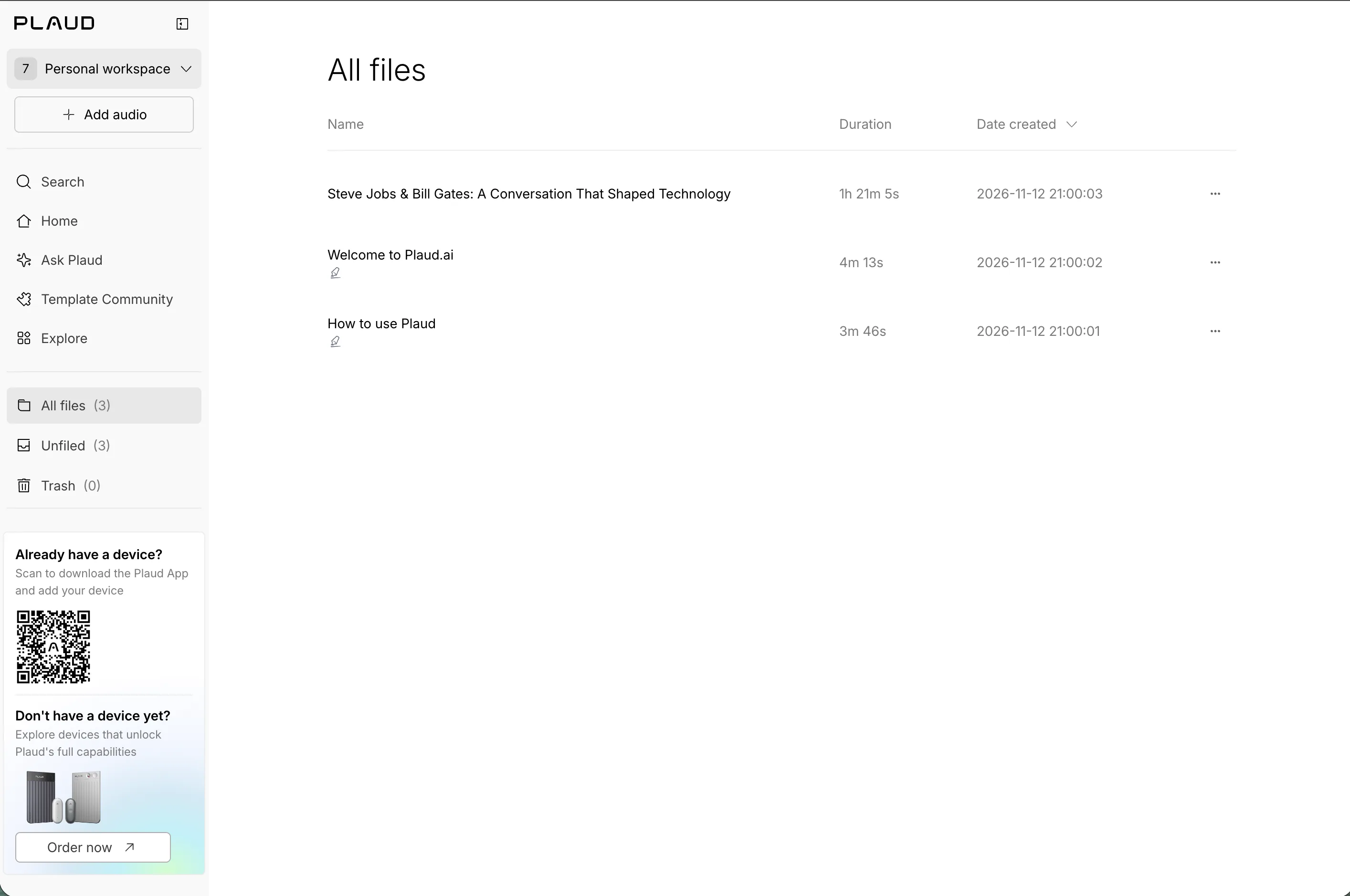
“All files (Where I got stuck)…”
…one set of files
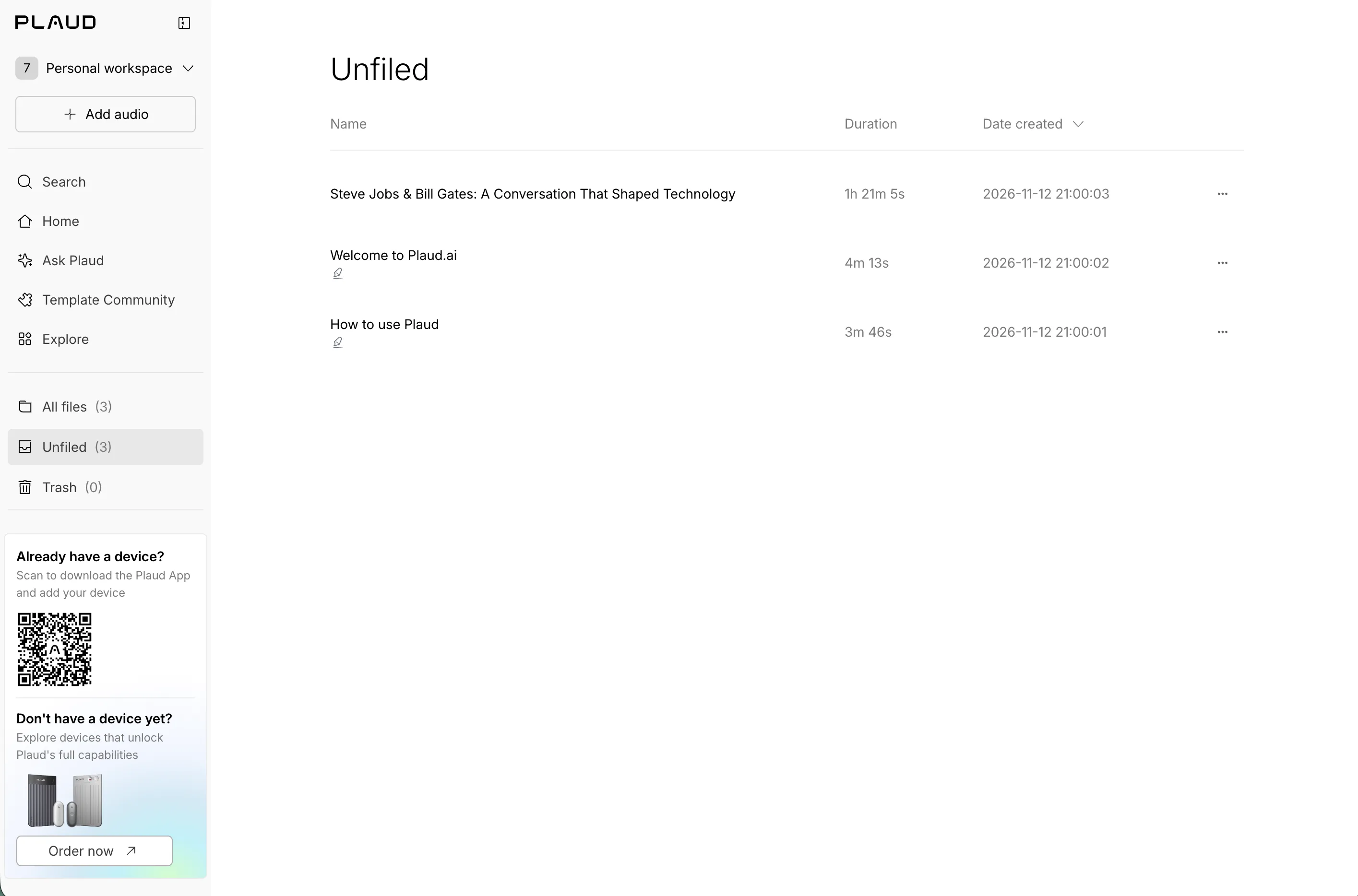
“…and Unfiled are the same (Where I got stuck).”
Trash, at the top level
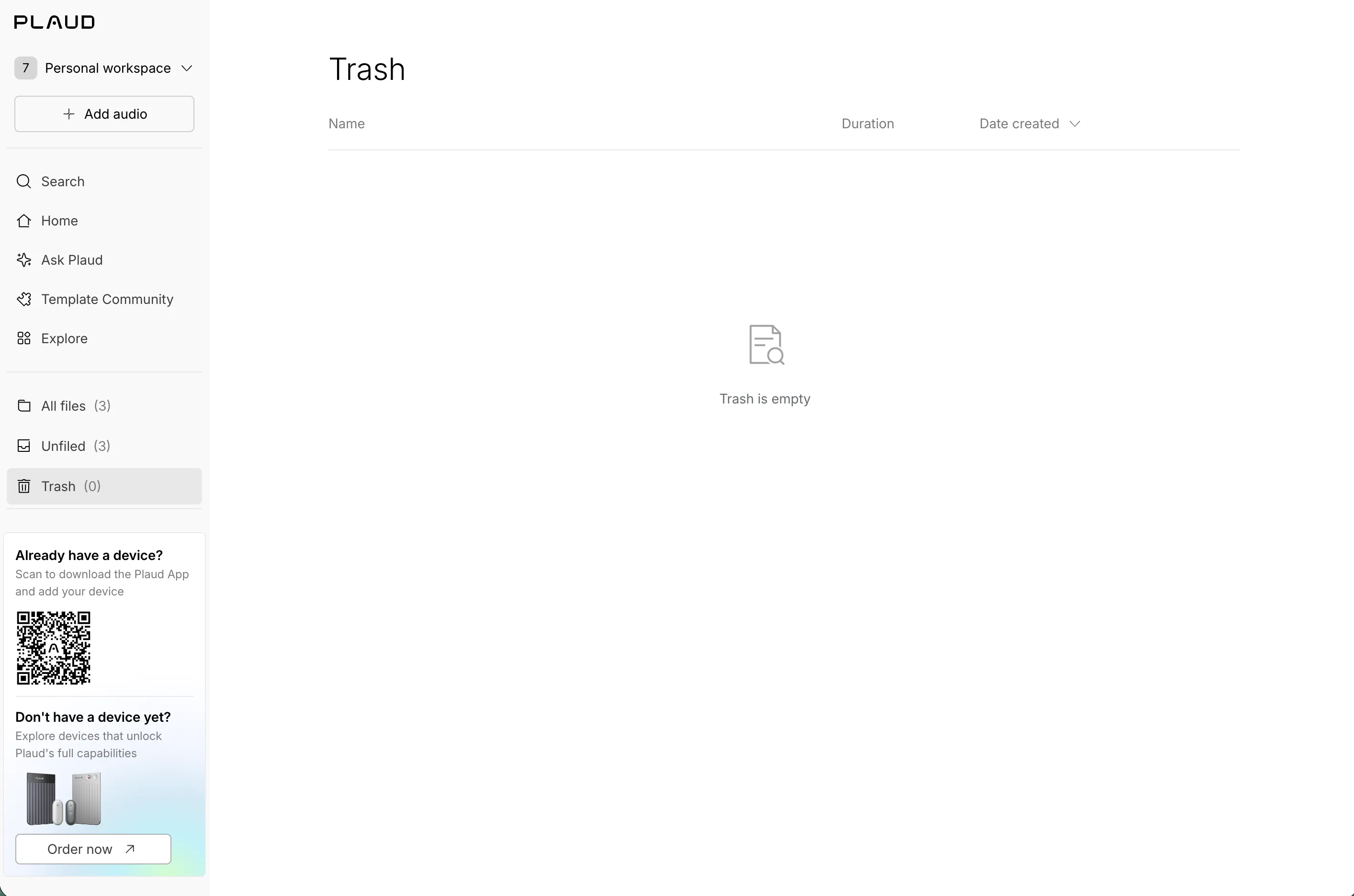
“And Trash is given high priority too? (What I expected) Interesting… I’d think you’d put that in a second level under All files somewhere (Ideas & wishes).”
A neat search
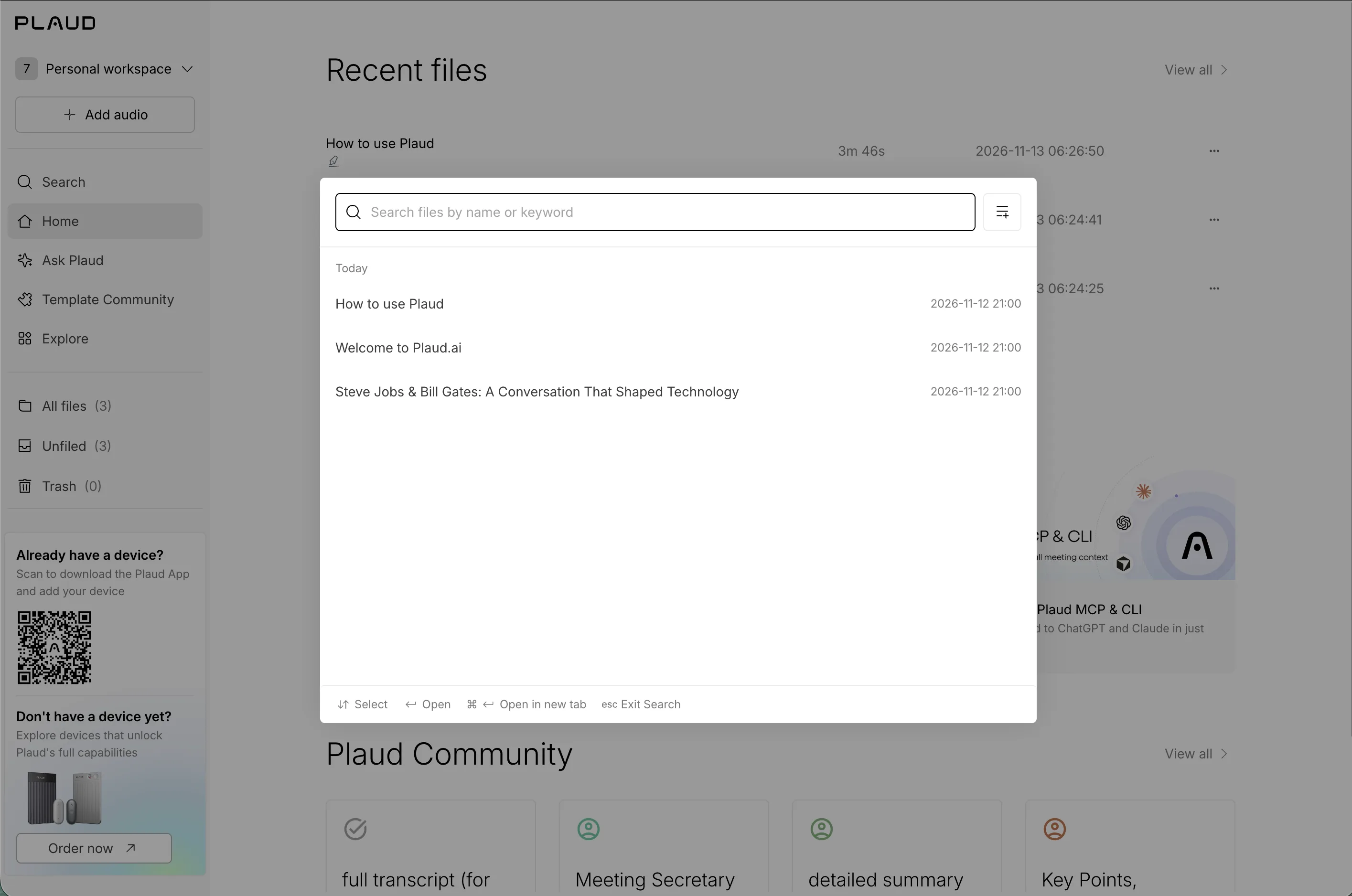
“Neat search place (What I loved).”
Hints and filters
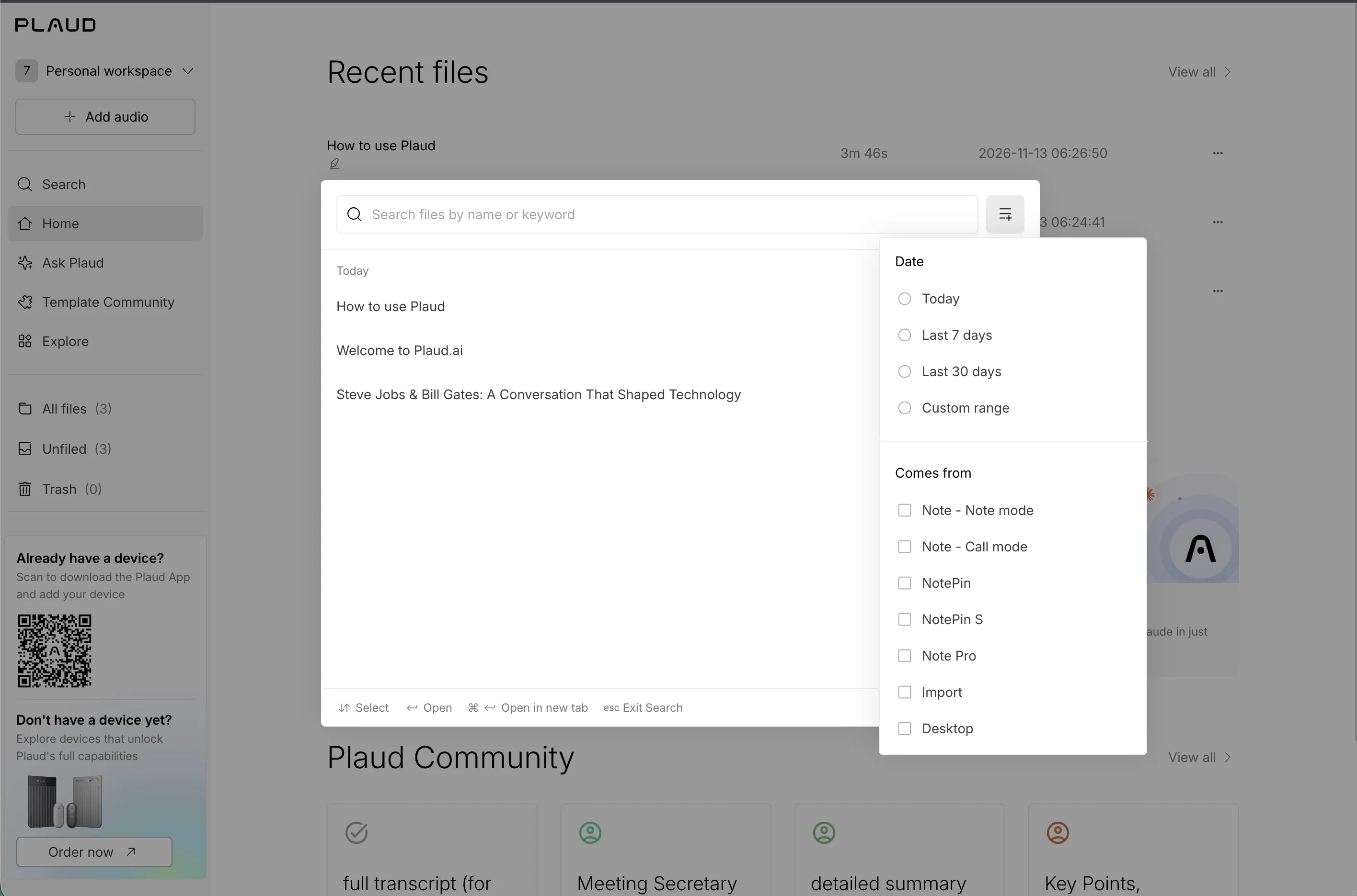
“I like the helper hints at the bottom (What I loved), and I like the filters too (What I loved).”
What I’d capture next
A second pass can answer the questions these first impressions opened up.
- Add my own audio file without a device, and record what the first real summary looks like.
- Check whether the sidebar device card can ever be dismissed or collapsed.
- Capture where the blog link leads, and map every Plaud site a new user can land on.
- Compare the mobile app's onboarding with the web's.
The feeling I’m leaving with
Keep the friendly consent illustrations, the integration icons, and the search with its keyboard hints and filters.
Make it clear where to begin, what a template is, and which features need a device.
Explore a calmer first session: fewer promotions, shorter samples, and a little visual interest in the notes.
Decisions I could see
- 01
Onboarding opens with two illustrated consent screens: a privacy promise, and a reminder to get consent before recording.
- 02
The home page stacks recent files, What's new, community templates, and two device promotions that stay in the sidebar.
- 03
The sample files are an 81-minute Steve Jobs and Bill Gates conversation, a welcome note, and a how-to, each with a long summary.
- 04
On a sample file, Change template and the + tab both led to an add-a-device prompt.
- 05
Templates are made and shared by the community, with weekly rankings, use counts, and ten-plus categories.
- 06
Explore holds AutoFlow, apps, integrations, and Share ideas; Share ideas leaves for a separate feedback site.
- 07
Trash sits at the top level, beside All files and Unfiled.
Tradeoffs
A broad first screen shows everything Plaud can do
⇄Leaves a newcomer without one obvious place to begin.
A large community catalog signals flexibility
⇄Asks a new user to choose before any summary has proven its worth.
Persistent device promotions support the hardware business,
⇄Taking permanent space from someone exploring the web app.
Hypotheses to test
- One first step on the home page, like trying a sample or adding audio, could reduce the sense of crowding.
- Saying what a template does, and that other people share them, could make the community feel inviting rather than overwhelming.
- Labeling device-only features before the click could replace surprise prompts with clear expectations.
What would a new web user's first five minutes look like if Plaud offered one starting point instead of everything at once?
One person’s first impressions, not a usability study or accessibility audit. I had no Plaud device connected, so anything that needs one is reported from the prompts I saw, not from using it.